So with all that spurring me into action here's the Junk Journal I created for Elizabeth;
Creating The Cover
I started by cutting two of the main shaped from mountboard using the Stamp & Photo Storage Scoreboards Die, removing the tabs on the bottom/top and overlapping the two side tabs to form a spine. I also cut a strip of mountboard the same width and length as the spine, gluing it in place over the top to strengthen the spine further.
Next I covered the front side of the cover with cotton muslin, tucking it over onto the reverse side at the edges. I also cut a piece to fully cover the reverse side. You can use your choice of wet glue or adhesive tape to secure the muslin in place.
Once dry I mixed some of the 'Uniform' Colorbox Blends Ink with water and applied it to the fabric on both sides of the cover. These inks are designed to work with fabric and colour it really well. Once dry I rubbed sandpaper over the surface to give it a worn look (it also helps to soften the surface) and dabbed the 'Nutmeg' Colorbox Blends Ink around the edges to add a touch of vintage age.
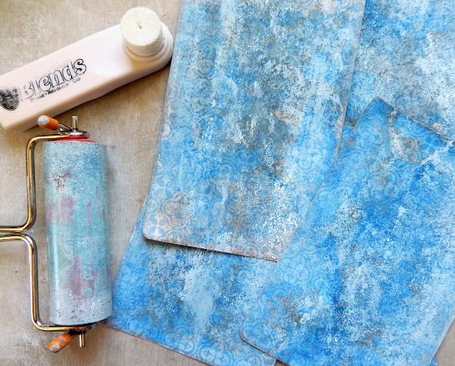
The card panels that were then applied to the inside and outside of the cover over the fabric were cut from Tim Holtz 'Correspondence' Paper Stash (each one being 3 3/4 x 5 1/2 inches, with a final strip for the spine measuring 3/4 x 5 1/2 inches). More of the 'Uniform' Colorbox Blends Ink was applied to my craft mat and diluted with a little water so I could dip each piece of card into it.
I repeated this process with the 'Nutmeg' Colorbox Blends Ink, using less this time. I also blended the ink directly from the sponge applicator to the edges of the card pieces.
As the Colorbox Blends Ink is a wet pigment ink it's ideal for applying to your craft mat and brayering over surfaces; I used the 'Coconut' shade this way to achieve a more weather-worn look to the card.
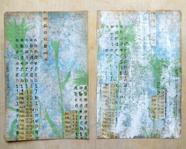
This 9 x 12 stencil is called 'Thistle' and comes from StencilGirl Products - I applied 'Frog' Colorbox Blends Ink through it with a mini blending tool onto the card pieces.
Did you know Colorbox Blends Inks can be used for stamping too? I applied the 'Ebony' shade directly from the ink wand to my stamps (designs from Tim Holtz 'Correspondence' and 'Purveyor' stamp sets by Stampers Anonymous) and added them to the design.
Some Tim Holtz Design Tape was added in random strips to finish the design (the piece on the left) but I wanted it to look even more weather-beaten. So in a move that will give some people chills I dry brushed white gesso over the top and then drew the outlines of the thistles through the stencil again with a permanent blue ink pen. These pieces of card were then glued into position on the inside and outside of the cover ready for the final embellishments to be added.
A couple of side by side holes were punched into the top and bottom of the spine so elastic could be threaded through to hold the signatures. This white 1.5 mm elastic was coloured with more of the 'Uniform' Colorbox Blends Ink, added in swipes direct from the ink wand.
To finish I used Distress Collage Medium Matte to glue some shells into place, squeezing a little extra around the edges so the 'Dirty Sand' Baked Texture Embossing Powder could be scattered around them. Once the Collage Medium had dried I could then use a heat tool to melt the powder a little, revealing some of the gold shimmer contained within it. The semi-precious gemstones from Emerald Creek Craft Supplies were also added to this beach-scape border along with the die cut word (you can even buy seashells from them HERE). And the seaside themed brass charms were linked to the elastic threads on the spine to finish the cover.
A Video Flip Through
Rather than take lots of photos I've put together a video flip through so you can see the junk journal inserts. These were created using lots of off-cuts from my scraps box, tea stained notepaper, more Tim Holtz Paper Stash ('Wildflower' and 'Memoranda') and Dina Wakley Cotton Watercolor Paper from Ranger. I used a selection of Eileen Hull's new Thinlits Die Sets to cut the mats, tags and pockets including 'Credit Card Sleeve & Tags', 'Journaling Cards, Flowers & Leaves', 'Journaling Cards, Hearts', and 'Journaling Words'. Let's see more here;
The Close Ups
As promised on the video here are a couple of close up shots so you can see more of the detail on the journal cover;
And at the beginning of this blog post I promised to share the beautiful hand-felted pouch that Elizabeth created for me, so here it is - gorgeous right!
I hope you've enjoyed seeing today's project for Eileen Hull Designs using her Sizzix Dies and Colorbox Blends Inks. If you have any questions please let me know in the comments section below. And as always I highly recommend you check out the array of inspiring projects created by my team mates over on Eileen Hull's website - there are many more ideas, tutorials, tips and techniques to be found that are bound to set those creative juices flowing.
There are a couple more project posts to come from me this week so do stay tuned for those. In the meantime take care of yourselves and get creative!
Jenny xxx


a totally stunning journal Jenny x Love the wonderful details you have incorporated.
ReplyDeleteTFS and best wishes
Annie x
That is so beautiful, my favourite colours and just so much to look at. I am waiting for the Credite Card sleeve Die to come from the US after I saw Eileen Hull show something having used it and I was to impatient to wait for UK shops to get it in. Thank you for so much inspiration.
ReplyDeleteThis is amazing and thank you for the tutorial!
ReplyDeleteLia xx
Every your work is absolutely stunning and a big surprise for eyes and heart!
ReplyDeleteThis is absolutely stunning Jenny. How beautiful!!! Every little detail is perfect. The way you used the dies and inks are so creative! I love this SO MUCH ❤️❤️❤️
ReplyDeleteA beautiful feast for the eyes....it is gorgeous. Love the colors and layers on each pocket page, thanks for the share!
ReplyDeleteLove this journal. Love all of Eileen Hull's dies.
ReplyDeleteLOVE LOVE LOVE!!! The felted pouch is fabulous too! What a summer treat!
ReplyDeleteLove all the details Jenny and thank you for sharing in such a wonderful tutorial. Fabulous colours and inky layers on the pages too as well as that fabulous cover. Jennie x
ReplyDeleteBlue and the beach and a junk journal? I’m in ecstasy! This is so perfectly aged and beautifully crafted! I love all the little inserts! Just completely gorgeous, Jenny! The baked sand between the seashells is the perfect touch!
ReplyDeleteBeautiful journal, love the sea theme xx
ReplyDeleteOh my gosh Jenny! It's so so beautiful and the muslin wrapped cover steals my heart! What a great idea and gorgeous design. Big hugs, Autumn
ReplyDeleteThis is really beautiful! I loved seeing how you made this. The seahorse is my favorite!
ReplyDeleteKate
Great project, great post, great flip through!
ReplyDelete