30 March 2016

We're 'Hip to be Square!' at Frilly and Funkie

Hi everyone and welcome! Over at Frilly and Funkie we are turning back time because it's 'Hip to be Square!' Our host for this challenge is the wonderful Cec Wintonyk. Here's what she has to say; "Let's go retro and make a project influenced by the brighter colours and/or images and patterns of the hippie era of the late 1960's/early 1970's. Your project must either be square or include at least one square element."

The Design Team will vote for their top four picks, the winner being invited to join us in a Guest DT spot at Frilly and Funkie and the next three receiving badges to display on their blogs. Everyone who enters and follows the rules will go into a draw to have the chance to win a $25 spending spree at The Funkie Junkie Boutique. So plenty of reasons to enter! And there's still time, with the challenge being open for another week.

This one certainly was a challenge for me as I didn't realise quite how often I reach for brown inks, paints and crayons! Undeterred I reached for the brightest of the Distress Crayons and got to work to create this square canvas...


Inspired by the movement of luminous colour in lava lamps, I layered a Doily die cut over a piece of card stamped with the matching Doily image. I then matched that stamping with more onto the canvas base. Then it was time to add the Distress Crayons; the colours blended beautifully (Mustard Seed, Mermaid Lagoon, Festive Berries and Seedless Preserves) creating extra shades where they overlapped. If you are blending crayons to create intense colours on a canvas or card I suggest two things - a thin base of gesso or similar does wonders as it doesn't grab the crayon as quickly as regular card in my experience, and you need to be generous with the amount of colour applied to get a good coverage (more is definitely more!)


On the central panel you'll also see; a rub of Picket Fence Distress Crayon over the die cut Doily and a little dilute Black Soot Distress Crayon around the edge to make it pop; the same colours used to create a base for the stitched lines and circles; a splattering of Picket Fence Distress Spray Stain; die cut Wildflower 'silhouettes'; and layering/lettering using Mustard Seed Coredinations card.


The rest of the Funkie side of the DT have come up with amazing projects of their own so make sure you hop on over to Frilly and Funkie to see them. Then it's your turn to get 'Hip to be Square' and dig your retro side to be in with a chance to win. Can't wait to see what you come up with!

For now take care of yourselves, Jenny xxx


29 March 2016

Tim Holtz 12 Tags of 2016 - My Mad March Version

Hi everyone and welcome! Well last month went by in a blur - between the trade show, workshops and a ton of sample making I didn't get chance to join in with Tim's last 12 Tags of 2016 challenge. I was determined to ensure that didn't happen again!!!

This month also seems to have rushed by but at least there's been time to really play with these new yummy Distress Crayons. For me, whilst they can be used for colouring in images, I've found that their real forte is in blending over other surfaces (particularly the more difficult ones!) such as gesso, paint, fabric and textured surfaces. And the fact that you can move them around with water is even more of a bonus. So my version Tim's altered corrugated card layer consisted of a chunk of ripped card, covered with Texture Paste through a mini stencil, painted with Brushed Pewter Distress Paint (and heated to make it bubble) before being gently brushed over with three of the crayons to catch the raised areas. You'll have seen something similar in my last project HERE, though there I really blended the rusty colours together. I also decided to go for it by using the new Mosaic Bigz Die to chop the whole lot up - you'll see why shortly...


The background became one of those I loved so much it was a hardship to cover! It started with some Idea-Ology Wallflower Paper Stash, layered up with those new Wildflowers die cuts and a thin layer of gesso before I blended the crayons over the top. Again it was easy to catch the raised flowers with the Picked Raspberry. It needed something else so I took inspiration from Paula Cheney's latest masterpiece HERE by stencilling gesso and some Crazing Collage Medium on top in a random pattern. Even the edges got a little touch of Black Soot Distress Crayon!


And so, it had to be done, layering the corrugated card across the background (now you can see why I chopped it up to 'stretch' and create 'mosaic windows') before adding yet more Wildflowers. These were blended with the same crayons as the background, just adding some Mustard Seed to make them stand out more and shadowing (Black Soot crayon applied lightly around the edge with a detailer water brush). Using silver foil for the embellishments let them pop a little without detracting from the rest of the design.


And here are some close ups...


There's still a couple of days left to join in the fun with Tim's 12 Tags of 2016 if you've not done so already.

I've got another project to share with you on Wednesday for Frilly and Funkie - more Distress Crayon fun and REALLY COLOURFUL!!! And some new paints and stencils have just arrived here so it's back to the craft room for me.
Whatever you're up to take care of yourselves, Jenny xxx

22 March 2016

Carte Blanche to Get Creative...

Hi everyone and welcome! Thank you so much for the fabulous feedback to my junk journal last week and vintage canvas yesterday; I feel blessed to get so many lovely comments to work which is shared as it's never a given. Now to today's project, and this one's a particular favourite...

(make sure you click on each image for a closer look)

Confession time - this was originally destined to be my project for yesterday, but having got lost in the process of creating it I realised there wasn't enough pale purple on it!!! Moral of the story, remember the brief - lol! However, that means it I can share it with other challenges, namely the latest one over at Creative Carte Blanche - Triple Trouble. We've been asked to combine three things which at first glance wouldn't go together (lace, metal and corrugated card) but for me that's a cocktail made in mixed media heaven and I couldn't wait to get started.


I often get asked 'where do you start'? The fear a blank canvas can create can seem insurmountable sometimes so a good approach is to grab a selection of things which are a) required for the challenge/rules/etc and b) colour coordinate. I also found a photo from last year's trip to Venice that fitted in well (a grand, yet dilapidated Art Deco/Nouveau style entrance at the rear of St Mark's Square - I could just imagine those 'rich young things' arriving here at sunset ready to party into the wee small hours).


After applying Texture Paste through a mini stencil onto corrugated card I let it dry, dabbed on Brushed Pewter Distress Paint and heat set until it bubbled. Getting rust stains on top is easy with the Distress Crayons; I drew through the stencil and then blended with my finger.


The colour laid down by Distress Crayons doesn't move until it is touched, even if you mist it with water. So I took care to add water just to the edges of each 'stripe' and rubbed gently with my finger again. Use a paint brush to add your water to make this process even easier.


If you go too far and end up with too much colour spread about fear not, a quick rub with a wet wipe will remove any excess!


These clever little crayons will also help you age resin and paper clay embellishments.


The canvas board was given a coat of texture paste to level it off and stick the lace in place. Once dry I spread on some of the Crazing Collage Medium using a spatula, even over the lace! This takes a little while to dry and create delicate little cracks. Colour was added initially by rubbing Tattered Rose Distress Paint over the lace and spritzing Tattered Rose and Rusty Hinge Distress Spray Stain.


In the past that would have been it, but being able to blend these little sticks of magic over pretty much any surface means you can continue to layer on colour to create a more intense and weather worn look.


I added stamping, Filmstrip Ribbon and Industrious Borders to the base for even more interest/texture...


and layered the photo onto the corrugated card with spare bits of card/packaging with altered embellishments...


to make up the finished canvas, one of my all time favourites.


And here are some close ups...


21 March 2016

Destination Inspiration for A Vintage Journey

Hi everyone and welcome! I've been busy recently experimenting with the new Distress Crayons. Today the first of those experiments goes live over at A Vintage Journey where it's my turn to host the Destination Inspiration. Here's a quick teaser...


To see the full project and find out more about the techniques involved just head on over to A Vintage Journey.

I'll be back tomorrow with another playtime project and some more suggestions for putting your Distress Crayons through their paces.
In the meantime take care of yourselves, Jenny xxx

17 March 2016

So what's inside my Junk Journal...

Hi everyone and welcome. This week the members of the IndigoBlu Design Team are sharing a variety of projects on their blogs and to celebrate there's some blog candy - up for grabs is the complete set of 'Colour Me' florals stamps!!!

To win all you need to do is leave a comment on each of the posts the Design Team members are sharing on their blogs this week. You can find the links on the IndigoBlu blog and the closing date to get those comments done is 31st March 2016.


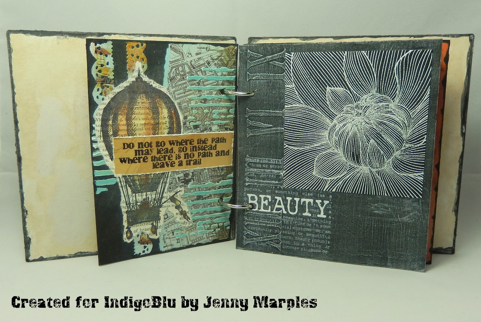
As part of this blog hop I'm sharing my latest project here. Last week I made a start on putting together a junk journal HERE. I say made a start. What that means in reality is the covers were altered! So many people commented that they couldn't wait to see the contents I figured that should be the next project. These things are supposed to come together relatively easy using spare bits and pieces of 'junk' - think I must have done it wrong as it took the entire weekend to complete!!! Here's the initial collection of junk (not all of which was used)...


Now grab a coffee and put your feet up as there are a few pages to get through! (and remember, just click on each photo if you want a closer look)... 


A simple ATC to start with using the A5 Word Blocks stamp set. I've used English Cottage Artist's Acrylic Paints (matte and metallic) and Gee-Sso Good! gesso (black and white) throughout this journal.


The back of the ATC uses the A6 Tiny Background and A6 Teeny Background stamps and Roman Numerals Stencil. The base of the larger page is a sheet from the A6 Cartography Mixed Media Paper Stack, altered with the A5 Grand Tour II and Grand Tour III stamp sets and that Roman Numerals Stencil again.


More Grand Tour III stamps and Cartography paper was used on the fourth page with detailing from the Texture Stencil. The fifth page included dry brushing over more Roman Numerals stencilling, another of those Word Blocks and an embossed A6 Colour Me Dahlia.


The next pages are probably the closest I got to being 'junky' using scraps of paper and card and even an old time sheet card! The tulip comes from the A5 Butterfly Collector stamp set and the glamorous lady is Valerie.


One of the Teeny Backgrounds was used again for back of the smaller page with images and words from the A5 Grand Tour I stamp set embossed over it. I created a faux rusted steel background on the floral page, this time using the Colour Me Anenome as the focal point.


I love painting and stamping onto fabric as it's so easy to do! It also provided the perfect backdrop for using the A5 Chemistry Lab and A6 Calculus stamp sets. The test tubes on the right are from the same set and are filled with a spooky concoction!!!


The old and new combined perfectly on more of the Teeny and Tiny Background card, with a mix of the A5 Beautiful Mind stamp set and A5 Chemistry Lab again. The border for this page came from the A5 Light and Sound Borders stamp set.


Mixing it up again I used the A5 Floral Fantasy and A5 Nottingham Lace stamp sets on the lacy page and cut a tag from the 12x12 Grand Tour Mixed Media Paper Stack as a backdrop for the Colour Me Daisy.


Script from the A5 Tasty Textures stamp set was used behind the die cut fabric butterflies, and it was back to the Floral Fantasy stamp set to create the patchwork page opposite on more of the backgrounds card.


These are two of the most texture laden pages, with paste, paint, fabric, die cuts and paper clay moulded shapes pressed into service. You'll spot another of those Word Blocks and the heart is in fact the Dinkie Heart Flourish stamp impressed into paper clay. There are also a few modelling paste sprigs stencilled through the Laurel Leaves Stencil.


Puddles of paint provided a vibrant backdrop to the sentiment from the Floral Fantasy set with the border repeatedly stamped using the A6 Laurel Leaves set. To finish another ATC; I used s scrap of painted/stamped fabric for the front, butterflies from the Floral Fantasy and flowers from the Roman Numerals stencil on the back to make the most of the stitching.


Phew! You made it! I used up a ton of scraps and offcuts (and a fair few stamps and stencils!) to create this but probably paid too much attention to detail in comparison to other junk journals I've seen. The lessons learnt? Mini journals probably aren't for me, but I discovered a few techniques and 'looks' that definitely be revisited along the way so all in all a win - win I'd say.

Thank you for joining me for this mammoth post today. I encourage you to return to the IndigoBlu blog post today and use the links there to visit/comment on my team mates projects so you can be in with a chance to win that fabulous stamp collection giveaway. I'm off to sort out a major tech problem that's been preventing me from using Facebook properly for the last few days. For now take care of yourselves, Jenny xxx

Related Posts Plugin for WordPress, Blogger...