31 March 2013

Happy (Chilly) Easter

Happy Easter everyone from a very chilly Staffordshire. Took my photos outside this morning - not a good idea as I am now typing with frozen fingers... I hope you are all warm, happy and indulging in a little of what you fancy (well not everyone likes chocolate, hard as that may be to believe!) I'm going to get on with this (mostly photos rather than blurb) as today is going to be something of a blur of visiting rellies and getting stuff done. And so without further ado...


This is my take on a cuckoo clock and has been created so I can enter Sandee and Amelie's brand new Steammpunk Challenge - Cuckoo Clocks Go Steampunk.
It is also my entry for Hels Sheridan's Sunday Stampers challenge - Nature,


I started with a paper substrate mini birdhouse and went to town with Distress Paints (Weathered Wood/Bundled Sage/Frayed Burlap - restrained for me:)

The corrugated card had some its backing removed roughly for a distress feel. Then I covered it in the same DP's as above (spritzed with water to allow them to blend/run) and then gave it all a good mist with Cosmic Shimmer Silver mist. It was then die cut into a range of cogs to be added to the base.

Next came the stamping - some directly onto the base and some onto tissue to ensure it would bend around corners more accurately. I used my favourite Coffee Archival Ink. And to finish I added some MOP buttons and leafy die cuts (inked to remove the white edges of course Hels!)

So that's it from me for now. Have a wonderful Easter wherever you are and whatever you are up to. Hugs, Jenny x

29 March 2013

Hop to it!

Hi everyone and welcome back. I really appreciate your company and the fact that you join me/comment even when I get too snowed under to reciprocate straight away. So, I had some quiet time very early this morning and managed to create my March Tim Holtz Tag for the latest edition of the 2013 challenge - I know, fashionably late with this as ever.


Are those shadows again? Oh yes, the sun shone for a short while so I hopped into the garden to grab some photos (seriously woman! how many times can you use that gag?)


I started with the tag background, created by combining some digital images from Nicecrane Designs. It's called Creative Peter Rabbit DSL and contains four black and white images which can be resized and coloured however you want to.


I chose to spritz my background with some homemade brown ink (a combo of red and green Jenny Bowlin inks) which, when extra water is applied, mottles to a colour not unlike DI Victorian Velvet. Then I painted the bunnies with said DI Victorian Velvet, plus Stormy Sky, Vintage Photo and Antique Linen. The tag edges were finished with Walnut Stain, of course.


I pretty much used Tim's ideas for die-cutting the centre panel and filling it with silver tinsel (coloured with Espresso and Stonewashed alcohol inks). Some dyed seam binding and a DI Stormy Sky banner/sentiment worked well together. The flowers/leaves were cut from an aluminium pie tin, coloured with DP Victorian Velvet, Wild Honey and Peeled Paint. To finish I created my own fringing and die cut a leaf to place under the seam binding bow at the top (one of my new Sizzix Thinlits - need more of these).


Hop (really?) you like what I've done here:) I'm entering it into the current Artistic Stamper Creative Team challenge -  Tags as well as Tim Holtz' challenge (which is the reason for this one being a tag, not a panel like my previous TH entries). It will also be entered into the current Simon Says Stamp and Show challenge - Quoteable.

And with this I really do hope you all have a happy and restful Easter filled with whatever makes you smile (which of course could include chocolate;) Hugs, Jenny x

28 March 2013

Passport to Inspiration

Hi everyone. Just to let you know my third and final Guest Design Team piece is now on show over at The Artistic Stamper Creative Team challenge blog.


 It has been a huge honour to work with Emma Williams and the team at The Artistic Stamper this month and   working with their brilliant range of unique stamps has been very inspiring. I'd love you to hop over to see what I've been up to HERE. Take care, hugs Jenny x

27 March 2013

You Can't Make an Omelette....

without breaking eggs?!!! Hmmm, a few nearly got broken this morning when my Broadband connection died! Still, enough of all that, it's back and so am I. Welcome one and all to a long overdue post from yours truly. I am going to delight you with my DT piece for this fortnight's Frilly and Funkie challenge - 'Easter/Spring Gifts But Not in a Basket'. Well it is definitely NOT spring around here so I went with Easter.


Egg cups (ok, they're mugs) - my version. Hopefully these mugs will last a little longer than the contents (plague of locusts and all that). And now a 'how to' explanation...


I started with plain ceramic mugs and stencilled gold Ferro texture paste onto the surface (it is tricky to apply through a mask on a round surface but a little perseverance produces an effective result).

I love to heat texture paste to make it bubble up as to me there is something more appealing about the slightly more raised/rounded edges.


Laura came to the rescue with my eggy decorations, having kindly sent me a large stash of mixed serviettes to experiment with. Laura and her equally talented daughter have created a fantastic video HERE to demonstrate how to apply serviettes to different surfaces.

I kept it simple on these mugs because a 'clean' look was in order - paint, ink, crackle, wax etc. await future attempts:)


With these applied/dried it was time to focus on embellishments. The little bottles were filled with various gold and iridescent beads, with the cork lids glued firmly in place with Glossy Accents to stop them escaping.

The little labels on the bottles are gold embossed vellum, again attached with Glossy Accents. The larger label were cut with one of my new Sizzix Thinlits dies from antique gold card and stamped with black Archival ink.

I was excited with the potential for the keys dies (also Thinlits) and had in my head the idea of using Tim's shrink plastic/Melt Pot technique. However it lost some of the detail of the key shapes so I went with peeling all of that off (hmm... ) and used the normal heat embossing method with plain gold powder over the now shrunken keys. 

They have been embossed on both sides make sure you do this quickly and leave them to cool for a while to prevent the reverse embossing from re-melting.


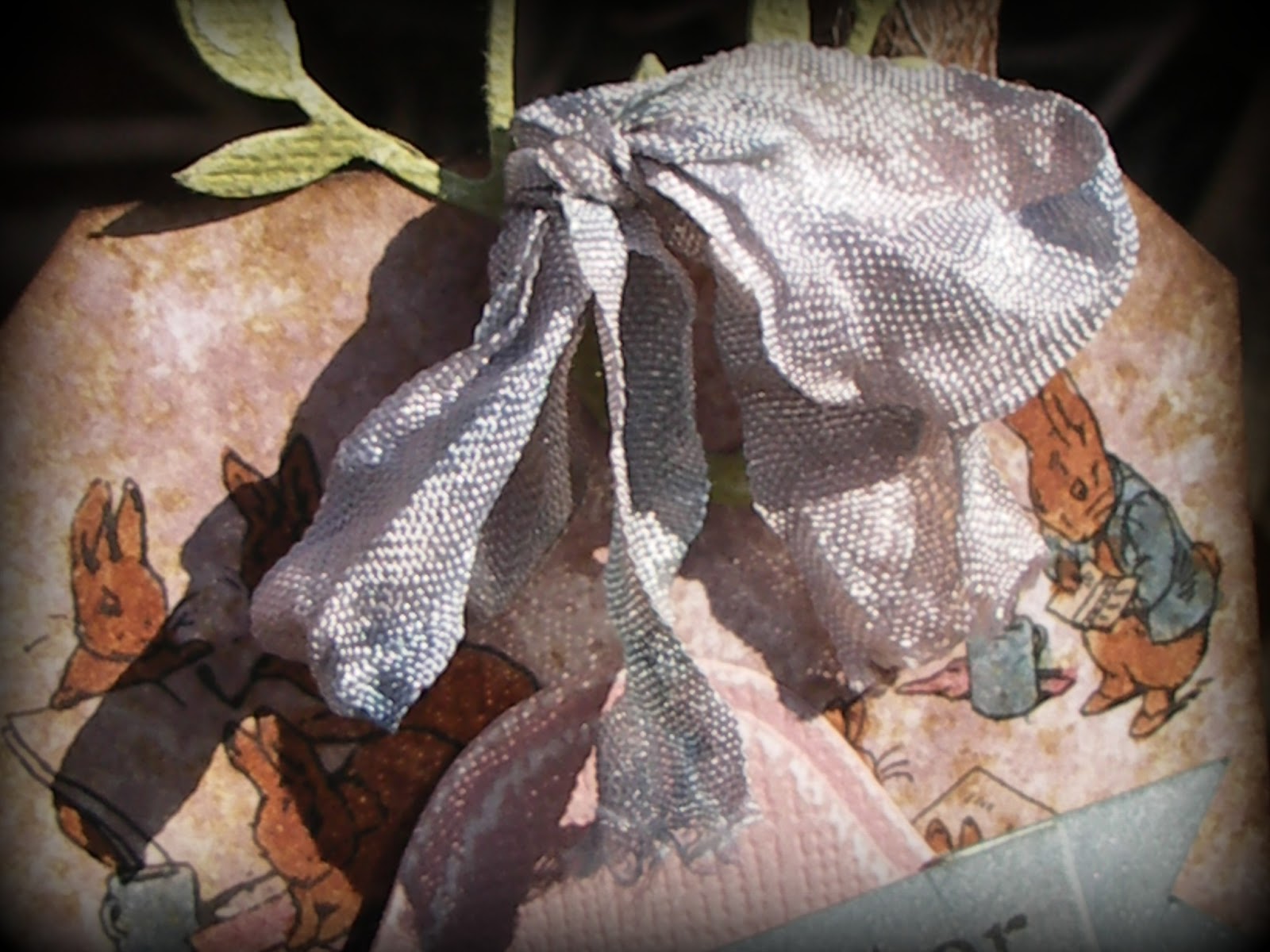
Some jute and seam binding tied the whole lot together to complete the mugs. Let's hope the recipients take the time to admire the containers before scoffing the contents! (I'm sure they will:) though what will then go into them is anyone's guess!!

As there are some very definite shiny elements and a little stamping in these I am entering them into Hels Sheridan's milestone 250th Sunday Stamper challenge - Shiny Happy People.


Now, some of you may have noticed I've been MIA over the past few days (a distinct lack of visiting/commenting, etc.) This is because I have been otherwise occupied helping Linda Coughlin, the Funkie Junkie herself, to set up a new Facebook page for The Funkie Junkie Boutique (had to do a new separate one for moi-self into the bargain which will need some work doing to it at some point). For those of you who are social media savvy types it is another great way to access info about the Frilly and Funkie challenges and the special offers/new products at The Funkie Junkie Boutique. I'm gonna shamelessly go for the sympathy vote and ask you please to 'Like' the new FJB page (if you want to of course) and let us know what you think of it. All suggestions gratefully received at this stage (did I really want to say that?!)

So having kept you here long enough I shall away to get some more stuff done with a promise that normal service re. visiting/commenting will be resumed shortly. In the meantime don't forget to have a look at the outstanding samples created by my teamies over at Frilly and Funkie, and take care all of you (including those of you who have been so badly affected by the adverse weather conditions). Huge hugs, Jenny xxx

21 March 2013

Layout Translations

Hi there peeps - welcome to my world. Anyone who visited my desk yesterday will have seen me making a start on creating some tropical bird cards based on a favourite scrapbook layout (in a vain attempt to ignore the wintery weather!!) The layout by Ingvild Bolme can be found HERE. And this is my take on it with one of the cards...


As soon as I saw Ingvild's design it made me think of a set of Nicecrane Designs digital images called Fascinating Birds. Aren't they so colourful?


The whole thing started with some pale  brown K&Co patterened paper from my stash, edged with DI Vintage Photo.

Then it was over to my favourite Artemio script background, embossed in white. Next I masked off the edges to create a coloured central panel (a mix of DI Bundled Sage/Stormy Sky/Peeled Paint).

Finally for the background I added white texture paste birdcages through a  lovely TCW mask.


Next I took one of the digital images and cut into the bottom of it, echoing the way the bird tails hung down on Ingvild's layout.

Having already placed a strip of beautiful lace down the right-hand side of the card, I layered the digital image over it with an embossed 'frame' (one of my texture paste embossed diecuts coloured with DI Bundled Sage and Walnut Stain). 


On Ingvild's layout she embellished her images with lots of flowers and leaves. I wanted to include some flora but knew it couldn't be overdone on a project one quarter the size of the original.

Included in my stash of previously 'rejected' items were some grunge paper flowers, stamped in gold embossing powder on paper which had already been painted with DP Picket Fence and DI Bundled Sage. Each one has a plain white button centre.

I completed the 'layout' by adding; punched antique gold card and olive textured card leaves; a yellow mulberry paper flower (with a brad coloured with alcohol ink to match the red on the bird); a small white die cut shape in the top right-hand corner; and a sentiment stamped in black Archival Ink.

I was happy with the way Ingvild's layout translated onto this card and as a result will be looking through other scrap layouts to see if they too could work in this way.


So that's it for tonight. As my card contains both green and brown I am entering it into the following challenges;
Hope it inspires you to take a look at layouts in a different way too. Hugs, Jenny x

20 March 2013

WOYWW 198

Hello out there!!! Time to share what is on my desk this gloomy, miserable, cold Staffordshire morning. Oh yes, it's time to join in the fun at the Stamping Ground where a lovely group of peeps share craft areas in various states of disarray. Want to be a part of it? Just hop over HERE to find out more from the wonderful Julia.


Here's the view of my 'temporary' desk - oh, who am I kidding, I've taken over the whole room so there are piles of stuff on the go everywhere. It's ok though because the boys can still get to the PS/Wii etc. (which is their main concern!) I have as usual got many projects on the go both physically and on my head. The one nearing completion is a set of two cards using digital images and inspiration from a scrapbook layout. I've had an order for 20 cards and have to keep trying to restrain myself to make them look more 'commercial' than grungy/shabby. It's a challenge!! The joy of having saved a ton of bits that didn't quite seem to fit with other projects is that they generally turn out to be absolutely perfect for other things. In the top right hand corner I am also playing with mini book shapes - part of a set of projects in my head. Loads to achieve today, so it's time to stop rattling on and get visiting lots of other desks. Hope you have a great Wednesday, whatever state you are in,
hugs Jenny xxx

19 March 2013

A 'Tuesday Tutorial'

Hi everyone in Blogland and beyond. As you may have seen from Linda's recent post on the Frilly and Funkie Challenge Blog, she has received a pile of new goodies from Ranger, including the new Distress Paints and new stamp sets!!! You can find them HERE at The Funkie Junkie Boutique.To celebrate this fact I wanted to share a step by step with you for creating a quick, colourful, adaptable card using Distress Paints and Stampers Anonymous Tim Holtz Mini Blueprint Stamps.


First some close ups, then the tutorial.


I chose to use Distress Paints for this because using them to stamp with gives such a great depth of colour and then they are superb for blending without going muddy.
You will also need four squares of white card (mine were 2.25" square) four squares of vellum (mine were 2.5" square) and some white cardstock for the background panel (mine was 148cm square - I know! what can I say, I'm a child of the 70's who had to learn to use imperial and metric at the same time!!)

Choose three colours that will blend well (test the results first if you are not sure). For the first card I used Mustard Seed, Picked Raspberry and Salty Ocean (inspired by Tim's Tattered Florals tutorial!) For this second version I used Wild Honey, Seedless Preserves and Barn Door.
Splodge each paint on your craft mat. Make sure you put your splodges close together so the stamp will be totally covered. When pushing your stamp onto the paint wiggle it around a little to get the colours blending together a little. Then stamp each image onto a separate square of card.

Next put some more dabs of paint onto your craft mat with a tiny spritz of water. Push your large background piece of white cardstock into the paint, spritz with a little water and allow the paints to blend together a little. If you get too much water on at this stage or the colours run too much for your liking you can use some tissue to mop up the excess.
Now dry with your heat tool. It is important to do this as it 'fixes' the paint. You can go back into the remains of your paint mix to fill in any gaps once the first layer is dry without fear of the original layer being affected. Blend/dry until happy.

Put your background card through your embossing machine using an embossing folder. I used the Retro Circles Texture Fades folder, but any highly patterned folder will do (would lay my life on it that the new Bottle Caps one would be perfect - gotta get it!) Don't worry if there is a little overlap when you are embossing your background. As long as it is not along the middle of the card it won't show.
Now distress the edges of the background and the little image squares - doing this seems to give card a thicker feel and the look of handmade paper. Plus it will hide any cutting mistakes!!

Finally make up the card by adhering the background to a square white card base, sticking the image squares onto the vellum, and then layering these little squares on top of the background using some dimensional foam (squares/tape etc.)
Now I'm thinking this card is uber-adaptable. Try different colours (checking their 'blendability' first) and different folders. Then of course you can use any combination of the Mini Blueprint Stamps (as they are all roughly the same size) depending on the card theme/recipient.


So now it's over to you! Please let me know if you have a go with this - I'd love to see some variations on a theme, and trust me, once you've done it once you'll find it is a fairly quick card to put together. I've put links to the products at the bottom of this post.
Take care everyone, and have some rewarding crafting time. Hugs, Jenny x

Related Posts Plugin for WordPress, Blogger...