19 January 2022

Gel Press Collaboration with Eileen Hull Designs

Hi everyone and welcome. This month Eileen Hull's Teams are collaborating with Gel Press all through January to see what magic can be made when both products are combined. Make sure to check in at Eileen Hull's blog each week to see what comes of our Gel Press journeys. Check out the Gel Press YouTube Channel too and see what they are doing with Eileen's journal bases. It's a match made in heaven!


I love using my Gel Press plates, particularly with PaperArtsy's Fresco Finish Chalk Paints and wet strength tissue (similar to deli paper in the US) to create pulls for use as backgrounds, a way of adding a pop of colour to a tea-stained page and hand drawn image.

But for this collaboration I decided to show how to use a small Gel Press plate to stamp and layer paints onto paper, creating one of the initial layers for a mixed media collage. The result was a new 'Full Size Journal' that will be filled with botanical images, die cut embellishments and stamping using Eileen's Maker Forte stamps.


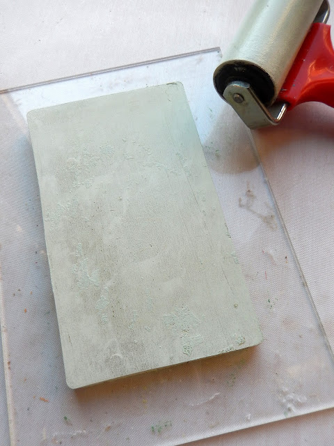
I've put together a tutorial for the main panel on the front cover and will then show how the same process is being used to create a couple of the pages inside. It all started with the first use of a 5"x7" Gel Press plate mounted on an acrylic stamping block to create a rectangular stamp; these handy plates have a tacky surface that self adheres to any flat, non-porous surface so they are easily peeled on and off a regular stamping block. I used a small brayer to apply a thin layer of yellow paint onto the Gel Press plate and stamped it onto tea-stained drawing paper over a piece of book text.


Now this is handy - I decided the yellow maybe wouldn't work the best on the lime/red journal cover so hunted out a sage green paint and applied another thin layer to the gel plate.


Since both the gel plate and the acrylic block are transparent it's easy to stamp pretty much directly over the first layer to alter the colour and I love that a little of the yellow peeped through at the bottom.


To add some contrasting colour without covering the lower layers I chose a darker sage and after brayering a thin layer onto the gel plate I lifted some of the paint with some crumpled tissue. What was left on the gel plate was pressed onto the paper to contrast with the lighter sage.


Now to get a pattern onto the painted rectangle; I used a piece of card die cut with Eileen's 'Heart Mandala' Die and after brayering a very pale green paint onto the gel plate I laid it onto the wet paint. Next I pressed a piece of tissue on top of the gel plate and pressed around the mandala to remove the uncovered paint.


Once you lift the mandala die cut from the gel plate you'll find you have the pattern left, all ready to stamp on top of the previous layers of paint. I would suggest you die cut your mandala from a non-porous piece of acetate or similar so that the paint doesn't get absorbed into it - the underside of my mandala already had layers of paint on it so the paint didn't get soaked up much but I would use the acetate next time.


To make the mandala stand out even more I ran my page through the Big Shot with the 'Heart Mandala' Die laid over the pattern on the paper, using a silicone rubber mat and crease pad to make it emboss rather than cut. The leaf was then drawn onto the page and I used watercolour pencils to add some colour on them.


To finish the page I stamped images from Eileen's Maker Forte Stamp Set 'Buttons, Cards & More', and added some faux stitching.


You'll see from the close ups below how I added the finished panel to the front of the journal cover with coloured card, more book text, lace, filigree metal corners, some hand stitching and one of Eileen's journal words.

The journal itself was cut from cardboard packaging with Eileen's 'Full Size Journal' Die and bound across the spine with red Architape®. Frayed cotton calico fabric was glued to the inside of the cover to further strengthen it before I bound in some painted tea-stained pages. You can see a tutorial for this process on my blog HERE.


I'm currently working my way through a fabulous online drawing course by Rebecca Sower on Jeanne Oliver's website and, buoyed on by the success of the print on the front cover I went on to make a start on two pages inside the journal using exactly the same process shown above.

On the first you'll see the mandala stands out more when the contrast between the upper and lower layers is more pronounced. I've also begun to add to the rest of the page with another of Eileen's Maker Forte stamped images.


On the second page the gel printed panel uses shades of blue paint to contrast with the colours on the drawing of the pear. Again you'll spot one of Eileen's stamp images tucked underneath some lace trim.


I hope you've enjoyed seeing how a Gel Press gel plate can be used as a stamping tool to decorate your die cut books and journal pages.

Make sure to check out the other collaboration projects and tutorials from the rest of Eileen's team members - links to their posts can be found on Eileen's blog throughout the month. And don't forget to head over to  the Gel Press YouTube Channel too for even more inspiration.

For now thanks for visiting,
Jenny xxx

6 January 2022

A New Door into 2022 with PaperArtsy

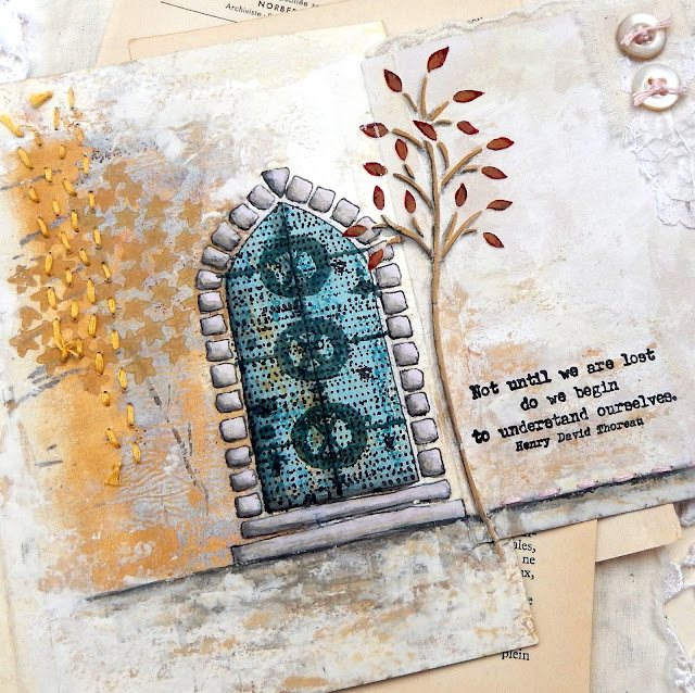
Hi everyone and welcome. In my personal quest to do more sketching this year I've been continuing to create art pages in an Eileen Hull 'Full Size Journal'. Today's page has a flip out element which opens to reveal a hand drawn doorway, painted and embellished with stamps, stencils and paints from PaperArtsy.


The colour scheme chosen for this page has a Summer vibe and consists of the following Fresco Finish paint colours;


Even though I got caught up in creating the page and didn't take photos along the way the following close ups will hopefully help to show how it came together, starting with the jumping off point - a gel print pulled on a piece of tissue. What was basically the leftovers on a 3x5 inch plate was retrieved using a combination of the Sand and Caramel paints.


Below you can see where crumpled tissue leftover layers gave the print what look like cracks. I stamped the stars from Seth Apter's Stamp Set ESA02 stamp set using the Caramel paint before the print was added to the blank page with a soft gel medium.


Before starting on the door and tree I made sure to blend the edges of the gel print into the rest of the page using some white gesso on a spatula. More Sand paint and gesso were used to help bring the 'white' and 'yellow' areas together even more.


The doorway started with a simple arch shape around which I drew the block frame and slab steps. They were painted with Taro Milk Tea which became less pink and bright with the addition of a little grey watercolour pencil, blended with a water brush to create shadows.


The door itself had a little of the Sand paint already on it from the gel print; I worked over the top of that using a small spatula to apply thin uneven layers of Seaglass and Calypso paint, making sure to leave traces of the lower layers visible. As with the bricks and steps, a little watercolour shading helped give it more dimension.


Two stamp designs were used to add a decorative finish to the door which was masked off prior to stamping. First up I used permanent black ink with the tiny dots from Seth Apter's Stamp Set ESA13 stamp set to add what look a little like nails to the door. Secondly I discovered that purely by chance Seth Apter's Mini Stamp EM45 design fit perfectly within the door space and after stamping in grey it was clear embossed to contrast with the lower layers.


It always helps to 'ground' drawings with some form of horizon line - this one was hand drawn with a black watercolour pencil and blended out a little beneath to add shadows. You may also be able to spot a little stamped detail using a combination of grey ink and Seth Apter's Mini Stamp EM49 softened with a little Grunge Paste scraped lightly over the top.


More Grunge Paste was applied through the medium sized tree on the Kay Carley Stencil PS061.


Some Caramel and Blood Orange paint was added through the stencil to give the tree a late Summer look and more watercolour shadowing helped to give it a little more definition and dimension.


The words chosen to add to the side of the tree felt appropriate coming from Alison Bomber's Stamp Set EAB12 'Travel & Journeys'.  Some hand stitching along the horizon line in an embroidery thread the same colour as the Taro Milk Tea paint added a subtle bit of texture and interest.


To compliment the stitching and create a page turning tab scraps of lace and calico were glued onto the top right hand corner of the flip out section and a couple of vintage pearl buttons were sewn on top using more of the pale pink embroidery thread.


You may also have noticed more hand stitching, this time in a yellow ochre colour to compliment the stars and help to add to the structure of the finished page.


I hope you've enjoyed finding out how this page came together and look forward to sharing more with you throughout 2022. For now I wish you all a very happy, healthy and creative New Year.

Thanks for visiting,
Jenny xxx
Related Posts Plugin for WordPress, Blogger...