25 August 2021

De-Stress with distress at The Funkie Junkie Boutique Blog

Hi everyone and welcome. Tera is hosting the latest challenge over on The Funkie Junkie Boutique Blog and she's called it 'De-stress with a little distressing'; "Are you feeling stressed? How about destressing with a bit of distressing. Show us some yummy grungy distressed goodness. This can be anything from torn and tattered bits, crackling, sanding, water spots and so much more! What's your favorite way to add distressing to your projects?"

The Design Team will choose their top four picks, with the winner being invited to join us in a Guest DT spot at The Funkie Junkie Boutique Blog and three additional outstanding entries will receive Top 3 Badges to display on their blogs. Everyone who enters and follows the rules will be entered into the draw to have the chance to win a $25 spending spree at The Funkie Junkie Boutique.

I've returned to working in my Paris art journal for this one, creating a distressed looking collage that features a photo we took inside the modern concourse in the Louvre. Looking up through the glass pyramid you can see the older part of the building outside, a real contrast in architectural styles.


Looking a little closer you can see that there is plenty of detail around the main image but they are all designed to draw the eye in rather than pull the focus away from it.


I took photos of the progress as this journal page was created, starting with the blank pages that had extra torn pieces from a book added over the top along with some texture paste. Some masking tape was also used on one side to attach a tag to the previous page.


The distressing and neutral layers of colour were built slowly and included Walnut Stain Distress Oxide, charcoal pencil and white gesso, all applied and removed in part with tissue to leave traces behind.


Rather than add brighter colour directly to the page I used a number of complimentary and contrasting Dina Wakley Media acrylic paints to pull a gel plate print on blank collage paper. Even better for this distressed look some of the paint at the edges became patchy.


Having glued a piece of this layer and some French text to the page with soft gel medium I used Dina Wakley's 'Marks' stencil and her 'Mineral' acrylic paint to add some stripes through the centre.


To add a little more design detail I stamped one of the geometric images from Dina Wakley Media's 'Be Willing' stamp set onto blank collage paper using black permanent ink.


This could then be added to the page in the desired spot with some soft gel medium. The joy of using this method is that you can have confidence in working on an uneven surface and you can also flip the image to the reverse side if it fits better with the page design.


Going back to adding more colour I again opted to use a gel plate to pull a print, this time with the stronger 'Ruby' acrylic paint teamed with the metallics.


Having mounted the printed image onto some aged paper it was then added to the centre of the journal page underneath the red panel. I also used one of the sheets in the Dina Wakley Media Collage Paper set 'Elements', applying small sections to the top and bottom of the page.


To 'knock these pieces back' I added some texture paste over the top, blending it into the white gesso and paste sections that were already on the page.


To finish I added a little hand stitching, a piece of torn lace, a stamped sentiment from Dina Wakley Media's 'Ledger Girls' stamp set and some more charcoal pencil detail. Here are a few close ups of the completed page;


That's my take on the 'De-Stress with a little distressing' theme. For even more inspiration the rest of the Design Team have come up with their own projects for this challenge so make sure you hop on over and check them out HERE.

24 August 2021

More Floral Cards for Eileen Hull Designs

Hi everyone and welcome. This month Eileen Hull's teams are sharing ideas for using Eileen's Sizzix Chapter 3 dies in non-holiday ways. In last week's post I showed how I took inspiration from one of Eileen's most recent FB Live tutorials (also available on her YouTube channel HERE) where she used her Colorbox Blends inks to paint watercolour flowers. By combining a painted floral background with die cuts from the Thinlits Die Set 'Wreath & Snowflake' and some of the products from Sizzix Effectz range I created a couple of Summer floral cards. This week I'm back with another couple of card ideas to share with you.


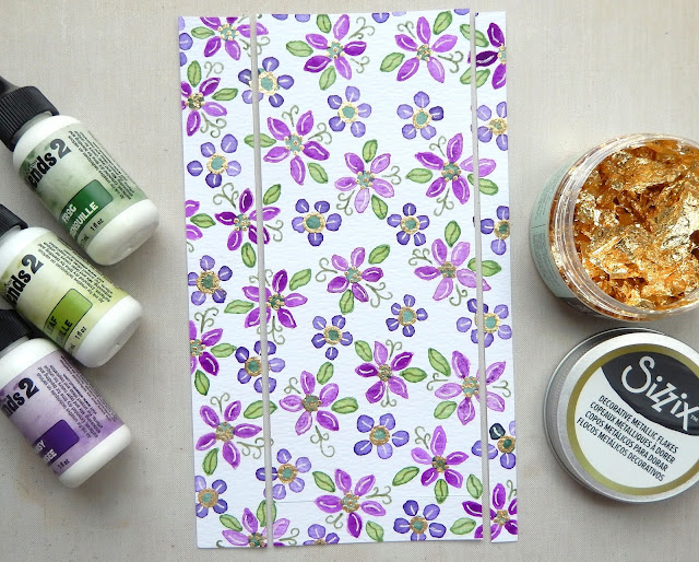
For this second set of cards I got more adventurous with the flowers, still using diluted drops of her Pansy, Frog and Leaf Colorbox Blends, but this time painting two different styles of flowers. To add a touch of sparkle I drew into the centres of the flowers with a glue pen and then applied Metallic Flakes from the Sizzix Effectz range.


At this angle you can see more of the detail including extra highlights and fronds drawn on with gel pens. This card was trimmed to fit the first slimline card.


After mounting the floral card onto a slightly larger piece coloured with dilute Pansy Colorbox Blends Ink I used a tracing wheel and gel pen to add faux stitching lines around the edge. Two thin strips of white card were cut using a CoolKatzCraft Ltd decorative strip die whilst the bow was cut using two of the dies from Eileen's Wreath & Snowflake die set. Mounting them to make the card look like a parcel, I added a tag cut using a die from Eileen's Waterfall & Tags die set, colouring it with Sizzix Effectz Luster Wax and stamping on a sentiment.


Having made three cards I was left with a few strips of floral card. By layering them with extra strips of white card along the card blank I was able to build a final background. To decorate I die cut some leaves and berries using the dies from the Wreath & Snowflake set, with the gold ones cut from card covered in Sizzix Effectz Decorative Foil Sheet. Adding a simple sentiment on top finished the card.


I hope you've enjoyed seeing how Eileen's dies have been used to create these cards. Make sure to check out the other Chapter 3 non-holiday ideas and tutorials from the other Inspiration and Educator Team members - links to their posts can be found on Eileen's blog throughout the month.

For now thanks for visiting,
Jenny xxx

18 August 2021

Floral Cards for Eileen Hull Designs

Hi everyone and welcome. This month Eileen Hull's teams are sharing ideas for using Eileen's Sizzix Chapter 3 dies in non-holiday ways. I took inspiration from one of Eileen's most recent FB Live tutorials (also available on her YouTube channel HERE) where she used her Colorbox Blends inks to paint watercolour flowers. By combining a painted floral background with die cuts from the Thinlits Die Set 'Wreath & Snowflake' and one of the products from Sizzix Effectz range I created a couple of Summer floral cards.


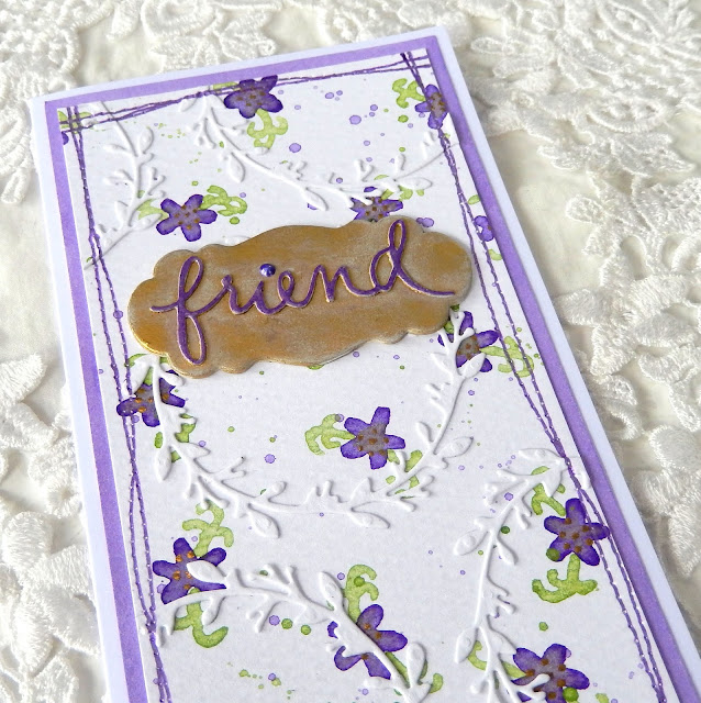
After watching Eileen's video I kept it simple and used diluted drops of her Pansy and Leaf Colorbox Blends, painting tiny violet flowers with little green fronds and some splattering. Rather than use foil I grabbed a gold ink pen and drew dots onto the centre of the flowers. This card was then cut in two so it could be used to create the two slimline cards.


At this angle you can see more of the detail. What I would say to anyone who doesn't feel confident painting flowers is just go for it - remember in nature things are rarely perfect so mistakes are fine and since it's a background you can always pop something on top to cover bits you are less happy with.


For the first card I die cut leafy wreaths using Eileen's die and glued them on over the top of the background. The extra bits on the side were trimmed off ready for the panel to be mounted onto a slightly larger piece of watercolour paper painted with more dilute Pansy ink around the edges.


Before mounting the background I used a tracing wheel and purple gel pen to create a faux stitched border. Once the floral background had been mounted onto the painted card and card blank base it needed a focal point. I coloured the label from Eileen's 'Journal' Sizzix Scoreboards XL Die with Gold Luster Wax from the Sizzix Effectz range. The die cut word was taken from an older Eileen set and was coloured with the purple gel pen to make it stand out.


For the second card I kept the background simple, adding the faux stitching around the edges again and mounting it onto more painted paper and a card blank. To create the focal point I die cut another wreath shape from white card, covering the wreath in more Gold Luster Wax before remounting it onto the centre piece. To finish I die cut another of Eileen's words, this time painting it with more of the dilute Pansy ink and mounted it on the centre of the wreath circle.


I hope you've enjoyed seeing how Eileen's dies have been used to create these cards. Make sure to check out the other Chapter 3 non-holiday ideas and tutorials from the other Inspiration and Educator Team members - links to their posts can be found on Eileen's blog throughout the month.

For now thanks for visiting,
Jenny xxx

11 August 2021

Triple The Heat with The Funkie Junkie Boutique Blog

Hi everyone and welcome. Suzz is hosting the latest challenge over on The Funkie Junkie Boutique Blog and she's called it 'Triple The Heat'; "August is always very hot for us in the Midwest. Our temperature can raise into the three digit numbers. I decided to use the number 3 as the inspiration for this challenge. I challenge you to use 3 of a kind.  You could use just three colors (white and black excluded), three of the same type of embellishment, three of the same images...  you decide how to incorporate the three of a kind in your project.  Make sure to mention what your three of a kind is in your post."

The Design Team will choose their top four picks, with the winner being invited to join us in a Guest DT spot at The Funkie Junkie Boutique Blog and three additional outstanding entries will receive Top 3 Badges to display on their blogs. Everyone who enters and follows the rules will be entered into the draw to have the chance to win a $25 spending spree at The Funkie Junkie Boutique.

It has been a while since I made a little notebook and this challenge proved to be the perfect opportunity. For the cover of the notebook I played with colouring, stamping and stencilling on fabric using Dina Wakley Media acrylic paints.


As a surface plain cotton fabric is perfect for using with paint if you are new to using it with stamps and stencils because it is very forgiving. The key is remembering that it is highly absorbent so you need to use more paint than you would expect.


I started with a piece of cotton larger than the size of the notebook covers. Three shades of purple paint (Fuchsia, Eggplant and Heather) were daubed onto the surface in patches and a little water was misted over the top to help them blend together at the edges. I also added splatters of the same colours. Once dry the fabric was ironed to make it smoother and more flexible. I then stamped the larger of the leaf shapes from Dina Wakley's 'Be Willing' stamp set using the Eggplant paint all over the mottled background.


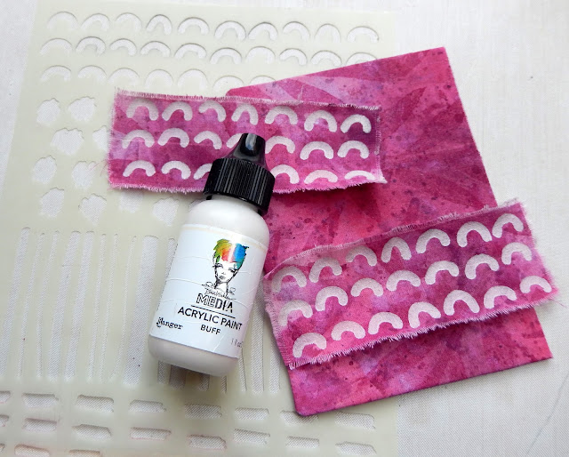
Having stuck most of the fabric onto the two sides of the notebook cover with soft gel medium I was left with two remaining strips. Buff acrylic paint was stippled through one of the repeat patterns from Dina Wakley's 'Marks' stencil onto them before they were  then layered on top of the background fabric.


Some Dina Wakley Media Sticky Back Canvas Tape was painted first with Heather paint and then with Eggplant paint before being sanded back to give a worn appearance. This was then used to join the two covers and the spine together.


I painted a piece of thick card with Olive paint before stamping the smaller of the leaves from the 'Be Willing' stamp set on to it with Petunia coloured Wendy Vecchi Archival Ink.


The same colour of ink was used to stamp the Be Bold phrase from the 'Be Willing' stamp set onto Turquoise painted card and to stencil over circles of Ruby painted card with the 'Marks' stencil. To finish all of the stamped elements were layered over a scrap of painted fabric (used to mop up the excess when creating the background fabric) and some paper painted with Ocean acrylic paint.


The close ups below show how some simple stitching frames the border of the fabric scrap and dots from a white gel pen are used to add small highlights to the three painted circle 'berries'.


That's my take on the 'Triple The Heat' theme. For even more inspiration the rest of the Design Team have come up with their own projects for this challenge so make sure you hop on over and check them out HERE.
Related Posts Plugin for WordPress, Blogger...