27 June 2020

Saturday Showcase - Floral Tags for The Funkie Junkie Boutique Blog

Hi everyone and welcome. Today for the last Saturday Showcase post of June 2020 over at The Funkie Funkie Junkie Boutique Blog everyone in the Design Team has joined together to share floral tags, each one with a tutorial - so you're getting even more 'bang for your buck' today. For my tag I've taken the opportunity to create with some of the Seth Apter/Aladine Izink inks and ICE gels and no surprise, I love them.


Thing is, most of us have inks already in our stash, so what makes these different (in my opinion of course). Here's just a few I've found so far - they are definitely versatile, with many ways to use them (a few are shown below) they pack a punch in terms of strength of colour, they have those translucent qualities that make layering a breeze and they are permanent when dry which means they won't move if you want to add anything over the top.

Let's get started with seeing some of that experimentation and versatility. I don't yet have many of the sprays in the line but that's not a problem when it comes to covering larger surfaces. I mixed up a little of the 'Cotton Candy' and 'Roast Chestnut' Izink Pigment Inks and diluted them with water. Strips of plain cotton were dipped into each mixture to soak up the liquid before drying. You'll see below how I made two different shades by including more of the 'Roast Chestnut' colour for the bottom one. Then I diluted a little of the 'Lycee' (the deeper pink colour) and dipped one side of each strip into it to intensify the colour and create a contrast.


For this tag I ended up choosing to use the lighter of the two strips of cotton, dividing it into two pieces before rolling each one up to form rosebud shapes. You'll see how some of the darker side was revealed by folding down some of the fabric at the top. Craft wire was then wound around the base of each bud to hold them in place and create stems.


Now to cover the wire and make it more realistic. One of Wendy Vecchi's Washi's (from Assortment 1) proved to be ideal.


I decided to add a little shimmer to the top of each bud by using the built in brushes in each bottle lid to apply some 'Improper Copper' and 'Opal Frost' Izink Pigment Ink directly to the fabric. That sparkle worked beautifully even on such a porous surface.


To create the blue strip on the tag I once again diluted some of the Pigment Ink (this time 'Thundercloud') with water before brushing it onto a scrap of book paper. You can dip and dry as with other inks and paints to get a multi-tonal look easily. And then to give it more of a vintage aged look I dripped a little of the 'Coffee' Dye Spray onto the paper, encouraging it to form drips and runs by spritzing it all with water.


The main layer of the tag is an old book page which worked well in terms of colour so I didn't want to alter that too much. Instead I scraped a mix of  'Greenland' and 'Snowball' Izink ICE through a Tim Holtz stencil to create a raised textured surface with a shimmer. And to compliment that further I diluted a little 'Olive Drab' Izink Pigment Ink with water and splattered it onto the page with a small paintbrush.


Now here's a tip - the ICE glazes add strength to thinner paper making them easier to die cut using the more intricate dies. Using a palette knife I spread a little of the 'Glacier Green' and 'Frozen Peas' Izink ICE over some thin book paper - be careful when pushing the gel out from the pack as you only need a little and it's easy to get carried away). Allow each gel layer to dry before applying the next to get a better look and then spray with more of the 'Coffee' Izink Dye Spray over the top to fill in any gaps. You can see below how I used Tim Holtz 'Cut Out Leaves' Thinlits Dies to create the shapes before cutting around them to make the delicate filigree leaves.


OK, now for the part of this tutorial that has me most excited of all. Remember that piece of painted paper from my last project HERE, made from mopping up the residue on my gel plate from a play session with Dina Wakley Media Acrylic Paints - well I chopped a piece off to cover a large tag and transformed it from this...


... to this using just Izink Pigment Inks (in this case 'Avalanche', 'Stratosphere', 'Thundercloud' and 'Royal Gold'). It's that transformation that for me makes these inks a game changer. I love making backgrounds with several layers of paint building on top of each other to form depth and interest to the final look and have discovered that these bottles of magic add a whole new dimension to that process. Pick colours that coordinate with those in your background, add a few drops, immediately scrape through them with a spatula to move them around the surface whilst still wet and see what a different they make. And because they are translucent when worked this way, dry rapidly and are permanent you don't get mud when adding more colours.


You'll hopefully see what I mean in the piece below which started life with a combo of oranges, reds, buff and a tiny touch of teal. Add white, red, gold and blues and see the way it transforms. Stamp on top (Wendy Vecchi's background 'All Stitched Up') and you have another layer. Why is this so important? Imagine, you've pulled a number of gel prints on larger pieces of paper or card and need to add smaller pieces to a collage only they need a slight tweak colourwise - pull out your Izink Pigment Inks and within a few short moments you can have just the piece you need, leaving the rest to be altered in other ways for other projects. It is truly going to make a huge difference to my projects going forward.


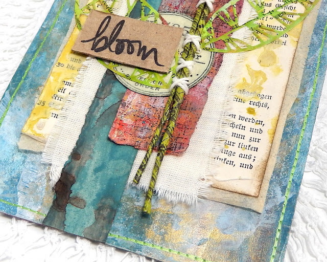
Back to the tag, and with all the elements made it was just a case of layering them together. I added a little pattern paper underneath the stencilled book page, a piece of plain calico fabric above, layered the blue and red pieces on top and glued in place the flowers before securing them with hand stitching. There's also a stamped circle (Tim Holtz 'Field Notes' stamp set) and the leaves plus a sentiment from an older Dina Wakley Media set. the addition of faux stitching in a metallic lime around the edge of the tag echoed the leaves and stems as well as adding a border to the piece. Here are some close ups;


I hope you've enjoyed seeing my own experiments for this tag with Seth Apter's Aladine Izink range. There'll be much more to come in the future. Meantime I hope you'll hop over to the  to see what my talented team mates have created for their floral tags - our styles and end results are so diverse that there's lots to see and find out from them all.

Thanks for visiting,
Jenny xxx

Products used to create this tag are available from The Funkie Junkie Boutique and are listed/linked below.

Sizzix Chapter 1 Tim Holtz Thinlits Dies - Cut Out Leaves

24 June 2020

Cattywampus at The Funkie Junkie Boutique Challenge Blog

Hi everyone and welcome. It's time for another challenge over at the The Funkie Junkie Boutique Blog. Sara Emily is your host for this one and she has called it 'Cattywampus'. "Cattywampus is a funny sounding southern slag term I hear a lot around the house. According to the On Line Slang Dictionary it has several meanings including "appearing off center, diagonal from, crooked or not level, appearing askew, tilted or lopsided". Taking inspiration from any one of these definitions, include something cattywampus in your vintage or shabby chic project. Be sure to tell us what that cattywampus thing is; we might miss it!'"

As ever, the Design Team will choose their top four picks, with the winner being invited to join us in a Guest DT spot at The Funkie Junkie Boutique Blog and three additional outstanding entries will receive Top 3 Badges to display on their blogs. Everyone who enters and follows the rules will be entered into the draw to have the chance to win a $25 spending spree at The Funkie Junkie Boutique.

Now I'm the type of person who likes straight lines so to be honest the whole concept of making things deliberately wonky felt a little out of my comfort zone, but thankfully a 'mop up' gel plate print came to my rescue and led to this 'cattywampus' birthday card.


So let's see that print and find out how it drove the design of this card; here's the collection of prints I pulled out, including a couple of pieces of card from previous projects and the larger piece of paper that I'd used to pull off the leftover edge bits from my gel plate after one of many painty sessions using Dina Wakley Media Acrylic Paint. It was the wonky lines in shades of red, grey, gold and blue that got me thinking that this could be a perfect background since they are wonky. I chopped off about a third and began to build on it.


Here's a close up of those won


So what if you have a painted background but don't have any leftover edges to create those wonky lines I hear you cry? Well fear not, they are easily added manually using some of Pam Bray's wonderful Rock Candy Embossing Powder from Emerald Creek Craft Supplies. I used an embossing pen to draw extra wonky lines onto the background and sprinkled over some of the 'Peppermint' colour, heat setting it to capture the sparkle and shine.


And to echo the gold colours in the background I repeated the process this time with the 'Butterscotch' variety, this time using thinner lines. I would suggest doing the thicker lines first because then when you come to heat the smaller ones you are spending less time potentially reheating the existing set powder and are therefore less likely to adversely affect it.


I wanted to add more layers to really build up the background so began by adding lines of hand stitching (use Wendy Vecchi's Poke & Stitch 'Rectangle Frames Stitching Template' to add regular spaced holes to stitch through if you are not ready to to at it freehand). And then I spotted that the hearts pattern on one of Wendy Vecchi's Washi Tape coordinated perfectly. By stamping a Happy Birthday sentiment from her 'Funky Flower Art' stamp set I was able to alter it to match the theme too. To balance the design I drew through one of Wendy's older stencils with a red pen a the top and bottom.


With the background complete and mounted on black card and the white, tall card blank attention turned to what should be used as a focal point. The person for whom this card is intended likes a glass or two of wine so I thought a couple of bottles would be a good plan. Remembering back to the plainer coordinating card prints shown at the beginning of this tutorial I used the Tim Holtz Sizzix Alterations Bigz Die 'Bottled Up' to cut a couple of bottle shapes.


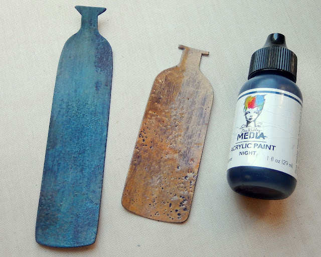
The flat paint colours were in danger of being overpowered by the background so I applied embossing powder to each in order to emphasis the colour a little more; you'll see Seth Apter's Baked Velvet 'Aegean Sea' and Baked Texture 'Vintage Beeswax' in use here. I deliberately overheated it to make the surfaces more pitted and faded in areas ready for the next step.


I wiped a little 'Night' Acrylic Paint over the embossed surfaces of the bottles and before it had dried completely wiped away the excess, leaving the residue in the pitted marks.


With the bottles done and added to the card wonkily,  I looked through my scraps and found this die cut doily which was covered in Faded Jeans Distress Oxide Ink and Fractured Ice Embossing Powder from Emerald Creek Craft Supplies. I also added more of the stamped Washi Tape onto a piece of card to act as the sentiment and glued antique bronze filigree corners above and below it over the bottles to finish the card.


Here's a couple of close ups of the finished card showing all of those textures and wonky details;


That's my take on the theme 'Cattywampus'. My incredibly talented team mates have also come up with their own cattywampus projects for this challenge so make sure you hop on over and check them out HERE. And remember to link up your own shabby chic or vintage projects to be in with a chance of winning one of the fabulous prizes that's up for grabs.

Thanks for visiting,
Jenny xxx

Products used to create this card are available from The Funkie Junkie Boutique and are listed/linked below.

Tim Holtz Sizzix Alterations Bigz Die - Bottled Up
Wendy Vecchi Studio 490 Stampers Anonymous Stamp Set - Funky Flower Art

16 June 2020

June Journal with Belagio Cork Fabric for Eileen Hull Designs

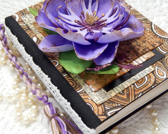
Hi everyone and welcome. This month Eileen Hull's Inspiration Team are excited to be collaborating with Belagio as we all create our take on the theme 'June Journals'. My June Journal is based on Eileen's 'Notebook' die and features a few of the gorgeous Belagio cork fabrics - they proved to be perfect for altering. You may also spot the rather large flower! It's been made using Sizzix Surfaces Sculpting Foam, inspired after seeing Eileen demo it on a Facebook Live for Creative Scrapbooker Magazine HERE.

Durable and user friendly, the cork fabric can be easily die cut, sewn by machine, combined with fabric, paper or pretty much any substrate you can think of. Thin sheets of real cork are laminated to a fabric backing so it is very flexible and durable. It’s perfect for covering three dimensional projects like boxes, books, and home decor pieces. Additionally, you can also use it to create 3D flowers and other embellishments… Living up to the Belagio motto: You are only limited by your imagination – this fabric will expand your creative possibilities! Here in the UK it's well worth hunting online for and it comes in many designs, whilst over in the US you'll be pleased to hear it's carried by Walmart and Hobby Lobby.


Let's start the brief tutorial by showing you the first of the cork fabric layers, added to the covers of a hand bound notebook. The design originally comes in just black overlaying the cork base but I wanted to add a little more to it so used a white gel pen to colour in some of the lines. The colour took beautifully first time - no need for reapplication, and I have to say it's really tactile as well.


Continuing along the theme of seeing how much you could alter it I put this piece of rose gold flecked cork fabric through my die cutting machine with one of Eileen's embossing folders, then sanded it back gently to reveal the pattern even further. I layered it over a piece of black card to add to the contrast.


So can you stamp on it? The answer is yes! This is one of Seth Apter's new stamps, teamed with black Archival Ink and as you can see even the most detailed of images can clearly be seen on top of this plain piece of cork fabric. I stamped the same image onto a piece of tea stained copier paper ready for layering underneath the black card on the front of the notebook.


With the cork layers die cut and glued in place on the front of the cover I needed a pop of colour to contrast with the neutral tones. Inspired by seeing Eileen play with Sizzix new Sculpting Foam (which is available in the UK as well as the US). Mine came as part of a pack with a 3D Leaf embossing folder and some Jen Long flower/leaf dies (as also seen on Eileen's video HERE). It was easily shaped with a some heat and an embossing tool and I used Eileen's Colorbox Blends Ink to add some extra colour and contrast. The golden stamens in the centre also come from Sizzix.


Once assembled the flower was glued firmly to the front of the notebook and I teamed it with a coordinating cotton yarn tassel, created using Eileen's 'Twist & Style Tool'. Here are some close ups of the finished book (which has blank tea stained copier paper pages inside);


That's it for this month's theme from me but make sure to check out the June Journals that the rest of the team have created using Belagio cork fabric  by visiting Eileen's website.

For now, thanks for visiting,
Jenny xxx

10 June 2020

Positively Pensive for The Funkie Junkie Boutique Challenge Blog

Hi everyone and welcome. It's time for another challenge over at the The Funkie Junkie Boutique Blog. Suzz is your host for this one and she has called it 'Positively Pensive'. "Today is Ballpoint Pen day! The challenge is to thoughtfully use a ballpoint pen on your project. You can doodle, journal, sketch or trace an outline using any color ballpoint pen on your art. Create a vintage or shabby chic project with some form of ink from a ballpoint pen and if it isn't obvious how it was used make sure to tell us in your post!"

As ever, the Design Team will choose their top four picks, with the winner being invited to join us in a Guest DT spot at The Funkie Junkie Boutique Blog and three additional outstanding entries will receive Top 3 Badges to display on their blogs. Everyone who enters and follows the rules will be entered into the draw to have the chance to win a $25 spending spree at The Funkie Junkie Boutique.

It's been a long while since I made a junk journal so it was a lot of fun to create this one featuring a whole heap of Wendy Vecchi's beautiful flower designs which I coloured (for the purposes of this challenge) with ballpoint pens.


Suzz' challenge theme initially had me somewhat stumped as to how best to use ballpoint pens on a project so I took a look on YouTube and found a fantastic video tutorial by Alphonso Dunn. It showed how you can use them to shade and colour images. With three pastel colour ballpoint pens selected I used them to shade and colour flowers from a number of Wendy Vecchi's stamp sets - it helped to stamp the images with coordinating Archival Ink colours too.


You can see in the close up photos above and below how some of the finished flowers were used to decorate various pages in the journal. I also used the pens to add decoration to the pages in the form of lines and using stencils. The journal cover was created using Eileen Hull's Pocket Notebook Die and as well as tea stained pages and old scrapbook paper, I created a mix of gel plate prints in the same pastel colours on a mix of surfaces.


I'll be sharing a more detailed tutorial on how to put the journal together and a flip through of the pages this coming Saturday over on The Funkie Junkie Boutique Challenge Blog so I hope you can join me over there for it.


That's my take on the theme 'Positively Pensive'. My massively talented team mates have also come up with their own projects featuring elements altered/created with ballpoint pens for this challenge so make sure you hop on over and check them out HERE. And remember to link up your own shabby chic or vintage projects to be in with a chance of winning one of the fabulous prizes that's up for grabs.

Thanks for visiting,
Jenny xxx

Products used to create this Junk Journal are available from The Funkie Junkie Boutique and are listed/linked below.

Wendy Vecchi Studio 490 Stampers Anonymous Stamp Set - Friends & Art
Wendy Vecchi Studio 490 Stampers Anonymous Stamp Set - Funky Flower Art
Related Posts Plugin for WordPress, Blogger...