31 July 2012

Make Life Special

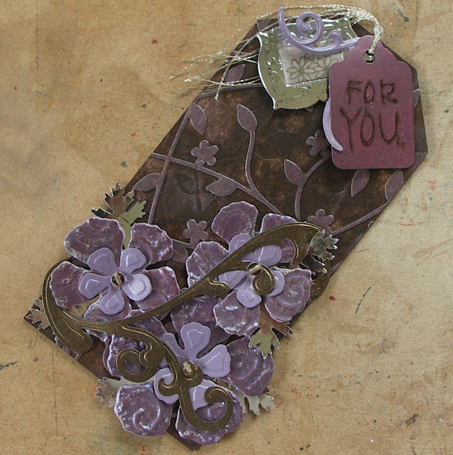
Right, it's been 'lets play with tag backgrounds' time and I was determind to join in the fun at Linda Ledbetter's challenge - Enamelled Metals this week, as it is one of the balls I have had to drop recently due to other commitments. By coincidence (OK, semi-planned) this one also fits the bill for the first challenge at the Crafty-Emblies blog - Flora and Fauna, and the Simon Says Stamp and Show challenge - What Do You Say? This one was so much fun and took inspiration from the Arts and Crafts movement era (my fav).


Now if you've got T!m Holtz' CC2 book you'll know how to do this (I mixed the acrylic paint colour myself) and if not why not!!! Seriously, it is an investment, as it is hard to keep lots of techniques in your head and T!m makes it so easy to learn some of his genius ways).


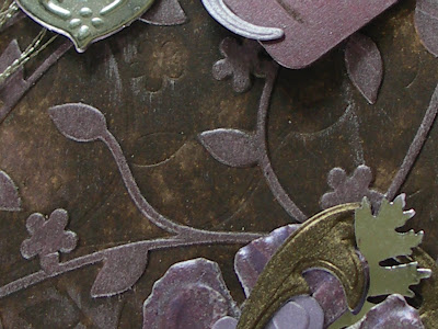
The flower extravagantly used every layer of the Rose Creations dies (which I believe Christine Emberson will be demo'ing on the TV soon) cut from strong brown parcel paper and stamped with DI Fired Brick. The leaves were stamped in DI Pine Needles and came from a Creative Expressions set. Don't you just love that button centre? Believe it or not it is a glass one!


I also added wooden buttons from Crafty-emblies and decided they looked beautiful without being coloured this time (that's right missus, you're learning that sometimes less is more!!!) The string is just cheap stuff from Tesco died with DI Fired Brick and water - isn't it amazing how these inks make everything look good.


Finally the sentiment element - a Sam Poole Art Phrase on a little tag covered in metal tape and Copper Mixative alcohol ink (thanks Anne, it got a coat of Glue n Seal to protect it - see I do listen sometimes!!) Don't forget those of you in the UK can buy chain by the metre from DIY stores and it doesn't take much to cut off small chunks to attach to a paperclip, or whatever else you fancy really! Now it's away to work for me before I rush to get home to execute an idea I had at 5 o'clock this morning. Take care of yourselves and wherever you are, keep crafting! Hugs, Buttons x

30 July 2012

Fushia!!!

Hi everyone and welcome to my final week as a GDT for the Make My Monday challenge. It has been a wonderful experience and I have been made to feel so welcome by this fabulous team. As you will be aware if you have been playing along Mynnette has taken us on a journey of the colour wheel.


For the last week of July she wants us to look at split complimentary colours. These are fun to play with. You start with one colour, find its compliment and instead of using the compliment, use the two colours beside the compliment. Mynnette has chosen the split complimentary colour scheme of fuchsia, green and yellow. Just to remind you, we have a prize in July sponsored by My Heart Pieces.


Priyanka is offering three digital images of their choice to the monthly winner for July.
So on to my final offering for this challenge;


Hhmmm, looking at this on the blog methinks it would be better to choose a less well lit part of the house to take pictures as the yellow and green look completely washed out! So please, exercise your imaginations as the colours are much brighter and bolder - honest!! LOL

Confession time - I hate fushia. That is quite a strong statement, but I bet we all have colours that we avoid like the plague. However, Hels Sheridan to the rescue...


If you haven't seen August's edition of the Craft Stamper I can thoroughly recommend it, and Hels has a whole section about using Distress Markers. In particular I loved her use of Picket Fence to give colours a chalky feel. By using this as a base layer it made the fushia (from the Hydrangea Big and Juicy pad) softer and a better companion to the Wild Honey. These two colours were also 'watercoloured' onto the butterfly (a free Indigo Blu designed stamp with aforesaid magazine - see, it really did help!!) The rest was a simple job of embossing, stamping, and matting and layering. Hope you like it.

OK, work beckons so this is being scheduled to appear whilst I am 'hard at it'! Please do head over to the Make My Monday challenge and if this colour combo holds any fears for you why not give it a go. Hope the day brings you what you want, and to those going through difficult times I send my heartfelt thoughts and best wishes. Thanks for your wonderful comments, hugs Buttons x

26 July 2012

Just a Rennaisance Girl

I've just spent a pleasureable hour catching up on blog posts (oh my are you guys talented or what!!) and now have 10 minutes to complete this post - time management is NOT my strong point. With that in mind I have created a tag to cover the requirements of a number of challenges;
And so, without further ado...


Hope this is showing up ok at your end - that's the only problem with sun, it adds too much light sometimes!! Never satisfied, eh?! This is about as girly as I get and was inspired by the paintings/frescos of the great Rennaisance masters (or ninja turtles! thanks for that mental image Anita!!)


It's the background I was most pleased with, though you can't see much of it and she of few braincells forgot to do a shot of the plain tag first! It was inspired by the amazing Paula Tidman (DO check out her blog HERE) who immediately springs to mind when I think rennaisance. She uses layers of loo paper (don't panic! - wet, inked and embossed!!) to superb effect. I used kitchen roll and more muted colours - VersaMagic Gingerbread and DI Spun Sugar.


Then it was a case of layering up Finnabair-style. The cherubs came from some Cellar Paper cardstock and the angel was stamped/coloured from Creative Expressions Herbal Collage. These were both covered in Glossy Accents. Did you know that Poundland are selling a set of 60 paper doilies (for  £1 - strangely enough!). Leaves plenty of pennies for buying the other essentials.


Other items - Coredinations cardstock, buttons from stash, textured gold card and glitter card, a piece of that lemon-juiced card from previous posts (man, that has lasted) and SB dies.
From the fab Frilly and Funkie shop - seam binding, pale twine, and pale burlap.
Inks include; DI Spun Sugar, Fired Brick, Walnut Stain, Picket Fence, VersaMagic Gingerbread, VersaColor Laurel Leaf.
OK, my time is up (well it was 15 mins ago! but there have been any number of links to sort) so it's time to sign off for now. Love to you all and thanks for your support. Hugs, Buttons x

25 July 2012

Ice Cream Dreams

Hello everyone and welcome (back). The challenges keep coming recently and methinks some are going to have to be combined somehow. Meantime a load of birthday crafty goodies have arrived so I'm like a pig in... !! One challenge I have been desparate to enter is The Stamp Man - Summer Colours (yes, I know, cutting it fine again!) This has truly been a challenge for some reason, as ideas came and went but my new TH honeycomb embossing folder arrived yesterday and hey presto!


Yes, at this stage it is in two bits but you NEEDED to see the background as it is so LUSH!


There, that's better. When I think back to childhood summer hols I think of time spent with my Nana and knickerboker glories from Notarianni's icecream parlour in Seaburn. And so an idea formed.


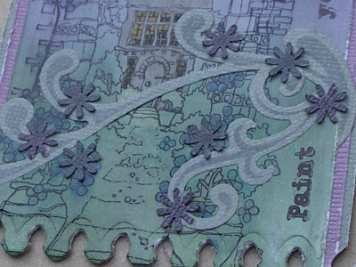
A briefish recipe; background TH marbled stains using Picket Fence, Wild Honey and Walnut Stain, with WS also applied to the embossing folder. The bottom edge was diecut with one side of a SB Fleur de Lis square and the self-adhesive lace border was coloured with Picket Fence and Faded Jeans DM's.


The main image is one from a Creative Expressions set coloured with DI's and water - Fired Brick, Walnut Stain, Spun Sugar, Wild Honey and Faded Jeans. It was layered onto Coredinations cardstock, distressed and inked and lace applied to the back. Then there's the acetate and shrink plastic (oooooh, great fun!) embellies mounted on top.


Finally I added stained seam binding and stitched pearl beads on the knot. The idea of glazing the sundae did cross my mind but the colours would have run. OK, are you hungry yet?
Right, I'm off to combine challenges and enjoy the lovely weather. Thanks for stopping by and letting me know what you think. I will always endeavour to do the same. Hugs, Buttons x

24 July 2012

Time for a redo

Welcome one and all to this neck of the woods. You meet me mid-squeal (a loud and extended one at that) as I have just found out that lucky ole me won Trace's one-year blog birthday candy draw!!!!! She has an outstanding crafting talent and her blog, inkypinkycraft, is a joy to follow. I promise to do my best to do justice to the Indigo Blu stamp sets (that have been on my wishlist for some time).

Now my turn to share. Reading Anita Houston's blog (as I know many of you do) a few nights ago she introduced the latest challenge at Our Creative Corner (which has a who's who lineup of designers). Their challenge is to 'makeover' a project you have been unhappy with.


Some may remember the project on the left - one created for the yellow/purple Make My Monday challenge and then discounted due to the lack of yellow. I mentioned at the time that it was inspired by the artwork of John Atkinson Grimshaw. He used some beautiful, soft, blended, muted colours to achieve an ethereal look on so many of his paintings, and this didn't come across in that first attempt. So it was time for a redo - hence the latest effort on right (created whilst watching Hels on the telebox).


In fairness there were no colour constraints this time, so I started with a layer of Memento London Fog on Ranger specialty paper. Then I blended layers of blue, purple and sage and more Fog (that's the great thing about this paper - it doesn't muddy no matter how much ink you throw at it). Next, add water with a thin brush and up comes some of the ink so that Wild Honey and a white gel pen can be used to create the moon and lit windows. I liked the moon last time and loved it this time.


A few elements got picked out with more of the same ink and this time a sentiment was added.


Although I liked the idea of vines/branches trailing across the original image, I decided to use the same dies in a more muted way with Coredinations cardstock, London Fog ink and some punched and blackened flowers. Having mounted the tag on More cardstock I used a SB Banner die to trim the bottom. A piece of died seam binding and a small UTEE embossed/distressed metal tassel was used to trim the top.

Overall I'm so much happier with this version and will be entering it for the Our Creative Corner challenge. I will also put it into the Fashionable Stamping Challenge - Let's Get Messy and Inky (you wanna see my fingers!) Right, way past my bedtime but it was important to get round to visit everyone's blogs as there have been some stunning creations on display over the past few days. Hugs to you all and thanks for dropping by, Buttons x

23 July 2012

Analogous Colours

And now for something different...


it's Monday so that means it is time for the Make My Monday challenge again and this week Mynnette has asked us to use analogous colour - turquoise, light blue and dark blue. Analogous colours (glad I'm not saying this out-loud as that word would get me every time!) are colours that sit in a group of three right next to each other on the colour wheel. We usually use these combinations when doing monochromatic artwork. This week we are focusing on blues and would like to see creations using turquoise, light blue and dark blue with white or cream as your neutrals. Just a reminder that Priyanka from My Heart Pieces is offering 3 digis of choice to the July monthly winner.


My offering as Guest DT member took a different direction from my usual style.


For me this is quite CAS!! and it took an age, primarily because the papers are from a large set of K&Co papers (one of those pads of 360 with several collections included) which are too thin to decoupage without first sticking onto card and then cutting out.


The smaller balloons were freebies from the May 2011 issue of Craft Stamper magazine.


The large balloon is a Stampendous image (from The Stamp Man) and has been embellished with my new SB Banner Basics Borders 3 in navy card which has been inked.

Post over, it's away to work (yes, this is scheduled) but that's ok as the sun is shining beautifully, I will be back to get inky earlier than ususal, there's no school run, and the sun is shining!! (well it is a novelty!) HUGE congrats to Bradley Wiggins - first time I've watched any of the Tour de France and the British lads were awesome, and now they're in training for the Olympics! That's dedication for you.
Thank you to followers new and old for joining me in my little bit of cyberspace. You are very welcome and I appreciate your company. May the sun shine on you today too, hugs, Buttons x

22 July 2012

Health, Peace and Sweet Content

I've been good (for once!) - having received some crafting goodies for my birthday (and more to come!!! squeals loudly) I got one of those 'cleaning up and organising' heads on. There you are, it must have been my birthday as that only happens once a year!!! Hels Sheridan's Sunday Stamper challenge this week is More Than Words and as part of this process I planned a small whiteboard/display board to help keep track of challenge titles/dates and show off the treasures received from fellow crafters. Bless him, hubby duly got to work creating a shelf arrangement on a cheap whiteboard. However, I couldn't go to town on it straight away as he has been adding bits of filler and sanding it, so that's on hold.

So what could I do instead? Well and the current Woodware Craft Collection challenge is Grey and Chartreuse, and once completed, I realised my entry would also fit Hels' criteria so that's a stroke of luck!


The background is embossed/sanded grey Coredinations cardstock, distressed on the edges.


The main sentiment involved clear embossing some Ranger specialty paper with an old PSX wooden stamp. Next came Memento London Fog, spritzed and flicked a la T!m Holtz. The border was masked so that the centre could be stamped with London Fog again using the Artemio manuscript stamp. Finally the sentiment (from Creative Expressions) was stamped in black. That was the grey taken care of.


My abiding memory of chartreuse is of the mini bottles of liquer bought for my parents on a trip to Epernay with my school when I was 11 (a LONG time ago!) Not sure if they liked it, but I thought it looked pretty :) I also remember being taken to the champagne cellars and drinking the samples (with one of my friends I hasten to add!) rejected by classmates. It was a warm, fuzzy walk back to the youth hostel for my friend and I in the midday sun, LOL.

Back to the flower, made by inking and spritzing/flicking more specialty paper with a vintage ink called old gold but very definitely chartreuse in colour. When it then got stamped with the manuscript stamp in London Fog the text went a grey/green colour! Weird but strangely nice. The main flower shapes were cut using a 3" super duper flower punch and chopped, glued, curled and rolled into the flower you see before you. The bottom layer was a SB Rose Creation and the leaves came from a Personal Impressions punch.

This should shortly be winging its way to someone I work closely with who is poorly at the moment. It never fails to amaze me how giving a handcrafted card to someone can make such a difference, but then I look up and see the beautiful card I received from my wonderful crafty friend Anne and know that it is the time, care and thought taken by them that makes it so special. Right, before I get maudlin' time to go and walk the dog :) Thank you to everyone for your lovely comments and may health, peace and sweet content be yours too. Hugs, Buttons x

21 July 2012

Creating Yourself

Good evening everyone, including those of you who are kind enough to follow my ramblings. Well, it's definitely the birthday season! It is one of my best friend's 50th today. She has overcome so many obstacles in her life and always keeps on keeping on no matter what. Such an inspiration. A card was needed...


We were chatting recently (discussing options for prom dresses for her eldest) and she reminded me that used to do lots of dressmaking, and an idea formed.


The colour scheme came about almost by accident - mopping up the remains of DI and water, especially on embossed white card, can have surprisingly subtle results. In this case it co-ordinated beautifully with a piece of Basic Grey card and some SB Fleur de Lis squares. The sentiment (Sam Poole) fit my friend so well.


It was then a case of layering up the embellies/stamped images (Andy Skinner/Sam Poole) including faux buttons, ribbon, lace, etc.


Having a spare piece of the embossed card meant I could layer up the taylor's dummy and then finish it with some dyed seam binding (courteousy of The Funkie Junkie's Boutique).

Pleased to say my friend loved her card. And I'm going to enter it for the Simon Says Stamp And Show challenge - No Rules (sponsored by Simon Says Stamp). Time to disappear for another day. Thanks for your lovely comments, hugs to you all wherever you are. Buttons x

20 July 2012

Happy Birthday to you!!!!!!

Uber quick post. Been at work, and now going out to celebrate MY BIRTHDAY!!!!!!!!!!
I share this momentous day with my beautiful crafting friend Anne and the super talented Lisa, and the first moon landings!!! What company! There must be others out there too - to all of you, have a wonderful rest of your day and may you have been blessed half as much as I have.


This was made for the latest Make My Monday challenge - and rejected as I didn't think there was enough yellow on it.


It's my Michael Powell stamp (oooh, but I got a couple more today!) and I stamped it on a background that had umpteen layers of ink/water/ink on it. The moon was coloured on top using Wild Honey, which sort of bleached out the purple.


I actually coloured and stamped the image onto four playing cards, which were pieced together. Some elements were coloured with Promarkers, and the for the windows I used the Wild Honey again to look like the building was flooded in indoor lighting.


Having finished the image a little more decoration - die cut vines coloured with violet UTEE and Wild Honey DI marker. It was an attempt at a John Atkinson Grimshaw style - more practice needed and I'll use more colours next time. Right, time is ticking and my OH is looking at his watch and tutting, so I'll be off.
Whatever you are doing, wherever you are, I hope you have a lovely weekend. Sending you all huge hugs, Buttons x

19 July 2012

Spritz and Flick, Yes, Distress, Definitely!!!

Back again! (told you I was on a mission today). Normally I try not to post more than once a day but as I said before, deadlines wait for no crafter and there is another one looming. I have missed a couple of Linda Ledbetter's Studio Compendium of Curiosities 2 challenges and was determind to enter this one - Spritz and Flick Distress. For anyone who hasn't seen it Linda challenges us to use a specific technique from T!m Holtz's CC2 book and it's week 13 already, sponsored by Simon Says Stamp too!


Now my photography skills are not the best and I've thrown the kitchen sink at this tag (no change there then!) but I promise there is some spritzing and flicking in there somewhere...


It sort of shows up here but as I chose to use Walnut Stain DI, emboss and rub over with Crimson Brilliance it wasn't going to be as  blotchy as it can get I guess.


Again, blurred image, sorry:( but hopefully you can see the texture in the metal foil flowers (alcohol ink, embossed, raspberry UTEE and a lot of heat to distress them).


A couple of tags to finish, including a silver die cut charm with gloss flower image (really, it is!) This was definitely another one of those 'learn from it' projects, which presumably is what you are supposed to do with each challenge. Anyway, promise to leave you all in peace now, as there are two projects on the go, nine in my head (probably why I can't remember much else!) and the small matter of a school run.  Nearly finished those too!! Yippee!!!

Thanks to all my followers, new and old for dropping by and thank you for your comments. It really helps to get feedback and lovely to think you have taken the time to do it. Hugs, Buttons x

Zoom!

Right, I'm on a mission today. Work has been busy but I've got some time to play today, which is just as well as deadlines are looming all too rapidly. The first deadline is for the Artful Times challenge - Mode of Transport. Just loved what the DT produced for this one.


And the how? Well I just went mad with loads of layers! Clear embossing, inking, stencilling with SB Sprockets and die cuts with the same, a layer of acetate, stamping, gromlets, die cut corrugated cardboard covered in mica powders, black Pearlidoodles, and a spot of lace/ribbon to finish.


And another view...


So there we have it. Told you I'm on a mission!! Less words, more action :D
Hugs to all out there and thank you for your kind words, Buttons x

17 July 2012

Metal Magic

Hurrah!! My laptop's back!!! Oh, I've missed it, and now I can sit here in comfort on the settee (before heading out to do the school run/go to work) posting the next birthday card in a series for my boys. This one is going to be entered into The Sunday Stamper challenge - Bits and Pieces and the Frilly and Funkie challenge - Make My Metal Altered. Please, if you get the chance and haven't visited either of these, give yourself a treat and take a look at the fab artistic work created for both by some uber-talented crafters.


This is the second in a series of cards for my sons' birthdays; this time it's the turn of the eldest. To sum him up - a mature and resourceful young man (who'll be driving my car v. soon!!! :0) who's passions in no particular order are science/manga/badgers.


The background to this very personal card has been created using metal foil tape with liberal splodges of Butterscotch/Stonewashed/White Mixative/Copper Mixative alcohol inks, further topped off by random drops of the alcohol blending solution.


Now anyone who has seen my posts before knows that wherever possible I love to create my own embellies, but I must admit I have become a huge fan of the wooden ones from Crafty Emblies as you can easily alter them and it would be difficult to make anything like them personally. Take the 'test tubes' which blend Faded Jeans thru' Pine Needles into Wild Honey DI - what magic! And what about an oversize magnet?! I loved that these embellies could become 'science-themed' as it's not a regular craft theme.


Other metal elements included the aluminium file label and the Badger bottle top (heartily flattened and covered in Crystal Lacquer).


The bit I'm most proud of is the artists pallette. My eldest finished his GCSE Art at Easter and I wanted to represent this in some way, but how? So, cut an oval of white card and reshape, colour with brown pigment ink (mottled with water) add dots and a squiggle of PVA glue (Cosmic Shimmer is great for this) and when dry colour with Promarkers. Et voila! A blast of Silver CS Shimmer Mist ala Finnabair and my work here is done! Right, time to disappear for the day. Thanks for dropping by and for all the lovely comments.
Hugs, Buttons x

PS: Thanks to the team at Fashionable Stamping Challenges for putting my oriental card in the top three - that truly is an honour:))

16 July 2012

So complimentary!

Good morning everyone and thank you to all of you who have been dropping by and leaving such lovely comments. The miserable moo has been put firmly back in her box and I'm starting a new week with a spring in my step. A new week, a new challenge over at the Make My Monday challenge.


Mynnette is taking us through the colour wheel this month, and this week she focuses on complimentary colours; these are colours that compliment each other. Hence the name. They fall across from each other on the colour wheel. Since purple and yellow are Mynnette's favourite colours and just happen to be complimentary, these are the ones chosen for this week's challenge. Don't forget, the July monthly winner will have the choice of three digis, generously donated by the wonderful Priyanka from My Heart Pieces.


And so to my offering...


It sorta summed up last week - made the first project, wasn't happy so made another!! Actually it was fairly simple really and I loved doing it as purple has to be one of my fav colours too.


After embossing the background (Sizzix folder with Brilliance ink applied) I went to town with Wild Honey - feminine grunge! Then time to go mad with embellies (mostly homemade of course!) The flower was net curtain, as were the yellow 'leaves' - it takes ink so well and dries just a little crinkled if you use a heat tool.


A SB Fleur de Lis square for the main sentiment, and a mini tag swirled around in Wild Honey with water with a Sam Poole Art Saying finished the whole thing off.

Well now it's your turn to play - the DT would love to see what you can come up with, and judging by last week's entries we are in for a treat :)) Please visit the MMM blog site to see what the DT have produced - such a talented bunch, so you are bound to find some inspiration there if the ole mojo is worn out after the weekend! Thanks for stopping by. Have a great week and see you soon. Hugs, Buttons x
Related Posts Plugin for WordPress, Blogger...