30 January 2013

Sprucing Up My Notes

It's time to share my DT sample for the latest Frilly and Funkie Challenge - Spruce It Up. Rebecca has asked us to take a look around our desks or workspaces and the things on it that we use to organise, communicate and run our lives. These could include calendars, birthday/anniversary planners, writing implements, checkbooks, iPads, index card files, cell phones, file folders, etc. Then she wants us to set ourselves the challenge of making one of these 'plain jane' items into something that makes us smile every time we use it. So what to transform? Well the answer right under my nose.


So, from plain notebook to something I'll enjoy recording the highs and lows of crafting in!


Yep, all the good stuff and the disasters are written/displayed in here in an attempt to prevent repeating the mistakes and remember how to replicate the good stuff.

The beginnings of this project was a tutorial about creating faux leather by Susi (see it HERE). It took a mix of DI Vintage Photo and Walnut Stain followed by a covering of Glue n Seal to spruce up the plain cardstock (courtesy of a large online company!)

Next came one of those paste embossed experiments - in this case plain white paste roughed up slightly with water as it was drying and then smothered in DS Tarnished Brass/Antique Copper and some DI Rusty Hinge/Tea Dye. Some tin mesh and a piece of stamped/fussy cut Vintaj Patina card were layered over the top .

Then it was just a case of choosing/altering the ephemera that would be scattered over the top. The buttons and lace were very easy. As those of you who saw my desk a few weeks ago will know I have a rather large collection of them so I'm a little spoiled for choice in this regard!! A couple needed the post removing so they would sit flat and glue properly.

The rest of the bits and pieces seemed to take forever to choose. I tried postcards, images, oh all sorts of stuff before I finally settled on what would look good (in truth I could change my mind even now!!!)

For those of you who have visited the Frilly and Funkie Challenge Blog you will have seen my 'button' on the sidebar. Linda wanted us to find something that represented us. This little dog image was found at The Graphics Fairy and after a spot of digital alteration it looked like I do - surrounded by a pile of paper wondering what to do next!! I used Brenda Brown's UTEE in the freezer crackle method again (see my last post).

Next came a real treat from my last Funkie Junkie Boutique package - a fabulous brass key!! Love this to bits and as I felt reluctant to put it on something that may leave my sight it seemed sensible to add it to my own notebook (for future inspiration of course!!) It took a spot of Verdigris Vintaj Patina beautifully.

Here it is in all its glory. I was rather proud of the leather strap - well actually this is grungepaper with DI Vintage Photo rubbed into it and holes punched into it. 

You can just see the main part of the pocket watch - oh yes, those new X-Cut dies came into there own here - which was cut from more of the Patina'd cardstock and other mirrored card covered in archival inks and Versamagic.

The buckle took a bit of doing - some clear UTEE stamped with a buckle and then painted on the reverse with DS Tarnished Brass.  Behind it is another piece of embossed paste (Gold Ferro with extra Rennassaince Treasure Gold  to highlight the raised parts).  Oh, and a few more buttons of course!

So there you have it. Hope it inspires you in some way to improve something useful but plain in your life . To see what the rest of the team have come up with pop over to the Frilly and Funkie challenge blog . There are some superb transformations on display.  Thanks to everyone for visiting and to those of you kind enough to leave comments  thank you so much. They are really appreciated. Hugs, Jenny xx


29 January 2013

Going Underground

Got you Jam fans singing yet? Well break out your sideburns and get ready for another masculine card using one of the London Underground poster images from Nicecrane Designs.


I kept this relatively simple in design so the poster and background could get the attention they deserved.
The image came from the following set which can be found HERE;


A few close up shots for you to show the details;


The background panel is one of those I created using Silver Ferro texture paste. Once embossed it was distressed with a combination of all three metallic Distress Stains. They were dotted around randomly and then rubbed into the dried paste with my digits (oh yes, never happier than when I'm covered in ink!!) Both panels were layered onto textured gold card and edged with a swipe of Rennaissance Treasure Gold.


Then for the clever(?) bit. To add a touch more interest I wanted to add some stamping. To do this I stamped Indigo Blu cogs onto tissue paper using black Archival Ink. Then a mix of Wild Honey, Pine Needles and Faded Jeans Distress Inks were mixed onto the back of the tissue with a spot of water and a lot of care. Once dry the tissue was torn roughly and applied to the background with  matte Glue n Seal (one of my crafting essentials).


The poster image needed distressing so I used a trick I saw on Brenda Brown's superb blog - having given it a couple of coats of clear UTEE I popped it in the freezer. It didn't take long to harden and at that point was ready to bend and crack randomly. Then I rubbed Brushed Corduroy Distress Stain into those cracks and let it dry. Finally I gave it a layer of that Glue n Seal to stop the UTEE peeling off completely.


A simple sentiment and a few cogs were all that was needed to complete the card which, I'm sure you will agree, is just perfect for the man in your life.


I'm entering it into the following challenges;


Hope this has 'tickled your tastebuds' to take a look at the three sets of digital images available in the Underground series. They are real gems for use on cards for men or women alike.
And whilst you are surfing please take the time to go and see Anne's latest project 'Children in the Victorian Age', an absolute gem of mixed media work produced by a wonderful crafter.
Thanks for dropping by, hugs Jenny x

28 January 2013

Time is running out...

for anyone wanting to enter the first Tim Holtz tags of 2013 challenge - that would be me then!! Thought it would be sensible to team this up with the Artful Times Challenge - Calling Time on ATC's. There are a lot of piccies for this one so feel free to scroll through if your own time is running out:)


So much for saving time, this one had me in knots for some reason! Looking at the 'tag' firstly, you will notice it's not strictly a tag - reason? This year I am going to make panels because they are so useful for putting onto tags or cards or presents or... well the list is endless really!!

It should have been a doddle as Tim is kind enough to provide a detailed step by step. However, that does assume you have all the required stash, and I didn't this time.

So my background used a Creative Expressions embossing folder on top of the blended/spritzed Distress Inks. Layering different colours made a real difference to the depth of colour, especially when using lighter colours like Bundled Sage and Tea Dye. I went for Stormy Sky and Rusty Hinge over the top, with a large dose of my favourite Walnut Stain used for edging and catching the embossed elements.

These grungepaper gears and sprockets were given a touch of metallic charm using my secret recipe. Actually it's the one I forgot recently and had to mess around to recreate (it's written down in my notebook now, phew!) I will be sharing the secret soon on another Frilly and Funkie step by step.

The seam binding was smooched in water with Antique Linen, Vintage Photo and Stormy Sky Distress Inks. When dry I stamped an Indigo Blu ruler in Black Archival Ink to measure my time.

I was lucky enough to get a Melt Pot at Christmas after I oohed and aahed at Hels Sheridan's demos on C&C. It's going to take practice methinks, but I did have fun using my favourite Indigo Blu watch stamp into well cooked clear UTEE.

Once the UTEE mixture had dried I dusted some Dark Bronze CS Mica Powder onto it and then restamped the clock with Black Archival Ink. For a final flourish to it I stamped the same image on gold cardstock, cut out the outer part, and added it to the moulded image.


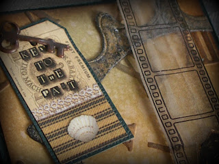
These are the last two close ups showing more of the metal work and the scroll, resplendent with it's Tim Holtz sentiment and Indigo Blue hand covered in Glossy Accents. I used a pin and plenty of ink to distress the scroll. You might also be able to see the filmstrip? This was stamped on shrink plastic, colour added with Promarkers and added to the panel with that red tape - I will use Glossy Accents in future.


Now for the ATC's - oh yes, not one but two! Well I was on a roll by this point. The principles are the same as those explained above so I won't bore you by repeating them. At least in this shot you can see that filmstrip more clearly. I didn't add any colour to the one on the ATC's because these had a lighter feel to them. A spot of matting and layering also helped to frame both these and the panel above.
  
Here's a few close ups on the first and second ATC's to show more of the detail.


So there you have it. Time now (like that!) to welcome my newest followers - thank you for choosing to spend some of your precious time with me - and say to everyone else I hope this week is a great one for you. Think I'm gonna be chained to this laptop for a few hours (more posts to write and a million(ish) peeps to catch up with). Huge hugs to you all, Jenny xx


Related Posts Plugin for WordPress, Blogger...