17 February 2021

Mostly Neutral for The Funkie Junkie Boutique Blog

Hi everyone and welcome. Sara Emily is hosting the latest challenge over on The Funkie Junkie Boutique Blog. She's called it 'Mostly Neutral'; "For this challenge, I would like you to use mainly neutrals, but I will allow you one accent color or use of metallic accents. Let's see how you use beige, ivory, taupe, brown, black, gray or shades of white or any combination of these to make any vintage/shabby chic project you would like."

The Design Team will choose their four top picks with the overall winner receiving a $25 gift certificate to go on a spending spree at The Funkie Junkie Boutique. All four top picks will receive badges to display on their blogs in recognition of their outstanding contributions.

Staying neutral was not a problem since I love making neutral backgrounds on which to pile more colourful focal points. The challenge came in selecting which colour would be the accent colour. As you'll see in the card below the final decision came down on the side of red.


I took photos as this card (and two extra) were created to show the process. I started with pieces cut from a large sheet of paper that I'd covered with brown watercolour paint, blended charcoal patches, white gesso, tea staining and finally stencilling with some plaster paste and the Tim Holtz 'Stitched' Layering Stencil.


For a previous project I had pulled some neutral coloured prints onto tissue using a Gel Plate; I picked a couple of these to add to the backgrounds and tore them into strips/chunks, applying them to the backgrounds with soft matte gel medium.


Here's a trick for helping to work out where to stamp an image and place the elements to compliment it; stamp your image onto a piece of clear waste packaging and you'll be able to figure out exactly how your finished piece could look.


After adding the tissue prints I added a blurred line with a charcoal pencil - being able to see how this would work with the final design as shown above was really helpful for this step.


After stamping Wendy Vecchi's 'Bouquet' image directly onto one of the backgrounds using black Archival ink and a stamping platform I used the matching stencil that comes with the stamp to apply white gesso over the top.


Keeping the stamped background in place I re-stamped it before applying 'Ruby' and 'Sterling' Acrylic Paint over the top. A final re-stamping with the black ink added the detail back onto the image. It was only at this point that I removed the now stamped background from the stamping platform.


To finish the card I added Glossy Accents over the stamped image; you could alternatively use translucent gloss gel medium over the top by applying it through the matching stencil. Finally some Wendy Vecchi Liquid Pearls 'Carnation Red' dots were applied along with white cotton lace (with a little tea staining to make it less obvious). The finished collage was layered onto a kraft background and a white card blank.


You'll have seen me mention three cards earlier; here are the other two which were created in the same way, the first with Wendy Vecchi's 'Simple Reality', the second with Wendy Vecchi's 'Spring Bouquet'.


So that's my take on the theme 'Mostly Neutral'. For even more inspiration my amazing team mates have come up with their own projects for this challenge so make sure you hop on over and check them out HERE.

For now, thanks for visiting,
Jenny xxx

Products used to create this card are available from The Funkie Junkie Boutique and are listed/linked below.

Creating a Folio Journal for Eileen Hull Designs

Hi everyone and welcome. This month the Eileen Hull Inspiration Team are sharing projects using her new dies. At the start of February we celebrated the release of Eileen's 2021 Chapter 1 dies by Sizzix with a blog hop and release party on FB. As part of the blog hop I shared this Floral Folio Journal;


Several people asked how the folio journal was created so today I'm sharing a tutorial to cover those questions with a bit of a variation on design. It all started with a change to the cover; rather than leave the four sides and adjoining spines together I was inspired by Eileen's extra long cover and chopped off the smaller sides from the die cut pieces. After separating the central spine pieces I re-joined one of them to the centre of the two long covers with some Architape using 1/2 inch Hinge Spacers. This allows for extra flexibility in your spine, particularly important if you add a hand bound text block.


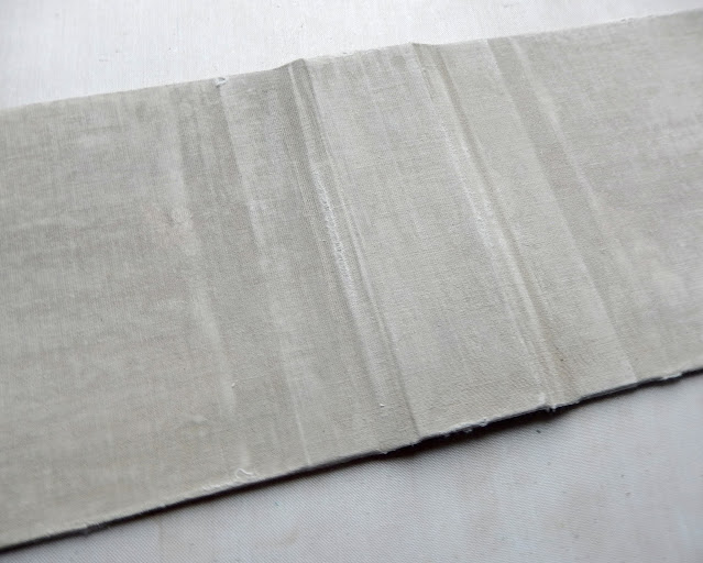
With the covers re-joined to the spine some plain cotton calico fabric was glued to the front of the cover and folded onto the inside using matte soft gel medium. It's important to let the glue dry before moving on or alternatively use dry adhesive sheets instead.


You'll notice below that I added another small piece of the calico fabric to cover the inside spine section since some of this will still be visible when the book is complete. Once the gel medium was dry I painted the fabric surfaces with a taupe colour paint.


With the paint dry I used a sanding block over the surface of the fabric, softening it and deliberately over-rubbing it in places to create a timeworn look.


I'd made my own sheets of decorative paper in neutral tones with watercolour paint, charcoal, gesso and plaster paste through a stencil. After cutting pieces to fit (two pieces 5 1/2 inches wide by 5 inches tall and one 1 1/4 inches wide by 5 inches tall) and distressing the edges I hand stitched them and stuck them onto the inside covers and spine.


Now to make the section that will hold the pages in place; I followed Maggie and Kay's tutorial HERE to create a flexi hinge spine piece using some of the decorative paper. It allows for dimensional page layouts like the ones in my Floral Folio Journal to lie flat. In that one I added just two of these hinged pieces to each side, gluing them onto the smaller spines - this had the added bonus of covering where the closure pieces had been secured at the back.


For this new Folio Journal I wanted to add some extra pages in between the hinged ones as an experiment. If you want to allow room for the flip outs and extra dimension on your pages there is no need for this bit. Using more of my own decorative paper I cut four pages 10 inches wide by 5 inches tall. These had tissue gel prints added in places before being stitched and distressed on the edges.


Below you can see where I made three holes along the spines of the four pages and matching holes along the centres of the gaps between the flexi hinges. Lining up those holes I stitched through them to secure the pages to the spine piece.


The photo below shows where the pages have been stitched in place. I then glued the spine hinge onto the inside cover spine using strong glue and allowed it to dry thoroughly. Remember, if you would prefer to keep it simple don't bother with adding the stitched pages in between the hinges, just stick your finished pages to the hinged sections.


Below you can see the front inside of the folio journal with the flexi hinge ready for it's page to be attached and the first of the stitched pages.


Flipping over to show another of flexi hinges sitting between two of the stitched pages. I am thinking that I'll add lace trims and gauze between the two sides of each of the stitched pages before gluing them together on the undecorated sides. I also added more of this decorative paper to the front and back covers of the folio journal to coordinate with that added to the inside.


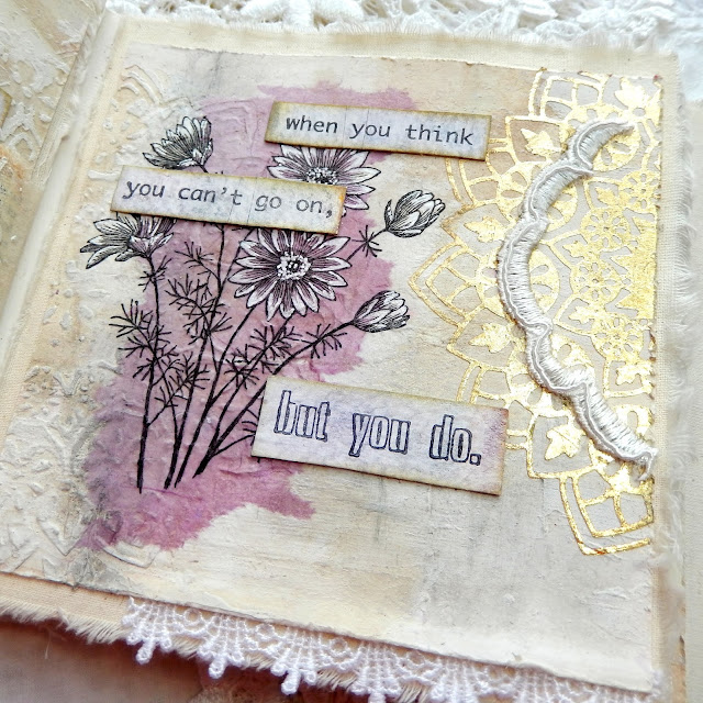
So now it's time to add collaged pieces and pages to the inside of this folio journal - with a colour scheme picked and some more(!) handmade decorative papers collated it's time for more creative fun.


I hope this tutorial proves helpful as you create your own Folio Journals. Make sure to check out the projects and tutorials from the other Inspiration Team members - links to their posts can be found on Eileen's blog throughout the month.

For now thanks for visiting,
Jenny xxx

3 February 2021

Groundhog Day at The Funkie Junkie Boutique Blog

Hi everyone and welcome. Suzz is hosting the latest challenge over on The Funkie Junkie Boutique Blog. She's called it 'Groundhog Day'; "This challenge is inspired by the movie Groundhog Day. In the movie Bill Murray is forced to repeat the same day over and over again for 10 years. This past year has been a little challenging and people have felt like they might be in a little bit of a Groundhog Day time loop. I am challenging you to create a shabby chic or vintage project that uses a technique, stamp, ink, or any other consistent tool that you find yourself using over an over in your art. Think of this as your opportunity to share what you find yourself repeating in your art frequently. Be sure to share with us in your post what it is that you keep repeating in your art."

The Design Team will choose their four top picks with the overall winner receiving a $25 gift certificate to go on a spending spree at The Funkie Junkie Boutique. All four top picks will receive badges to display on their blogs in recognition of their outstanding contributions.

It should come as no surprise that I made a book for this challenge given how many I've created over the past few years. There is something fulfilling about making something that can be useful as well as decorative. That being said this one is a Tiny Book so if you are a person of few words it's ideal!


I also love adding different layers and textures where possible; in this case the card used on the covers was painted with a mix of purples and golds before transparent texture paste and clear embossing powder applied through Wendy Vecchi's 'Rectangle Grate' stencil. When set and dry 'Buff' paint was applied over the top before being rubbed back to reveal the pattern.


Creating collages can go one of two ways - either it comes together really quickly or time is taken up 'auditioning' a huge range of bits and pieces until the right combination of elements can be found. I now store scraps and leftovers by colour to make this process a little easier. The collage on the front of the book started with a piece of painted card left over from the background (minus the stencilling). I added some fabric and gauze behind it to ensure a contrast with the background.


The collage elements on top include a strip of text, hand stitching, a die cut key (one of the elements on the Tiny Book Die) and a little vintage daisy cut using a die from Eileen Hull's new 'Folio Page, Pocket & Flowers Die Set. The addition of the thread through the centre of the button and rub on numbers add touches of black detail that coordinate with the text and contrast with the more muted main colours. The flourish behind the flower was stamped in dark brown ink using a stamp from Wendy Vecchi's 'Thank You' MAKE ART Stamp, Die, Stencil Set. Gold thread tied around the book spine adds that final touch of 'bling'.


So that's my take on the theme 'Groundhog Day'. For even more inspiration my amazing team mates have come up with their own projects for this challenge so make sure you hop on over and check them out HERE.

For now, thanks for visiting,
Jenny xxx

Products used to create this card are available from The Funkie Junkie Boutique and are listed/linked below.

Wendy Vecchi MAKE ART Stamp, Die, Stencil Set - 'Thank You'
Tim Holtz Ideaology Remnant Rubs - Specimen

Eileen Hull Designs Chapter 1 Release Party and Blog Hop

Hi everyone and welcome. Thanks for joining us for the Eileen Hull Chapter 1 Release Party and Blog Hop. Just wait until you see all of the fun options the new Sizzix ScoreBoards 'Folio Journal' Die has in store for you! You will also love the 'Mandala' and 'Folio Page, Pockets & Flower' Thinlits Die Sets that coordinate with the new Folio Journal. Eileen's Inspiration and Educator Teams have already been sharing card ideas using the new Thinlits Dies. Now, and throughout February, they will be sharing their Folio Journals with you and today we start with a launch blog hop. 


Please hop through the blogs and be inspired by the work of the talented Inspiration and Educator teams (links below). Leave a comment for each designer and you'll be in with a chance to win a 'Folio Journal' Die. Join Eileen and specials guests for a Facebook Live on Wednesday, Feb 3rd at noon Eastern Time (5pm UK time). Comment on our Facebook Live and be eligible to win either the 'Mandela' Die or the 'Folio Page, Pockets & Flowers' Die Set- two winners! Winners will be announced on the Facebook Live show on February 9 at 6pm Eastern Time. We appreciate your love and support, friends! We hope that you will be inspired too and share how you use the dies in the Eileen Hull Fan Club.

In this post I'm sharing photos showing some of the pages in my Floral Folio Journal starting with the cover, which has been covered in gauze, white gesso and panels cut from a decorative paper that I made. It has layers of paints, inks, charcoal pencil, stencilling through a die cut of Eileen's 'Mandala', stitching and a little collaging. The same paper has been used to cover the inside of the Floral Folio Journal and is the base layer for some of the pages and pockets. Flowers and words by Wendy Vecchi stamp sets have been used throughout.


The photos highlight some of the ways I used the new dies throughout the Folio Journal. For example the die cut 'Mandala' can be used as a page as seen above. On the simple flip out page below the corner pocket that comes in the 'Folio Page, Pocket & Flowers' Die Set has been decorated with part of a 'Mandala' cut from painted paper.


Here you can see where I've die cut a 'Mandala' from kraft card to be used as a stencil through which to apply texture paste to various pages. It's amazing how much of the detail comes through and it became something of a 'motif' that can be seen throughout the journal.


On this page I cut the 'Mandala' from a Sizzix double sided adhesive sheet and, after sticking it down, covered it with gold metal flakes. You could get the same results by using metallic foil sheets on top of the die cut adhesive.


This 'quilted' effect page is already detailed so it needed just a little decoration. The various flower and leaf shapes from the 'Folio Page, Pocket & Flowers' Die Set were ideal with the various shapes cut from more of the card that had been used in the background.


The Folio Journal has a lovely deep section around the spine which enabled me to add a wrapped spoon (cut using Eileen's Teacup Die) alongside the neutral stencilled paper I created for the covers and pages - a big thank you to Cec Wintonyk for that idea!


On the other side from the spoon is another of the die cut pockets which holds a 'Mandala' stencilled tag. Really helpfully Eileen has included a die to cut the pocket and another to create a coordinating decorative panel in the 'Folio Page, Pocket & Flowers' Die Set.


A double gatefold page spread includes die cut 'Mandala' shapes on  the outside and more of the Folio Flowers on the inside. The various flower shapes in the die set work really well together to enable you to create a range of flowers and leaves from different materials (in this case painted paper and vellum).


I've included words on the second side of the gatefold spread and more of the flowers to make the design flow. The brighter colours stand out against the neutral stencilled paper background.


On the last full page the stencilling again takes centre stage, this time with layers of paint over the top and the words cascading down it. With such a beautifully lacy feel it coordinates with the various lace trims.


One of the real treats about using this new Folio Journal is the amount of depth and space (real estate!) available to decorate; this means you can add lots of layers to each page without fear of them making the covers 'bulge'.


Thank you for joining me here as part of this Eileen Hull Designs Blog Hop. Here's the full list of blog hop participants - remember to leave a comment for each designer and you'll be in with a chance to win a 'Folio Journal' Die;

Related Posts Plugin for WordPress, Blogger...