22 February 2017

Out of the Cold at Frilly and Funkie

Hi everyone and welcome! It's Cec Wintonyk's turn to host the latest challenge over at Frilly and Funkie and her chosen theme is 'Out of the Cold'. Here's what she says about it; "It is winter and that means snow and cold in so many places so let's head to the tropics. Create any vintage or shabby chic project that will make us feel warm - think lots of sunshine, bright colours, flora and fauna and even animals hiding in the rain forest."

The team will choose their top four picks with the winner being invited to join us in a Guest DT spot at Frilly and Funkie and the next three will receive badges to display on their blogs. Everyone who enters and follows the rules will be entered into the draw to have the chance to win a $25 spending spree at The Funkie Junkie Boutique, so there are plenty of reasons for joining in the fun.

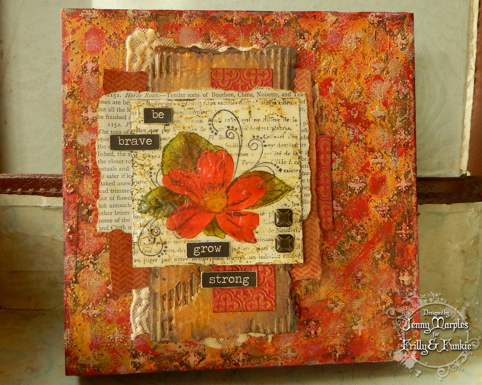
For this challenge and the next two after it, the Design Team is excited to be celebrating all things Wendy Vecchi. We will all be using her fabulous products, new and old, in our creations. I've chosen to create a bold, bright canvas packed with texture and those warm colours.


I created another of those 8x8 inch deep edged canvases using Wendy's translucent embossing paste through the Vintage Quilt stencil and Distress Paints to build a multi-layered background. The focal point is the Wild Rose, made by following Wendy's own 'Specimen tutorial' and the new Wild Rose Collage Stamp It Stencil It which helpfully adds the script and swirl background as part of the design.  It is really easy to add Archival Ink colour to the rose image using the stencil that comes as part of the set and matches perfectly the beautiful rose image. That was added to a coordinating collection of textured cards and papers including wrapping paper stamped with the new Herringbone Background and corrugated card smeared with Wendy's gold embossing paste. The finishing touches for this canvas needed to stay simple so Big Chat words and some Nail Heads worked well.


That's it for my DT project for the current Frilly and Funkie challenge 'Out of the Cold'. Do make sure you hop on over to see what my talented team mates have created with their Wendy Vecchi goodies and warm colours. And remember to link your own warm colour shabby chic or vintage projects to be in with a chance of winning one of the fabulous prizes.

That's it from me for now. Projects are calling out for attention in the craft room. Have a great end to your week and have fun! Take care, Jenny xxx

18 February 2017

Geological Journal and ARTifacts...

Hi everyone and welcome! The amazing Seth Apter is challenging all creatives out there to document your personal art journeys through 2017 in some form of journal, sharing it with him and fellow travellers throughout the year. Here is his introduction to the project 'ARTifacts'. I've decided to join in with the fun and have created a new journal to hold those all important memories - here's what it the cover looks like; I've shared a proper walk-through video on my Facebook page (there's a link below).


I've called it a 'geology journal' because it has a look of stone from the layered Tim Holtz Distress Paints, stamping using Seth's own stamp range from Impression Obsession and Ranger Archival Inks through a new stencil designed by Seth for Stencil Girl Products. Having layered  die cuts using Seth's Robo Ring set from Spellbinders, I've added a combination of natural elements that bring back memories of January 2017 for me. These include the gorgeous gemstones in the centre from a range called Quarry supplied by Emerald Creek - you need to check these out as they are perfect for all mixed media projects! Of course all good journal covers need a starting point right? And in my humble opinion I've got the best here - Eileen Hull's new Journal die from Sizzix will be released this spring and is already available to pre-order in the UK here and in the US here.


I wanted to make some quick and easy pages to fit inside this Midori / Travelers Notebook size journal and have come up with a fast way of using rolls of paper to do just that. This roll of parcel paper is around 50cm/20" wide but you can use smaller width rolls if you want to and of any type of material too! (wallpaper, wrapping paper, greaseproof paper, etc) - by folding and cutting it lengthwise down the middle I created two long strips.


I cut each strip in to 19cm/7.5" chunks and folded them down the middle. Build up a number of these to create 'signatures' (like mini books).


For this journal I wanted to document 12 months of the year so made my three signatures 8 pages in total. You can choose how many pages you want and of what thickness depending on your choice of paper.


For speed I machine sewed the signatures together a couple of times on the longest stitch length. You can also hand stitch or even staple yours together depending on the look you're going for (and patience/skill levels!)


Finally I measured the required page width on the first page of the signature (in this case 11cm/4.5") and, using a ruler, tore the first page to leave a rough edge. Keeping the ruler in place I then tore the remaining pages in the same manner. Work through to the middle pages then flip your signatures over and repeat until all the pages are torn to the desired width. And that's a signature complete!


And here's a reminder of what the journal cover looks like;


And in case you missed the link on Facebook here is the video of the completed journal;


Hope you've enjoyed seeing the first instalment of my ARTifacts journal journey. I'll be back to share how the pages are coming along over the next few months as more is added.

Take care of yourselves and have fun! Jenny xx

8 February 2017

Be My Valentine? for Frilly and Funkie

Hi everyone and welcome! It's Zoe Hillman's turn to host the latest challenge over at Frilly and Funkie and the chosen theme, appropriately for the beginning of February, is 'Be My Valentine?' Love is in the air, and with Valentines Day just around the corner, this challenge is to make a card for your sweet Valentine in a vintage or shabby chic style.

The team will choose their top four picks with the winner being invited to join us in a Guest DT spot at Frilly and Funkie and the next three will receive badges to display on their blogs. Everyone who enters and follows the rules will be entered into the draw to have the chance to win a $25 spending spree at The Funkie Junkie Boutique.

For my Valentine's Day card I took the opportunity to play with some brand new Wendy Vecchi designs and gave a decidedly more masculine look to it. You'll be seeing much more of this fella in the coming weeks but for now he has been christened 'Mr Valentine', and though he may have a tough exterior, inside he's just like marshmallow; all soft and gooey.


Guessing you'd want to know how this came together I've whipped up a tutorial for you;

Start with a square of card covered in a mix of orange and brown Distress Paints (colours listed at the end). Repeat stamp over with the Les Roses background using Jet Black Archival Ink.


Use Matte Distress Collage Medium to apply torn and wrinkled pieces of Tissue Wrap over the top as unevenly as possible before trimming away any excess from the edges of the card.


Using a mixture of blending and direct to paper methods apply Orange Blossom and Potting Soil Archival Inks over the whole background to give it more of an aged appearance.


Apply white gesso to your craft mat and dab the background in to pick up random patches. I finished mine by splattering Ripe Persimmon and Spiced Marmalade Distress Paints over the top.


Stamp Mr Valentine a couple of times in Jet Black Archival Ink to get a main image and extras of his head, his hat and his hand. Colour his face and hand with Tea Rose Archival Ink and his hat with Potting Soil Archival Ink. I used a little Candied Apple Distress Crayon to colour his tie. Fussy cut and layer together with dimensional tape or glue.


I cut two hearts by tracing them from the Not Enough Hearts stencil before colouring them with Red Geranium Archival Ink. After sticking them together I stamped them unevenly with the new Herringbone background in Potting Soil Archival Ink.


I worked out where Mr Valentine would be positioned on the card and drew round him before adding a little dilute Walnut Stain Distress Crayon to add shading. I then applied Black Embossing Paste through the new Rectangle Grate stencil (which reminds me of film tape) and allowed it to air dry.


To finish Mr Valentine and those hearts were layered over the background before being matted onto black card and a white card blank. The sentiments from the new Quotations set were scuffed at the edges to reveal their white core before being stuck in place.


And here are a couple of close ups of the card so you can see more of the dimension and detail;


His eyes follow you around don't they! So that's it for my DT project (and additional tutorial) for the current Frilly and Funkie challenge 'Be My Valentine?' Please make sure you hop on over to see what my talented team mates have created for their Valentines and remember to link up your own projects to be in with a chance of winning one of the fabulous prizes.

I have some shows coming up at the weekend (details on my sidebar) so it's back to the craft room to prep for those.
For now take care of yourselves and go have fun! Jenny xxx


3 February 2017

Words That Are Special at A Vintage Journey

Hi everyone and welcome! Today sees the launch of the latest challenge at A Vintage Journey called 'Words That Are Special'. Our host for this challenge is the amazing Jennie Atkinson. Here's what she has in mind for this theme; "We often use words for cardmaking, scrapbooking, journaling, layering backgrounds, stamping, collage, in mixed media work, on our tags …. In fact words are often an integral part of our design processes for many of our projects. This month show us words that are important or special to you and how you incorporate them in your vintage; shabby; mixed-media; art journaling; industrial or steampunk art."

This month we are sponsored by Country View Crafts who have generously offered a £20 voucher to their online store for a randomly drawn winner. And three hand picked Pinworthies will be offered the chance of a guest appearance for a later challenge, so there's plenty of reasons to join in.

Having returned from the trade show in the US with a brand new Distress Oxide pad in my mits the temptation to play proved overwhelming! First opportunity available and I was back in the craft room having fun, exploring the first of many possibilities. With the basis of a card made I really needed some special words to bring it all together and make the eventual recipient ponder perhaps. Not only did they add meaning to and otherwise random collection of images, the bold lines also added to balance the finished composition, providing a focal point; it's something I've found in the past - the right words in the right place can really finish off a project perfectly.


Here's the 'how to'; I started by applying several colours of Distress Ink (Salty Ocean, Broken China, Brushed Corduroy and Frayed Burlap) to the centre of my craft mat and added some Cracked Pistachio Distress Oxide to one side - you will contaminate your oxide pad if you smooch it over the Distress Inks but it can be removed easily by wiping away. Spritz the inks with water to form droplets on your mat.


Swipe your card through the various inks - you'll get the familiar deep translucent look to the Distress Inks and a more chalky, softer look from the Distress Oxides. I added mine to a slice of Tim's new Distress Mixed Media Heavystock as it has less colour than manilla to affect the look of the inks and is designed to take all sorts of abuse without warping. I dried the first layer before going in for a few more dips.


I continued applying more ink droplets from the residue on the craft mat and in between added droplets of water from my mister bottle. Normally this reacts with the Distress Inks by removing the colour back to the base, but with the addition of Distress Oxides these wet areas only go back a little way to reveal the underlying colours.


With all the ink added I blended a couple of the same inks over any 'colour light' areas and onto the edges of the card.


Now for a really exciting reaction - I stamped the Nordic background over the inky card using the Distress Oxide. At this stage it looked very soft and the image wasn't as distinct in some areas as I wanted.


Bearing in mind Distress Oxide is a brand new combination of Pigment and Die ink I misted a fine layer of water over the whole tag to 'activate' the pigment part of the ink and allow the die part to wick a little.


This was when the magic really happened, revealing a much clearer image the like of which I've only been able to achieve using Distress Paint as a resist to inks in the past. But then when Distrsss Paint is dry it remains fixed whereas Distress Oxide remains water-reactive. I was happy at this stage but could have continued adding more water for a less defined look to the image. It's such a game-changer!


With the main portion complete and the process repeated on a Heavystock Tag, I stamped a couple of the flowers and stems from the Mini Bouquet set in the centre of the card, die cutting them with the coordinating Mini Bouquet die set.
Some of the new Journey Design Tape was added to the bottom of the tag.


Here's one of the new Paper Dolls, already cut out and ready to colour with Distress Markers. I trimmed this one a bit more as I'm a little OCD with my fussy cutting but  as most of the work was already done that didn't take long!


Finally I stamped some of the Wildflowers on the tag as a background element, Some stitching was added to the edges of the card and tag before layering together on a card, and of course the final all important words were added - some Quotations Metallic Stickers had just the right ones!


Let's take a look at some close ups of the finished card so you can see the details a little better; you'll spot the machine stitching (deliberately wonky!) extra Journey Design Tape and gold detailing using a paint marker pen.


So that's where this month's fabulous theme took me. Now please do hop on over to A Vintage Journey to see what my fellow Creative Guides have come up with - it's well worth the visit! Then it's over to you - the challenge will remain open for a month so there's plenty of time to get those creative juices flowing and link up your entries to be in with a chance to win.

Off now for some Friday fun. Whatever you're up to take care of yourselves, Jenny xxx

Related Posts Plugin for WordPress, Blogger...