18 April 2013

April Colour Palette comes through!

Hi everyone. First up apologies if I haven't been to visit your blog recently - a major league catch up is on the cards this weekend as tomorrow is going to be rather 'full on' at work. As for tonight this post will be short and sweet.


This is something of a variation on a theme (see 'A Tuesday Tutorial') a tried and tested method for fulfilling a card order for a male birthday when time was not on my side. And the perfect colour scheme came courtesy of the Seasonal Color Palette April challenge at Ranger.


The background was made using Distress Paints, the new Bottle Caps embossing folder (lurve this!) and a rub of Distress Ink. This time I went for one panel of birthday Mini Blueprint stamps in Distress Paints with a tag sentiment coloured with Distress Ink. Again, loving the Sizzix Thinlits dies for the tag and the XOXO border. Relatively straight forward to create and happily received it turned out well.


And of course Hels wants to see our 'painty' creations over at the Sunday Stamper challenge - Paint Box.
So that's it for now. Have a great Friday and take care of yourselves, hugs Jenny xxx

16 April 2013

Foamtastic!!!

Hi everyone. I want to start this post by offering my heartfelt thoughts and prayers to all those affected by the tragic events in Boston yesterday. Horrific things like this always help to put your own challenges into perspective.


So here's my offering for today (yep, another card - I've got orders to fulfil and a large family:) This all started as a result of reading Sandra's inspirational description about the creation of her DT piece for the current Simon Says Stamp and Show challenge. 


The thought of creating your own background stamp in this way was too good an opportunity to miss.

Out came the Cut n Dry Foam and one of the Texture Fades embossing folders (you'll recognise the one:)  After heating the grey side with the heat gun I pressed the folder into it for a short time. Hey presto! a great impression made. 


The grey side took to being covered in Distress Ink really well, even with two colours applied. And it was even easier to get a clear impression from  stamping it on white cardstock as the spongy side was great for squishing down with very little pressure.

Next job - cover the ink in patches of Walnut Stain Distress Embossing Powder and copper mica powder and heat until set (a bit of water spritzing was required to set the mica).

The long strip is another piece of the 'faux rust' card made with Distress Paints/Inks/Stains (details HERE).

The poster image is a Nicecrane Design favorite of mine called Vintage London Underground advertising Vol II. It looks even better when distressed with some ink and water spritzing.

Now it was time to pile on the embellishments. Various die cut shapes in different textures (goodness I love the new Sizzix Thinlits). 


The clockface was stamped and embossed, the cogs had alcohol ink applied, and a small piece of embossed/inked/gilded Ferro was included. I also went to town with gold UTEE from the Melt Pot onto a piece of card which was then stamped with a mini blueprint ticket. When cool it was treated with Distress Paints/Stains in the same manner used by Tim Holtz on his April tag alpha/metal embellishments. To make the image pop out it was finally restamped with Archival Ink and covered with Glue n Seal to stop it cracking.


Obviously this is going to be entered into the Simon Says Stamp and Show Challenge - Background.
As it contains so much texture I am also entering it into The Artistic Stamper Creative Team Challenge - Texture.

Thank you Sandra for your inspiration -  after the triumphant moment of creating a usable background stamp this was a joy to put together. Here's hoping you have some triumphant crafty moments too. Hugs, Jenny x

14 April 2013

Inspired by Finnabair

Hi everyone and thanks for joining me. Over at Snazzy's Design Team blog they have an 'Inspired by Finnabair' challenge. As her style of work has inspired me for some time it seemed appropriate to enter.


This doesn't look like many of the entries, granted, but I love the way she works with layering elements around a focal point (usually a photograph) and then duplicates a smaller version along another edge - as she has done in this layout. The central image for me was some masked/embossed stamping using an Indigo Blu set. It was the first time I'd used glossy and Distress powders side by side and the timing on heating them was tricky. The antique gold card was also recoloured with Pan Pastels which was able to glide smoothly over all the embossed elements. The scissors were also embossed (Ranger Verdigris EP) after having been fussy cut.


 I rather like the sewing pattern (an Andy Skinner stamp on tissue paper coloured with DI Antique Linen). Other elements include Old Paper DS splats, some die cut paper/kraft glassine, lace, ribbon and more stamping. To me it reflects the eclectic mix of ephemera Finnabair uses all the time. The edges were embossed with clear embossing and again, Pan Pastels were rubbed over to highlight them. I love that if you put too much on you simply take an eraser to it (which unfortunately you can't do with inks).


It was an enjoyable experience creating this - using white without having to be paranoid about having to keep my fingers ink free all the time! It also taught me a lot more about what is/isn't possible with various media. Hope you are inspired in some small way by what you've seen and I would highly recommend those of you who haven't seen her work that you take a look at Finnabair's blog. Take care of yourselves, hugs Jenny x

13 April 2013

Learning to fly further...

Hi everyone and welcome. It is always a joy to see that followers count going up and I am eternally grateful that you choose to spend time here. I've got a number of things to post with deadlines looming, so please 'bear with' and don't feel obliged to comment on them all.


This card is one of those that was in my head but took some doing to turn it into reality. I would imagine by now we've all seen/attempted Tim's 'faux verdigris' technique on his April tag. He challenged us to use different colours, and in recent posts I've shown you my 'faux rust' version. That got me thinking "What other 'faux effects can I create by mixing up these wonderful Distress Paints?"

Waiting for over an hour in a hospital waiting room got me flicking through an interiors magazine and I struck upon the idea of having a go at doing a 'faux aged plaster' effect. Colours picked (and listed below) I started playing, dabbing different amounts of each on my craft mat with water and swooshing the white card through them (extra Picket Fence/Antique Linen were required). Then more water spritzing - the key here is to use a little water and allow the paint to drip downwards in one direction - drying, and repeating the process until the card was covered.

At this point it is was little darker than expected, but now it was time to employ Hels Sheridan's paint scrapping technique, adding more Picket Fence to my Stamps Away 6" blending mat and scrapping it randomly across the surface. Then a coat of Picket Fence Distress Stain, a few random patches of Picket Fence Crackle Paint and finally the merest of hints of Renaissance Treasure Gold gilding wax rubbed into the cracks and around the distressed edges. Et voila! Old plaster!

Using this piece of card was relatively easy as I was able to take inspiration from the work of Natasha Naranjo Aguirre at A Painterlady's View. First it needed a stencilled 'dado rail' in white texture paste and more gilding wax. Then a picture to hang on the wall, courtesy of  Nicecrane Designs (details below) mounted on a spare piece of 'faux verdigris' card and embellished with some of The Funkie Junkie Boutique's yummy metal filigree corners, some handmade flowers with vellum leaves, and a stamped sentiment. As you can see, the whole lot was layered onto more vellum and cardstock, with little pieces of lace used behind the rips and tears at the edges.

 The beautiful birds image comes from Nicecrane Designs and can be found HERE. It really comes to life when covered with a few coats of clear embossing powder.

The challenges I'm entering this into are;

Thank you again for joining me - hope I've given you something to think about here, especially if you too are playing with these amazing Distress Paints.

Take care of yourselves, hugs Jenny x


11 April 2013

Inspired by Brett Weldele

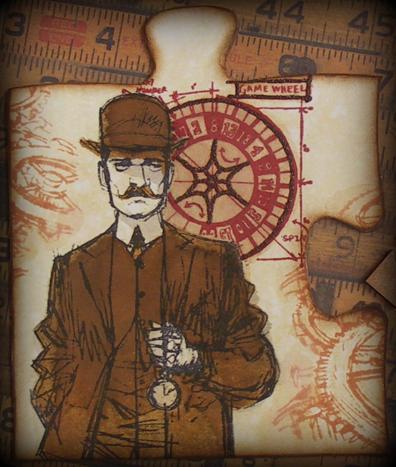
Welcome everyone and thank you to my new followers for deciding to join me in my little bit of Blogland. Tim Holtz recently flagged up some tutorials by Brett Weldele - he paints the most gorgeous pictures using Distress Stains and collaborated with Tim to create the Time Travellers stamp set.
If you haven't seen them yet then I highly recommend that you take a look;


Having studied these carefully I set to work on a puzzle piece that came as part of a wonderful prize from Tracy Evans. It got covered in white paper first and then a layer of DS Antique Linen, spritzed/dabbed with water. The gentleman and wheel were stamped in Archival Ink and painted with DS Antique Linen/Pumice Stone/Brushed Corduroy/Rusty Hinge/Walnut Stain. Walnut Stain Distress Embossing Powder was added to the game wheel and the gears were stamped/blended with DI Tea Dye. Finally the edges of the puzzle were distressed with DI Rusty Hinge/Walnut Stain, DP Walnut Stain and DS Tarnished Brass.


Next I wondered whether I could combine painting with my faux rust  background.  I created a panel using Tim's 'April Tag' technique as previously described HERE, this time stamping the Papillon background in Coffee Archival Ink to make it less dominant. Then this gentleman was painted in the same way as above, with the bottom torn/painted to allow it to blend into the background. Just for once I've even managed to capture something of the shine from the DS Tarnished Brass! In case you are wondering these two do form parts of two cards, but as they have been made for an upcoming family birthday they are not going to be shown in full. Well that's it for now. Hope you are inspired to take a look at Brett's tutorials and have a go at painting with Distress Stains and Inks yourselves. Hugs, Jenny x


Related Posts Plugin for WordPress, Blogger...