13 April 2013

Learning to fly further...

Hi everyone and welcome. It is always a joy to see that followers count going up and I am eternally grateful that you choose to spend time here. I've got a number of things to post with deadlines looming, so please 'bear with' and don't feel obliged to comment on them all.


This card is one of those that was in my head but took some doing to turn it into reality. I would imagine by now we've all seen/attempted Tim's 'faux verdigris' technique on his April tag. He challenged us to use different colours, and in recent posts I've shown you my 'faux rust' version. That got me thinking "What other 'faux effects can I create by mixing up these wonderful Distress Paints?"

Waiting for over an hour in a hospital waiting room got me flicking through an interiors magazine and I struck upon the idea of having a go at doing a 'faux aged plaster' effect. Colours picked (and listed below) I started playing, dabbing different amounts of each on my craft mat with water and swooshing the white card through them (extra Picket Fence/Antique Linen were required). Then more water spritzing - the key here is to use a little water and allow the paint to drip downwards in one direction - drying, and repeating the process until the card was covered.

At this point it is was little darker than expected, but now it was time to employ Hels Sheridan's paint scrapping technique, adding more Picket Fence to my Stamps Away 6" blending mat and scrapping it randomly across the surface. Then a coat of Picket Fence Distress Stain, a few random patches of Picket Fence Crackle Paint and finally the merest of hints of Renaissance Treasure Gold gilding wax rubbed into the cracks and around the distressed edges. Et voila! Old plaster!

Using this piece of card was relatively easy as I was able to take inspiration from the work of Natasha Naranjo Aguirre at A Painterlady's View. First it needed a stencilled 'dado rail' in white texture paste and more gilding wax. Then a picture to hang on the wall, courtesy of  Nicecrane Designs (details below) mounted on a spare piece of 'faux verdigris' card and embellished with some of The Funkie Junkie Boutique's yummy metal filigree corners, some handmade flowers with vellum leaves, and a stamped sentiment. As you can see, the whole lot was layered onto more vellum and cardstock, with little pieces of lace used behind the rips and tears at the edges.

 The beautiful birds image comes from Nicecrane Designs and can be found HERE. It really comes to life when covered with a few coats of clear embossing powder.

The challenges I'm entering this into are;

Thank you again for joining me - hope I've given you something to think about here, especially if you too are playing with these amazing Distress Paints.

Take care of yourselves, hugs Jenny x


11 April 2013

Inspired by Brett Weldele

Welcome everyone and thank you to my new followers for deciding to join me in my little bit of Blogland. Tim Holtz recently flagged up some tutorials by Brett Weldele - he paints the most gorgeous pictures using Distress Stains and collaborated with Tim to create the Time Travellers stamp set.
If you haven't seen them yet then I highly recommend that you take a look;


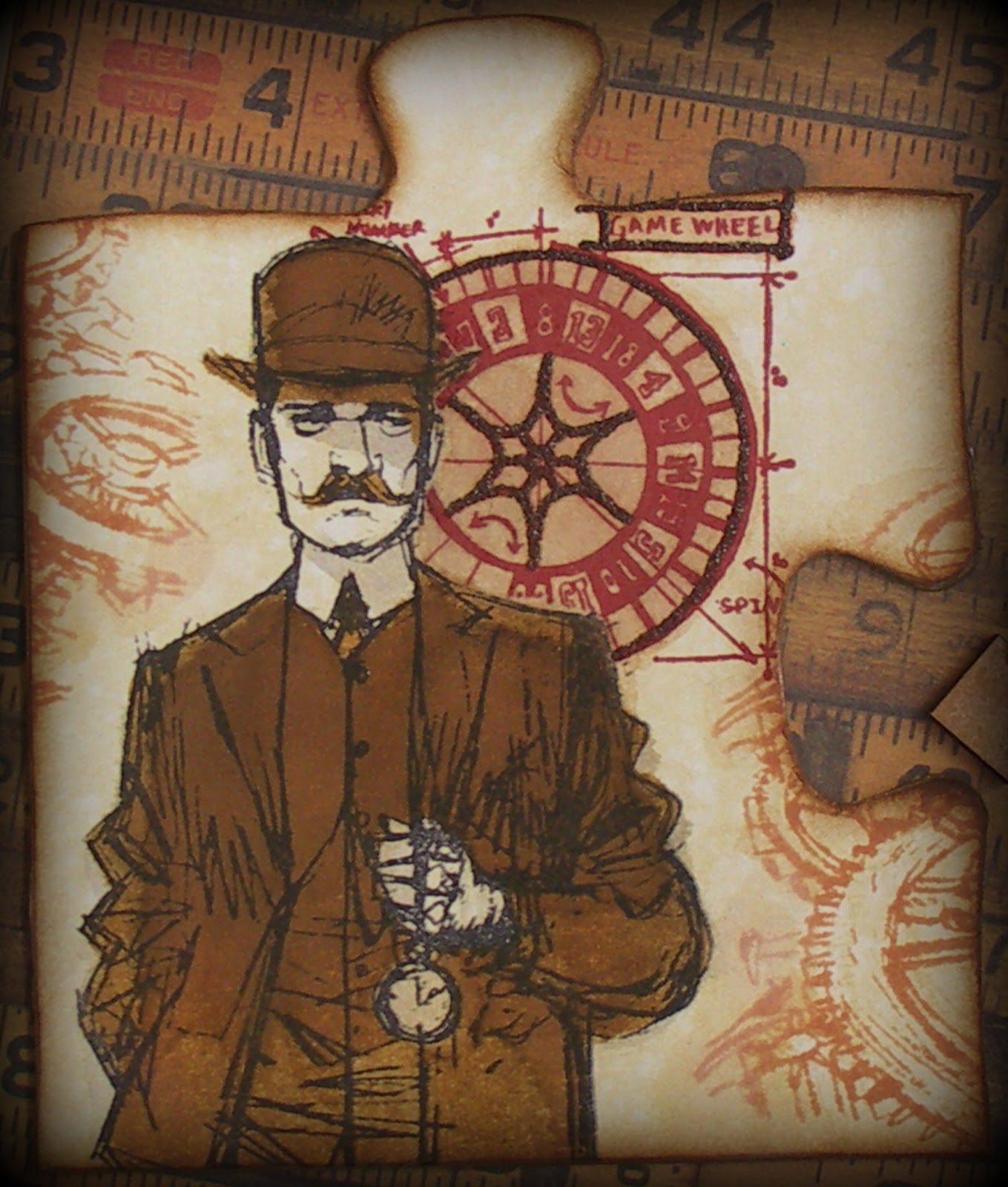
Having studied these carefully I set to work on a puzzle piece that came as part of a wonderful prize from Tracy Evans. It got covered in white paper first and then a layer of DS Antique Linen, spritzed/dabbed with water. The gentleman and wheel were stamped in Archival Ink and painted with DS Antique Linen/Pumice Stone/Brushed Corduroy/Rusty Hinge/Walnut Stain. Walnut Stain Distress Embossing Powder was added to the game wheel and the gears were stamped/blended with DI Tea Dye. Finally the edges of the puzzle were distressed with DI Rusty Hinge/Walnut Stain, DP Walnut Stain and DS Tarnished Brass.


Next I wondered whether I could combine painting with my faux rust  background.  I created a panel using Tim's 'April Tag' technique as previously described HERE, this time stamping the Papillon background in Coffee Archival Ink to make it less dominant. Then this gentleman was painted in the same way as above, with the bottom torn/painted to allow it to blend into the background. Just for once I've even managed to capture something of the shine from the DS Tarnished Brass! In case you are wondering these two do form parts of two cards, but as they have been made for an upcoming family birthday they are not going to be shown in full. Well that's it for now. Hope you are inspired to take a look at Brett's tutorials and have a go at painting with Distress Stains and Inks yourselves. Hugs, Jenny x


10 April 2013

Springtime in Paris

Hello everyone and welcome to another DT card for the current Frilly and Funkie challenge - April in Paris. The constant cold weather in the UK means springtime this year seems to have been put on almost permanent hold. Looking at photos from the same time last year there were lots of flowers in bloom and nest building aplenty - that's not the case this year.


 So, I let my mind wander back to those lovely warm days and and grabbed my new stamp set - Tim Holtz 'Paris to London' - for inspiration. The Postcard Texture Fade was used on the white base card. It is a bit of an art using an embossing folder on a piece of card 6"x 6". Next I die cut various elements with the same white card, including a postage square (Spellbinders) for use as a base element.


The postage square was embossed with in white with the background stamp part of the set. I also stamped/embossed/fussy cut a fleur de lis, postage stamp, postcard and the Eiffel Tower (which looked better in copper). These elements were layered onto the postage square and the white texture paste leaves were applied to the background. 


Then it was time to take my heart in my mouth and grab the coloured mists (this is always scary as the end result is unpredictable!) The idea was to  echo the colours in the flowers so layers of orange, yellow and brown-red were spritzed onto the background/white elements. Initially I masked off the outer edges, but having a patch of colour in an off-centre position looked wrong so the whole lot got covered and the edges ink distressed.


I'll be honest - panic set in at this stage as all that lovely die cut/fussy cut/stencilled detail had been lost, with only the embossed areas remaining obvious. Then I reached for my white Uni-ball pen and coloured over those elements again to make them pop once more (with the added extra of some Treasure Gold gilding wax) and hey presto, card salvaged.


Then it was time to go mad with embellishments, including the handmade flowers, the distressed tape measure (cut from one of the new Texture Fade folders) and a copper metal corner that got snipped in half. Linda may recognise the little Paris tag, a die cut freebie that was sent with one of my first orders from her - anyone who has ever ordered from The Funkie Junkie Boutique will know that Linda wraps her orders by hand and has been known to drop in extra goodies too which makes the whole shopping experience so exciting:) 


Hurrah! You've made it to the end of this post! Hope you've been inspired/encouraged along the way, if only the recognition that things go wrong but can invariably be fixed with a bit of perseverance. Please make your way over to the Frilly and Funkie challenge blog to see what my awesome teamies have been up to. You may even be inspired to have a go at joining in yourselves, especially with a $25 shopping spree up for grabs. Hugs, Jenny xxx

Related Posts Plugin for WordPress, Blogger...