13 March 2013

WOYWW 197

Happy WOYWW! Apologies - I know, it's been a bit on and off for a few weeks but I thought I'd better show my face today, even at this late stage of the day.


A snapshot of my temporary desk today shows me painting another of those Morris backgrounds (there, now you can see it's not wrapping paper!) You can see the fabulous stamp in the bottom left-hand corner and the 'palette' in the middle of the desk. The heart will be placed behind the red square in the corner. I've made a start on playing with some new dies which are absolutely gorgeous. On the far right are some tissues that will be used on painted cardstock (got to do some looking up on the best way to tackle them) so they can become card toppers. So there you have it for this week.

Now, I'm off to link this to Julia's central switchboard HERE before catching up with fellow WOYWWers. More from me tomorrow (I know, I'm like buses) but for now take care, Jenny x

More Morris

So it's the second week of our "William Morris style" challenge over at the Frilly and Funkie challenge blog and as the team member who picked this theme I felt just a little nervous at how/whether people would tackle it. I have to say my team mates have seriously done this theme justice, each putting their own unique style/twist on it. And then there have been some wonderful entries too. If you've not seen them yet I highly recommend that you take a look HERE. So the onus was now on to come up with something myself (no pressure then!!)


How about those colours eh? They are classic Morris colours but not classic Buttons, but hey, life's all about trying new things out in my book. The whole thing started with a fabulous Inkylicious Morris style background stamp (repeatable thankfully). I stamped it out in a strip using Archival Ink and then set to with some Distress Inks. These are wonderful for painting with and blend together well.


Actually the painting process is rather relaxing, but then what to do with the completed panel? Morris and his fellow craftsmen were inspired by and used tiles for decorative purposes, so I took that as an idea and chopped it up - a bit drastic eh?


Having tiled it onto complimentary cardstock thoughts turned to a focal point. Working on the principle 'quality not quantity' I took one of my embossed/inked gold Ferro texture paste frames and sat it on a piece of rusted tin mesh to give the impression of a cage.


Over this I added a die cut branch (see Nicola!!) made from chalky inked metal and another of my lovely birds (I know, Red Archival/Tea Dye Distress! What a combo, but it works!!) This glossy little birdy deserves to stay outside the cage.


So has this made the grade? That's for you to decide, but if it inspires you to have a go at this style yourself then it will have succeeded. There's a list of ingredients below and don't forget to pop over to the challenge blog to see what my teamies have done. You're in for a treat. Hugs to you all, Jenny x

PS. When you read through the challenge take a look at the first image of the woodpeckers in the orange tree - guess who created this tapestry and now has it hanging on her bedroom wall!

11 March 2013

Steampunk Layouts

Hi everyone and welcome. It's so good to have your company. Just to let you know I've got a few things to post this week, and today I'm kicking off with the first offerings - some steampunk inspired cards (that were photographed well before the snow hit!!)


Each of these were created using digital images from Nicecrane Designs (you might recognise the second one from a post by the wonderful 'Butterfly' HERE).


The genius thing about digital images is that you can resize them to match your requirements - in this case to fit beautifully inside the large die cut sprockets made using my metallic grunge paper recipe - and the bonus with these images is that they are black and white, so you can colour them however you want. Here are the two sets I used (click on each one to link you to the site).


I didn't want to upstage these images too much, so having added Distress Ink/Stain colours to them I turned my attention to the backgrounds.


In order to work around the image without affecting it I used a Finnabair trick - drawing around each image with a pencil, deliberately smudging these lines to add some shadow.


I was then able to remove them and start splatting Distress Stains around.


The choice of background colours was determined by those used on the main images.


Stamps used included sets from Tim Holtz, Kanban and a freebie from The Craft Stamper.


These were complimented with various die cuts, metal bits and bobs and wooden elements from Crafty-Emblies (one of which was coloured with Metallic Distress Stains).


Hope you like the layouts for each of these. I have taken inspiration from lots of scrapbook layouts - well if they work for a 12"x12" page why shouldn't they work for a 6"x6" card front? Now, it's very last minute but I saw there is a challenge over at Try it on Tuesday - Time Flies, so I'm entering the first card into it this time as it reflects a view of future flight in times past.  Right, is time for me to away as I have origami to do with Son 3, some paste to slap around (on a project!!) and some dies to use (I've got some new Sizzix Thinlits! SQUEAL!!) Hope you all keep well and warm, hugs Jenny x

10 March 2013

What a difference a day makes...

Here in the UK it is a day to celebrate mums and all they mean to us. Some people just tend to go through the motions on days like these and see it as another one to 'tick off the list', but for many of us it is a real chance to say/show what our family members mean to us (not just take it for granted that they know). Those of you who follow my blog regularly (thank you for all your continued support) will already have seen my cards HERE. I then decided to create a little something to give alongside each one.


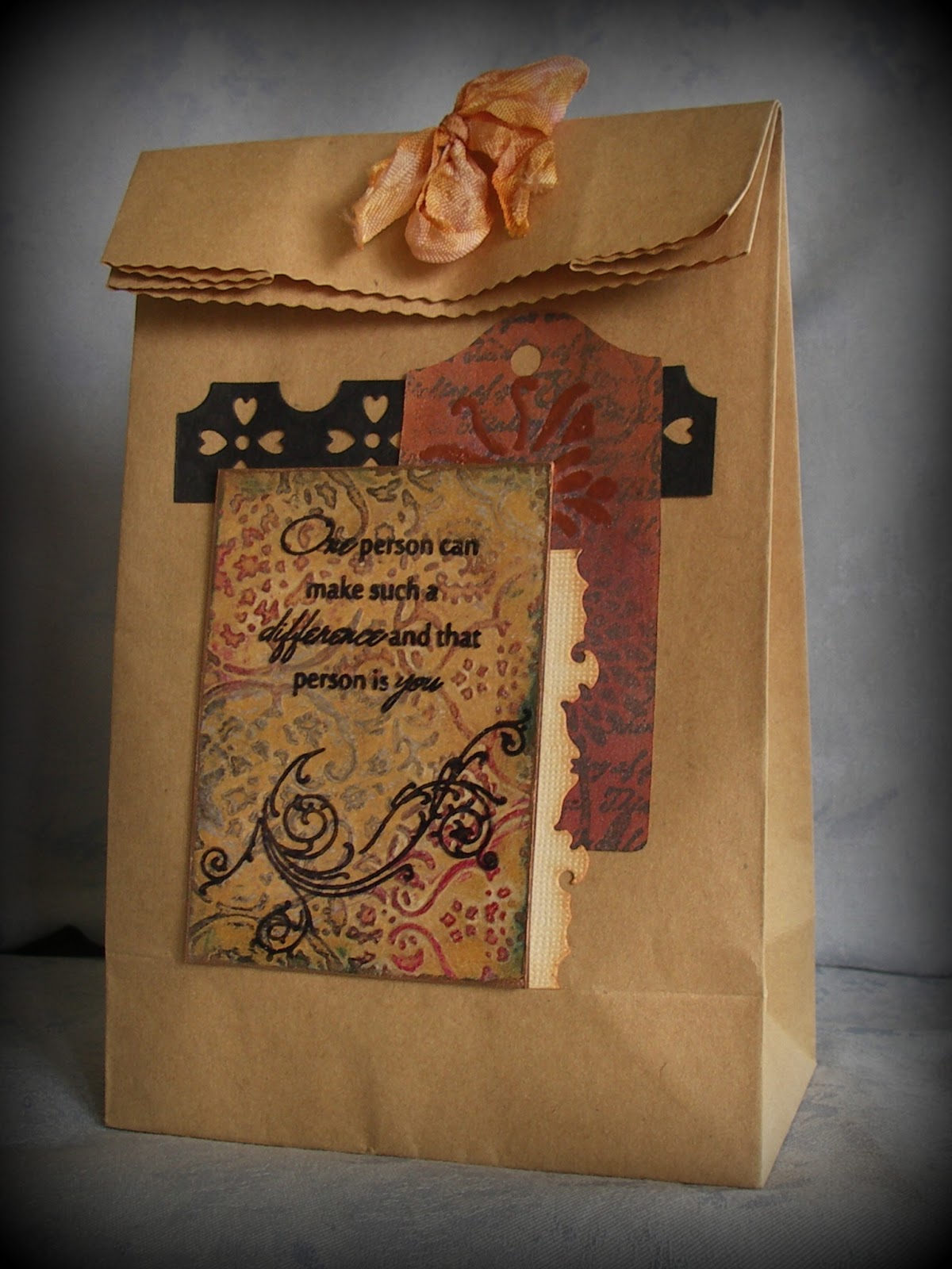
I was inspired to create bags (containing a little something of course) using ATC's as the focal point and echoed the colour scheme used on the cards. Those of you who saw my Friday Focus post over at Frilly and Funkie should recognise the background on the ATC element. That damask embossing folder works a treat with this technique. However the next challenge was to work out how to add the stamping without affecting the clarity of it. Acetate was the logical choice, added to the card using Glossy Accents when dry. This also allowed the edges to 'bleed' a little to distress/age them, and they were finished off with a swipe of Rennaisance Treasure Gold.

As well as adding a couple of die cut card pieces and some dyed seam binding, the little tag was created -  this involved stamping the tag with black Archival ink, covering with some Distress Metallic Stain, and then blending some Distress Inks over the top. The embossed butterfly shape (using the same mask as was used on the card) needed a couple of coats of Copper powder to allow for maximum shine.

Over at Unruly Paper Arts they are having an ATC extravaganza and one of the reader challenges involves adding an ATC to a project, so this will be my entry.

Oh, and not that you will be wondering but just because I consider myself the luckiest mum on the planet, my boys spoiled me with their own handmade creations and some rather indulgent chocolate - to be honest they have been a tower of strength these last few weeks doing so many household chores and helping me wherever they can so these were an added bonus.


And here's another reason for recognising (as is so often the case) what a difference a day makes in crafting! Having completed these cards in time for posting on Friday I went back to them afterwards and decided they needed something else. So to the first one I added some lace that had been coloured with Distress Paints and water (boy, do they blend well). To the second one I added some shadow stamping onto the postcard and layered lace over the antique gold cardstock. Now they can finally be 'put to bed'!

Now, it's time for the final day of Crufts 2013 and I want to know how the Alaskan Malamutes do in the Working Group competition, so I'll love you and leave you for today. Thanks for stopping by, Jenny x

8 March 2013

Friday Focus - Distress Metallic Stains


Hi out there in Blogland. Apologies for the lack of blogging/commenting over the past few days - the mind was willing but the body had other ideas. Anyway, I have been playing working with a technique using Distress Metallic Stains and wax crayons and wanted to share the results with you. To find out what I've been up to just pop over to Frilly and Funkie to take a look - hope it gives you a few ideas to experiment with this weekend. Hugs, Jenny xxx

2 March 2013

Lets Dance


Good morning everyone. Well, yesterday I promised you news, so here goes. I was beyond thrilled to be asked by The Artistic Stamper Creative Team to be their Guest Design Team member for the month of March. To take a look at my first project please visit the blog HERE
Hope you like what you see. Hugs, Jenny x

1 March 2013

Lady in Green

Hi everyone. Can't believe it's March already!! So there are a couple of challenges I really needed to enter this week and with time getting on I sat this morning with a few ideas but no flash of inspiration. Now normally I would just leave it and do something else instead, but as one of the challenges was Hels Sheridan's Sunday Stamper - You Raise Me Up I couldn't just give up. And then there was Simon Says Stamp and Show - The Stamp You Love But Don't Use. I've got one or two of these to my shame, and one, a freebie from The Craft Stamper magazine, has been begging to be used for eons.


The background started as one of my playing card blanks last seen in a tutorial HERE. I worked out where to put the face and then started with the paste using some leaf patterns.


When applied I heated the paste to puff it up. Then Distress Paint time.


All four greens were dabbed on, spritzed with water and blended (your fingers are great for this although you need to be prepared to get mucky forcing it into the gaps). Distress Inks were blended over the top to intensify the colour.


The face was stamped onto tissue, glued over the background and a pencil blended on the edge of the face to give more definition.


The ivy was stamped in different Distress Inks onto textured cardstock, with the the edges roughened and inked and the leaves folded along the central veins for dimension. The tiny crimson mulberry flowers contrasted beautifully and lead me to colour the lace with matching alcohol ink.


Finally a sentiment was stamped onto complimentary die cut cardstock layers. And that was that!

Hope you can join me tomorrow for something exciting. Have a great weekend, hugs Jenny x
Related Posts Plugin for WordPress, Blogger...