29 August 2017

ITAC 2017 Challenge 1 - Europe

Hi everyone and welcome! When I saw the buzz on social media about the ITAC 2017 Challenge I was intrigued and keen to join in, though (as you'll have seen from the flurry of posts recently) time has been at a premium. Well yesterday was a day taken to create just for me, so armed with paints, stencils, stamps and paper I took the leap and tackled Challenge 1 - Europe. All the details and inspiration can be found HERE. From the list of requirements I took paper, a face, letters, numbers, blue, and the flowers which are new stamps given a vintage finish.


This canvas started with a layer of texture paste before I applied strips of book paper and layers of paint (Park Lane, Coastal Walk, Grandma's Teacup and Frosty Sky). By applying it with a brayer, a spatula and stamps (Numbers and Anemone) the patterns were built up gradually. The face (Face II) was stencilled in the palest shade and filled in before having the outlines reapplied in the darkest shade. Some more numbers were stamped with White gesso and Stroke of Midnight paint, before I then had huge fun applying Mega Flakes and Rust alcohol Ink dribbles. With my initial layer of paper having disappeared from view I stamped the Anemones onto more of it with a mix of paints (Miss Moneypenny and Leather Corset) cutting them and adding a little Brushed Corduroy Distress Ink to age them. They were scattered over the canvas to highlight the flow of the design (using Slap It On Matte) and provide a base onto which I could add the stencilled words (with the Believe stencil).

Et voila! Here are some close ups of the finished canvas; 


So that's my entry for the first challenge from ITAC 2017. With a second challenge, a new continent and a whole new set of criteria to play with the next entry is already underway (can you tell I'm having fun with this?)

I'll be back soon with that and a Guest appearance for a different challenge. Until then grab your supplies and challenge yourself! Jenny xxx

25 August 2017

When is a Wild Poppy not a Wild Poppy............

Hi everyone and welcome! Fans of IndigoBlu will know that Kay Halliwell-Sutton recently released five sets of fabulous new floral stamps (and a new big butterfly). A few of you will have seen a set of samples I created with some of them HERE. Now as the stamps were sent out just as I was leaving for a short holiday in France there was nothing for it but to stamp some out and take them with me to colour in the evenings.


Thing is, I didn't have the names for the sets so when I saw the A6 Wild Poppy it looked for all the world like a sunflower to me (mind you, we were surrounded by fields of them and the heatwave may have gone to my head!) Just goes to show we all see something different in an image when it isn't named for us! So, with the help of some Albrecht Durer watercolour pencils my wild poppies became sunflowers, and when I returned home they were added to a twisted twig circle with some leaves from the A6 Peony set to create this Summer wreath. By painting the reverse, gluing them to thin plastic, cutting them out and heating to mould them they turned from 2D to 3D! Here are some close ups to show the details;


Just goes to show if you don't have Summer create your own (and look beyond the labels to see let your imagination fly)! Make sure you check out the new IndigoBlu florals and Big Butterfly if you haven't done so already. I'll be having lots more fun with these florals in the weeks and months to come. Whatever you're up to take care of yourselves and get creating! Jenny xxx

23 August 2017

On The Cutting Edge with Frilly and Funkie

Hi everyone and welcome! It's Suzz's turn to host the latest challenge over on the Frilly and Funkie Challenge blog and she's called it 'On The Cutting Edge'; this challenge is all about using your dies, punches or other cutting tools to create a masterpiece featuring at least one die cut, machine cut or punched image. Make sure your art is in the vintage or shabby chic style and incorporates a cut out.

The team will choose their top four picks with the winner being invited to join us in a Guest DT spot at Frilly and Funkie and the next three will receive badges to display on their blogs. Everyone who enters and follows the rules will be entered into the draw to have the chance to win a $25 spending spree at The Funkie Junkie Boutique, so there are plenty of reasons for joining in the fun.


One of  the dies I have used most used this year is Eileen Hull's 'Journal' die - with it back in stock again at The Funkie Junkie Boutique it was a no-brainer to make a new journal. It was designed with someone in mind and need to have a robust cover with a relatively flat surface to prevent being caught when taken in and out of a bag. So I cut an inner layer from Sizzix Paper Leather because it doesn't tear but is flexible and painted the spine to match the old book covers that were glued on top for strength as well as look.


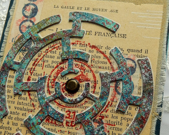
Decoration came in the form of fabric, pages from an old French text (picked up on my recent travels) and stamped masking tape. The focal points for both the front and back covers were the die cut Broken Maze shapes (using Seth Apter's fabulous die). These were cut from a piece of card which had a multitude of Dina Wakley Paint layers applied with brushes, a spatula, Seth's French Script stamp and a craft mat. Adding the white edging with a pen was a trick Seth teaches in his classes and I added stamping behind using one of his 'Rotators' stamp set.


After adding the name plate (the sentiment is one from Wendy Vecchi's 'Artful Thoughts' stamp set) and Nail Heads I strung the spine with 2mm elastic and added a piece of sari silk to close. Inside is rather boring and practical (hence no photos) as it's just lined notebooks that can be slipped in and out when being used for recording notes, ideas and designs. Here are more close ups;


That's it for my DT project for the current Frilly and Funkie challenge 'On The Cutting Edge' I hope you've been inspired by my latest journal. Do make sure you hop on over to see what my talented team mates have been inspired to create. And remember to link your own die cut shabby chic or vintage projects, to be in with a chance of winning one of the fabulous prizes.

I'll be back again soon with lots of new projects. In the meantime take care of yourselves and get creative! Jenny xxx


22 August 2017

Stitchy Flowers Earrings for Eileen Hull Designs

Hi everyone and welcome! I'm back today with my latest monthly project for Eileen Hull Designs. We were asked to use the dies from Eileen's HeARTfelt Collection in different ways and the Design Team have really risen to the challenge as can be seen HERE and HERE. With ideas as diverse as a tablet holder and shadow box to a wine cuff, pin cushion and money box it's clear they can be used in a multitude of ways. And today sees even more ideas shared on Eileen's website - make sure you check out them out and prepare to be amazed!

As you'll have seen from the title of this post I went down the route of making jewellery with mine and came up with this simple but effective design for using the fabulous Stitchy Flowers die set;


Despite their length these are incredibly light due to the special material I used for the flowers. Here's the all important tutorial;


The flowers were cut from Sizzix 'Paper Leather', a light yet super tough material that can be cut, embossed, stitched, painted and generally abused without risk of tearing. And as you'll see from the dies chosen and cut out pieces, it can be die cut with Thinlits dies too!


Having punched a hole at the top of each of the larger flowers I painted both sides with Dina Wakley's Lime acrylic paint.


The smaller flowers had the Ruby shade applied to contrast with the larger layer.


The flowers were then embossed with one of Eileen's embossing folders from Sizzix. I made sure the flowers were lined up so that the embossed details matched when layered, but that's just me - matching the patterns is not essential!!!


To add even more interest I diluted some of Dina Wakley's Ocean acrylic paint and splattered both sets of flowers (on both sides) using a small brush.


When dry this process was repeated with the White shade to contrast and coordinate with the beads.


When dry I glued the two layers of flowers together. Dots of 'Caribbean Coast' Enamel Accents were added to the centre of each completed flower.


To finish I used silver findings and some coordinating semi-precious beads from my stash to link the hooks to the flowers.
And as a reminder here are the finished results all ready to wear;


I hope you've enjoyed finding out more about how these Stitchy Flowers earrings came together. And a quick reminder to head over to Eileen's website to see a multitude of other ideas for using the dies from her HeARTfelt Collection.

I'll be back tomorrow with my latest DT project for the Frilly and Funkie challenge blog. Purely by coincidence the latest challenge is all about using your dies! Until then take care of yourselves and get creative. Jenny xxx

21 August 2017

A Candy Non-Haunted House...!

Hi everyone and welcome! Thank you to everyone for your overwhelmingly positive reaction to my first Halloween 2017 make. As I looked back at it I felt the next version would need an injection of colour to contrast with the first. There were also a number of valid comments from people outside the US who quite rightly said that Halloween doesn't play such a big part in their calendars, so I wondered what other uses this wonderful house image could be put to. Thoughts turned to candy houses in storybooks and films, and so the idea for a 'fantasy' style look took shape. Here's what happened;


This tutorial follows the basic principles from the last monochromatic version, but includes some tips for creating the splattered background by making use of the 'Ravens' stamp set as well as the 'Haunted House' set.


1. Use the Stamp Platform to position the Haunted House stamp on your card and impress with Antique Linen Distress Oxide ink. Leave your stamp in position and wipe away the remaining Oxide ink to prevent transfer to the next ink pad.


2. Paint small sections of the house with bright Distress Paints (in this case Picked Raspberry, Seedless Preserves, Wild Honey, Mustard Seed, Candied Apple and Dusty Concord). Allow to dry.


3. Re-stamp the Haunted House using black Archival Ink - the joy of the Stamp Platform, apart from the fact that you will get a perfect replication of your original stamping, is that you can reapply the ink if any does not transfer properly first time.


4. Repeat the process, this time with the twisted tree from the Haunted House set. I added leaves and after re-stamping with the black ink, painted over the face in the tree to make it less scary. I also used the splatter image from the same set to add faux 'foxing' to the paper before trimming to size.


5. As Distress Paint and Archival Ink will resist Distress Ink I happily blended over Scattered Straw (avoiding the windows) before spritzing with the Distress Spray to get those familiar watermarks. I finished the panel with a quick blending of Walnut Stain Distress Ink to age the edges.


6. To create the background use the splatter stamp from the Ravens set. Position the stamp on the Stamp Platform where required then apply a coat of Distress Paint using the dabber top. You can be sparing with it as it is easy to go in with another layer on top with this fabulous tool. You'll also notice I put scrap paper under the card to protect the Platform from excess paint over the edges. Allow the paint to dry and clean off your stamp before re-positioning and repeating with another colour until the background is complete.

To finish I mounted the main panel and background onto black card, with a strip of altered Metallic Kraft card used underneath the main panel along with a little lace. I stitched the background to the base card bland and added a suitable Halloween Clipping to complete the card.

Here are the close ups so you can see the card in more detail;


I hope this gives you some alternative ideas for using the Haunted House stamp set. If you have your own non-Halloween ideas I'd love to hear them!

That's it for now but I'll be back tomorrow with something completely different (and I do mean COMPLETELY!)
For now take care of yourselves and get creative. Jenny xxx

19 August 2017

A Tim Holtz Haunted House...

Hi everyone and welcome! I'm back to share my first Halloween card and tutorial for 2017. Having been lucky enough to win a recent Tim Holtz giveaway I was thrilled to receive a couple of Tim's newly released Halloween 2017 stamp sets and a fabulous new ornate stencil - and here's the first of what is bound to be a collection of projects using the Haunted House stamp set (click on the image for a closer look);


As promised here's a full step by step tutorial for recreating this card;


1. Spread Opaque Crackle Paste unevenly over thick white card.


2. When dry cover completely in Walnut Stain Distress Paint and allow this layer to dry too.


3. Apply a thin uneven layer of White Gesso with a dry brush to help highlight the texture/cracks.


4. Use the Stamp Platform to stamp the Haunted House image with Iced Spruce Distress Oxide Ink. Leave the stamp in place on the Platform and clean off any residue ink to prevent transferring it to the next ink pad.


5. Use a fine brush to paint in the stamped image with Iced Spruce Distress Paint and allow to dry.


6. With the Haunted House stamp still on the Platform re-stamp over the painted image with Black Archival Ink (several times if the detail doesn't show through immediately).


7. Apply Design Tape strips either side of the Haunted House (I used an old one with the new raven design) and add your choice of Halloween Clippings around them.


8. Stamp the moon and bat images from the Haunted House set using the Stamp Platform (so you can reapply ink if the first impressions aren't clear - you are stamping on to an uneven gesso'd surface so this is possible). Use a fine nib water brush to apply a smudged line of Walnut Stain Distress Crayon around the Clippings to highlight them.

To finish I drew some lines across the Design Tape to break them up a little, sewed around the edges and scuffed them with my Tim Holtz Distress Tool, and layered onto altered Metallic Kraft Card (tutorial for that layer HERE) and plain kraft card. I also used a white gel pen to add some highlights to the windows and lantern on the Haunted House.

Here are some close ups so you can see more of the details;


Isn't this Haunted House fantastically detailed! There are a myriad of uses for it so this won't be the last you'll see of it here :) For those who are interested I've added the full list of ingredients below.

I'll be seeing you soon with more projects. In the meantime have a great weekend, take care of yourselves and get creative! Jenny xxx


Related Posts Plugin for WordPress, Blogger...