22 June 2016

Pastels and Pearls for Frilly and Funkie

Hi everyone and welcome! As promised earlier this week I'm back with a much gentler, less vibrant looking canvas as part of the latest Frilly and Funkie challenge. The wonderful Nancy Dynes is our host for this one and has chosen the theme 'Pastels and Pearls'. "Create any vintage or shabby chic project that features a pastel colour palette and includes pearls. Those are the only guidelines. Other than that, the sky is the limit!"

At the end of the challenge the team will choose their top four picks. Our first place winner will be invited to join us in a Guest DT spot here at Frilly and Funkie. Three additional talented participants will receive badges to display on their blogs. Everyone who enters and adheres to the challenge guidelines will be entered into a drawing to win a $25 spending spree at The Funkie Junkie Boutique!


For this one I returned again to a favourite project created by Paula Cheney HERE, inspiring the soft, blended background. Harlequin stencilling with the Crazing Distress Collage Medium kicked the whole thing off before I blended my Distress Crayons over the top. I really concentrated on getting colour into the crazing to accentuate it further. Remember you can use a semi-dry wet wipe to help blend the crayons and get a lovely soft look. Typo stencilling with Texture Paste came next into the non-patterned areas and I used a little white gesso over the top to brighten the lettering. With the background complete I turned my attention to the floral centrepiece.


As well as a scattering of beautiful Petaloo flowers I also added some die cut and brass leaves. Alongside a cheap pink paper flower (coloured in the centre with a drop of Rusty Lantern Lime Lindy's Stamp Gang Starburst spray) I used some Mini Tattered Florals die cuts, painted with gesso, spritzed with Shabby Shutters Distress Stain Spray, and highlighted with the Picked Raspberry Distress Crayon and a gumdrop centre.

The largest textile flower and smaller pink flowers were made using some of the self-adhesive Tim Holtz Textile Surfaces. The smaller ones used the lightest colour in the pack, stuck to some Clearly for Art, coloured with the Picked Raspberry Distress Crayon and Pearl Perfect Pearls, die cut, shaped with a heat gun and finished with pearl centres. The larger flower used the darker colour in the pack, backed on to kraft card and moistened with Ink Refresher before being shaped and layered together with coloured gauze. Would a tutorial for these be helpful?

I love the brass heart charm holding a piece of Wildflower paper and Remnant Rubs from the Botanical collection. It teamed up well with the white heat embossed sentiment from the Life Quotes stamp set and the final pearls.


There you have it - my contribution to the collection of gorgeous 'Pastels and Pearls' creations from the Frilly and Funkie Design Team. Make sure you hop on over to see their incredible makes, by which time I'm sure you'll be inspired to join in the fun and be in with a chance to win!

Thank you for joining me today. Whatever you're up to for the rest of the week have a good one and take care of yourselves, Jenny xxx


20 June 2016

Bubblegum Pink Destination Inspiration at A Vintage Journey

Hi everyone and welcome to a new week! Thank you to everyone for your lovely feedback on my latest TV appearances. I'm pleased to say there are more in the pipeline including something rather special next month... For now it's back to normal service and today I'm over at A Vintage Journey with the latest instalment of Destination Inspiration (and a confession!)


So with this sneak peek of my finished project and a new tutorial in store for you I hope you'll head on over to A Vintage Journey to see more.

There's more to come this week with something decidedly softer and more feminine...
In the meantime take care of yourselves, Jenny xxx

13 June 2016

Hochanda Shows for IndigoBlu

Hi everyone and welcome! I wanted to give you a quick reminder that I'll be back on your screens tomorrow, Tuesday 14th June at 10am, 1pm and 5pm. You can tune in to Hochanda via Freeview channel 39Sky 663, FreeSat 817 and online at www.hochanda.com

Here are a few sneak peeks of the projects I'll be demonstrating throughout the day, including tips, tricks and techniques with IndigoBlu Acrylic Paints;


I hope you can tune in and join me tomorrow, but if not there is a 'Catch Up' service now available on the website so you don't need to miss out on all the fun! See you all very soon! Take care of yourselves, Jenny xxx

12 June 2016

Master Doolittle is so Dapper

Hi everyone and welcome. Back when Tim Holtz' Dapper paper collection first arrived in my craft room I had a ton of fun creating several male themed cards. This was one which (due to the flurry of DT projects and other stuff) got left behind unpublished. Time to put that right and remind you that Frilly and Funkie's latest challenge 'Let the Words do the Talking' is in it's final few days - so just enough time still to enter!


I know, there's a lot happening on this card but hopefully the design draws your eye to the young man I've re-christened Master Doolittle. Clearly he loves animals and in my head will go on to become a vet, naturalist and explorer with a unique ability to speak to animals. Did you know the grown up version of Doctor Dolittle first appeared in the illustrated letters to author Hugh Lofting's children, written from the trenches during World War I when actual news, he later said, was either too horrible or too dull.


I am so pleased with how the mottled Distress Paints pick up on the colours in the Animals book cover and help to lift the largely neutural coloured layers. Hidden away there's some alphabet stamping and stencilling, and I love how those Industrious corners help frame Master Doolittle. My trusty Distress Crayons came in useful again too, aging the Flashcard and adding a shadow around the central figures.


Hope you're all having a good weekend out there and whatever you're up to take care of yourselves, Jenny xxx


10 June 2016

Chameleon Friend Fridays Blog Hop with IndigoBlu

Hi everyone and welcome! Over on the IndigoBlu blog we are taking part in a special Friend Fridays blog hop with the lovely people from Chameleon Pens. This is the second week of the series with Nikki Killinger and myself getting the chance to share our projects with you.


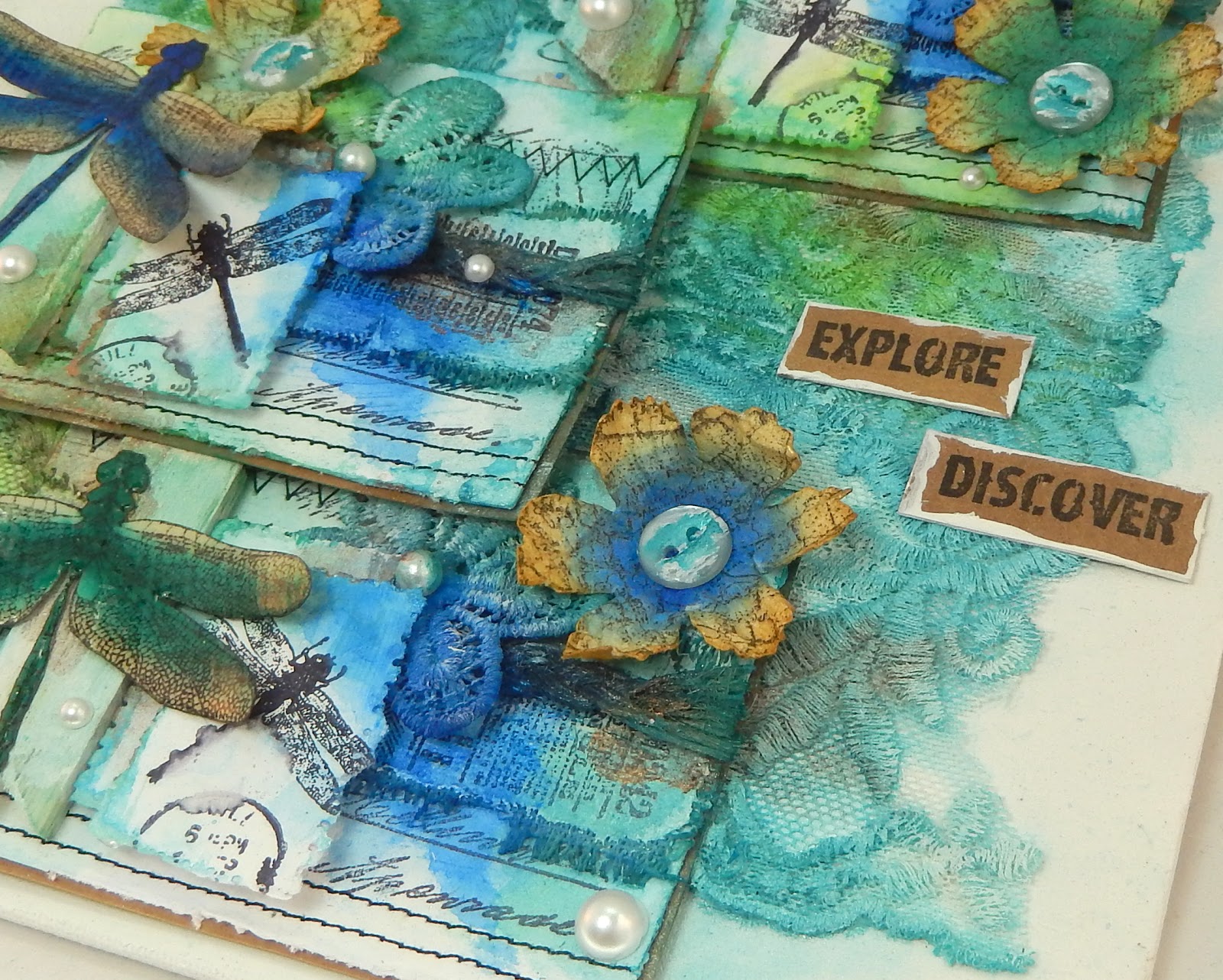
Having taken the time to play with these lovely Chameleon Pens I decided to showcase a couple of uses for them on this mixed media canvas. Opting to stick with blue/green tones I stamped the Dinkie Dragonfly onto watercolour cardstock using Memento Tuxedo Black and blended the colours across the wings and body. Once dry I blended a little Brushed Corduroy Distress Ink across them for a more vintage look and added Glossy Accents for added shine. The die cut flowers were created with the same watercolour papers, pens and inks, this time with all over colouring that would be great on a background and stamping with the map image from the A5 Grand Tour II set. After layering up lots of stamped textiles, surfaces, texture paste and gesso, dilute puddles of IndigoBlu Acrylic paints were applied. It didn't take long to get to grips with these wonderful pens and I enjoyed seeing what they could do when combined with stamps and die cuts. Here are some close ups of the various elements;


With more to see from Nikki and the rest of the team I hope you'll take the opportunity to hop over to the IndigoBlu blog and Chameleon Pens blog to see many more fabulous projects and find out more about these lovely pens.

Chameleon Pens used; Cool Tones 5 Pen Set
Stamps used; Dinkie Dragonfly, Grand Tour I, Grand Tour II
IndigoBlu Paints used; Kingfisher Blue, Hunter Green, Townhouse Teal, Sleeping Beauty, Lime Marmalade, Pheasant Bronze.


8 June 2016

Let the Words do the Talking at Frilly and Funkie

Hi everyone and welcome! It's the second week of our latest challenge over at Frilly and Funkie, and our host Sue Carrington has this to say; "I love to include meaningful sayings on my projects, sayings that speak to me and inspire me to do the things I do. What I would love to see on your projects for this challenge are the words and sayings that mean a lot to you and inspire you."

The winner will earn the chance of a Guest DT spot here at Frilly and Funkie, and everyone who enters and follows the rules will go into the draw for the chance to win a $25 spending spree at The Funkie Junkie Boutique. And there are Top 3 Badges for three further outstanding entries, chosen by the Design Team, because choosing just one winner is so hard!

Here's my canvas for this challenge, inspired by the display of fabric swatches on clipboards that adorned Tim Holtz Eclectic Elements stand at the recent Quilt Market. Read all about it HERE (and you'll see the wall I mean in the first photo!)


The whole theme for this canvas is that word LIFE, spelt out in Letterpress Blocks. The various swatches help document memories and the every day objects that make up our lives; pressed shirts, a romantic trip, long time friends, a great night out, cutlery, and a fun day skating - a real life quilt.


The base of the canvas was covered in a sheet of Dapper paper and stencilled with some Texture Paste through the Mini Latticework Layering Stencil. I used some of the Eclectics Elements fabric and stamped on some of the Textile Surfaces before stitching them to wadding and mounting on small kraft tags. The Hinge Clips were made for this piece too it seems!


Just one word can conjure up a whole picture. Several can hold a special meaning. So which words will be your creative spark? Hop on over to Frilly and Funkie to see the ones used by my talented team mates and then it's over to you.
Can't wait to see what you come up with! Until then take care of yourselves, Jenny xxx


7 June 2016

Summer Sunshine

Hi everyone and welcome! Following a recent hotel visit I was inspired to make the background to this canvas with my IndigoBlu paints and Mega Flakes; the colour combination reminds me of a painting of red boats by Claude Monet (Argenteuil). As I pondered where to go next with this piece the latest Simon Says Stamp Monday Challenge - Summer Garden - was launched and that became the catalist to complete it. For all my friends in based across the Atlantic it's exciting to see that the IndigoBlu stamps and flake I've used for this are stocked by Simon Says Stamp (in case you're wondering, that's the A5 Floral Fantasy set, A6 Colour Me Anenome and Copper Kettle Mega Flakes)!


The base of the canvas was covered in layers of texture paste, Gee-Sso Good gesso and Pantry White Acrylic Paint (you can find all the IndigoBlu matte Acrylic Paints HERE and the Metallic ones HERE). A combination of brayering and painting rough layers of Peppermint Tea, Lime Marmalade, Townhouse Teal, Kingfisher Blue, Postbox Red and Burning Bonfire was interspursed with stencilling using the new Weird Science stencil. I handpainted lines of Kingfisher Blue and applied the Copper Kettle Mega Flakes over red line tape as an accent.


If you've seen some of my previous projects you'll know I love to use the Colour Me Anenome stamp with my Tattered Florals die cuts a they fit perfectly to create a stamen filled centre to these flowers. For this canvas I used white embossing powder as a resist to the diluted paints and added some Glossy Accents to the centre of each bloom.The butterflies from the Floral Fantasy set were given the same treatment and to add a little age to the edges of them all it's easy to apply a little Brushed Corduroy Distress Ink with the Mini Blending Tool. Those wonderful words also come from the Floral Fantasy set and are particularly pertinent for those of us who have to endure all that the Summer weather throws at us here in the UK!


I'm also entering the final Our Creative Corner challenge for a while - A Beautiful Mess - with fond memories of my time on the Design Team and recognition of the fun I had making a controlled 'mess' with the paints on the background of this canvas.

And I'm also entering the current challenges at;

That craft room of mine is calling loudly with lots of deadlines to hit before an upcoming trip and my next IndigoBlu shows on Hochanda next Tuesday June 14th to prepare for - hope you can join me for those.

Thank you for joining me today. I hope the sun is shining on you wherever you are, and whatever you're up to take care of yourselves! Jenny xxx

3 June 2016

Embossing Pastes and Textures with A Vintage Journey

Hi everyone and welcome! Today sees the launch of the latest challenge at A Vintage Journey called 'Embossing Pastes/Textures'. Our host for this one is the wonderful Astrid and here's what she has in store for us; "use any kind of texture paste (home made, crackle, coloured or plain) on your projects. There is an endless variety available, so play, have fun and apply it to your heart's content. Use it through stencils, randomly or in whatever way you want, but remember it should be in one of the vintage; shabby; mixed media; art journalling; industrial or steampunk styles that we favour. Put on your mixed media hat and create some magic!"

This month we are being sponsored by Country View Crafts who are offering a shop voucher for a randomly drawn winner. And three hand picked Pinworthies will be offered a Guest appearance for later challenge, so there's plenty of reasons to join in the fun.

When coming up with a 'plan of attack' for this theme I was inspired by two wonderfully creative people. Wendy Vecchi recently shared a brilliant idea for mixing embossing powders to create a faux rusted effect on different inky backgrounds HERE. Back in 2013 Vivian Keh (Contadina K) posted a fabulous video using embossing powders with embossing pastes to create fabulous textures. That little voice in my head that often says to me "I wonder what would happen if I..." kicked in and here is the resultant finished canvas...


And here's a guide showing how it came together;
Here are some close up photos which let you can see how the embossing powder 'cocktail' works over the various colours of embossing paste, unifying and blending those strong base colours and enhancing the textures.


So that's where this month's fabulous theme took me. Now I urge you to hop on over to A Vintage Journey to see what my fellow Creative Guides have come up with - it's well worth the trip! Then it's over to you - the challenge will remain open for a month so there's plenty of time to get those creative juices flowing and link up your entries to be in with a chance to win. For now take care of yourselves, Jenny xxx

1 June 2016

Happy Homes - The Mixed Media Monthly Challenge 2nd Birthday Celebrations

Hi everyone and welcome! I was really excited when Donna Bowman invited me back to be a Guest Designer for The Mixed Media Monthly Challenge 2nd Birthday celebrations. If you've not yet visited this challenge blog then I highly recommend it as they have superb designers on board who create a wealth of mixed media art each month to inspire you.

The theme for this month is to celebrate a wonderful 2nd year of crafting by choosing to create something for one of the themes from last year. Just in case you need a helping hand here's a handy guide/graphic to remind you of those themes...


And quite by chance it's a thrill to announce that this month will be sponsored by The Funkie Junkie Boutique!!!

I chose to go with the Dimension theme from month #23 (April 2016) a challenge I entered as it was heavily influenced by the designs of their sponsor for that month, the wonderful Wendy Vecchi. In honour of that fact my Dimension canvas this time round is also a Wendy Vecchi inspired one...


The design for this canvas has been in my head for a long time but it was the arrival of my invite that gave me the perfect opportunity to create it. I was inspired by the beautiful artwork shown on the Mat Minis Birds & Their Houses packaging created by Wendy herself. The Mat Minis are so easy for adding dimension in themselves but the idea of replicating the tree to create a dimensional woodland scene was exciting.


The base of the canvas was covered with white embossing paste, dried and coloured just a little with a mix of Cornflower Blue Archival Reinker and rubbing alcohol. Using the Layered Tree stencil I added leaves and branches in various blue, green and brown shades of Archival Ink, making sure they overlapped and graduated. Another layer of trees was created by smearing a little silver embossing paste through the stencil with my finger. If you then heat the paste it bubbles and sets before being coloured by the same inks. And then I repeated this process using the white embossing paste for a completely different texture/layer. The joy of using the stencil throughout this process is that you can easily go back over trees you've already created to add more colour or embossing paste and build as much dimension as you want. Again inspired by Wendy's original artwork I added 'berry clusters' using Rose Gold Liquid Pearls as a finishing touch.


One thing I've learned from Wendy's tutorials is that you can continue to add delicate detail to your artwork using her background stencils - it covers overly blank spaces without intruding heavily on the main design. A stamped lace border edge also fitted perfectly with Old Ledger pattern. The bird houses and birds are so simple if you ink them up and use the coordinating stamp set to add the detail. Finally the sentiment banner just needed the addition of some filigree metal edges to make it stand out.


I really enjoyed putting this together and getting the chance to be a part of the 2nd birthday celebrations at The Mixed Media Monthly Challenge. Make sure you hop on over to the challenge blog to be inspired by the rest of the designers and then its your turn to pick a theme. 

Have fun creating and take care of yourselves, Jenny xxx


Related Posts Plugin for WordPress, Blogger...