29 May 2015

Friday Focus at Frilly and Funkie

Hi everyone and welcome to this, the last Friday in May (can you believe it!!!) I'm back as promised for the second post of the day. This time it's a heads up about a Friday Focus tutorial that I'm hosting over at Frilly and Funkie. It's about as close to CAS as you're ever going to get from me and is such an easy yet effective idea that there are two finished versions to see!!! Here's a quick glimpse...


I hope you can join me over at Frilly and Funkie, and if you haven't seen my earlier post for A Vintage Journey (yet another tutorial - gosh, I've been busy!) you can catch that HERE. Tomorrow I'll be out and about demonstrating for IndigoBlu over at PDA Card and Craft in Langley Mill (details on my sidebar) so if you're in the area it would be great to see you.

Whatever you're up to this weekend I hope you have a great one. Take care of yourselves, Jenny xxx

Eroded Wallpaper - Tag Friday at A Vintage Journey

Hi everyone and welcome. Here's the first of today's posts from me as part of a special Tag Friday edition over at A Vintage Journey and for this one I've been messing with a Tim tutorial. Having been intrigued by the new 'Worn Wallpaper' used by Tim and his team for the Eclectic Elements booth at the recent Spring quilt market - see post HERE -  it connected in my mind with Tim's 'Eroded Metallics' technique. Could I reproduce a similar look to that gorgeous layered wallpaper using Distress Paints? Well I'll let you be the judge of that but here's the resultant tag ( and don't worry, there's a step by step so you can see how my mind was working!)...

(click on each image for a closer look)

I started with a jumbo tag, painting stripes of Frayed Burlap and Scattered Straw Distress Paint in uneven thirds. To add the line detail evident on the original I used the side of my stamping block to add stripes of Wild Honey.
This stage does not have to be neat or perfect; in fact imperfection adds to the aged look!


Next I used one of the smaller stamps from the Distress Damask stamp set with Antique Linen down the length of the Scattered Straw stripe.


This was repeated using a larger stamp from the same set and Walnut Stain down the Frayed Burlap stripes.


In order to qualify for the Compendium of Curiosities 3 Challenge 29 - Eroded Metallic (sponsored this time by Inspiration Emporium) and out of respect to Tim I've not shown the next stage. However, if you follow his technique on page 44 of the CC 3 book using first a thin layer of Antique Linen Distress Paint, and then repeat it with a thicker layer of Stormy Sky Distress Paint you'll end up with something like mine. The eagle eyed amongst you will notice on my first photo Iced Spruce was in the line up for this stage, but as the various layers dried I realised that it could look a little too grey overall if I went for that, hence the swap to Stormy Sky. Next up I stamped the wreath image from the Daydream stamp set in Archival Ink.


And to layer over it I was relieved to use the complimentary stamp and die from the Love You Framelits set - phew, well you didn't think I'd be hand cutting that fiddly element did you?! It was stamped using the same Archival ink onto a piece of manilla card painted with the same Stormy Sky, with the edges blended using Gathered Twigs Distress Ink.


A little Scattered Straw and Wild Honey were applied to the flowers from the Idea-Ology Foliage set.


Enough seam binding to add a strip and bow to the tag was coloured with Antique Linen Distress Stain.


I die cut the sentiment from Wild Honey coloured card using the Celebration Words Thinlits Dies (my new favourites!) and then layered everything over the stamped wreath to form the focal point of the completed tag.


And here's some close ups to finish (and remember to click on them for a closer look) ...


And another small triumph - I found that by trimming a little off the sides of the jumbo tag (before I started) it fit perfectly onto a DL card blank! Result!!
Now I highly recommend you visit A Vintage Journey to see the gorgeous tags created by my fellow Creative Guides.

I'll be back in a few short hours from now with my second post of the day, and it is COMPLETELY different! Hope you can join me for that. In the meantime have a great day and take care of yourselves, Jenny xxx


All products used in this project can be purchased from our sponsor, Country View Crafts.

27 May 2015

Feeling Happy, Happy, HAPPY!!! at Frilly and Funkie

Hi everyone and welcome. It's the Funkie DT's turn to show you their take on host Georgie's theme 'Happy, Happy, HAPPY!!!' over on the Frilly and Funkie Challenge blog. This could be a project you love doing, a product you love using, or something that makes you so happy that it just gives you the inspiration to create something beautiful. It really is an anything goes kind of challenge, but remember to make sure you have fun!!

Nothing makes me happier than learning about and playing with new 'stuff''. Inspired (but of course!) by this month's Tim Holtz 12 Tags of 2015 May tag I set to work with those Tiny Tattered Florals and came up with this...

(click on each image for a closer look)

First twist (as ever) it's a card not a tag. Adding burlap as a background to a card gives a great starting point and having made sure it was stuck down firmly with Glue n Seal I edged it with Potting Soil Archival Ink. On Tim's original he added mixed ephemera and I loved the collage look but by adding the pieces of paper from the Wallflower stash I got to include those beautiful botanical images into the background.  A layer of Glue n Seal fixed them in place permanently and protected the Brushed Corduroy blended edging. Next came the stencilling using the Blossom Layering Stencil coloured with a mix of Fossilized Amber, Stormy Sky, Fired Brick and Peeled Paint Distress Inks.


Now on to those Tiny Tattered Florals. To get the perfect coordinating colours I cut each bloom from Watercolor Cardstock and used the same Distress Stain Sprays on the 'roses' and cornflowers. As for the little 'daisies' I blended Fossilized Amber Distress Ink to the outer leaves and left the inner ones uncoloured so that they became two-toned when rolled. Recommendation here - if you've used Distress Inks on your die cuts use hot glue or silicone glue to get them to stick together permanently... With the addition of Peeled Paint leaves my flowers were ready to layer over the stencilling alongside some Heirloom Roses. Tim used Remnant Rubs to great effect so I followed suit, then finished the card with some of those new die cut celebration words and an Industrious Trim.


Have to say I was happy to experiment with these and even more happy with the results. Now, it's time for you to show us what projects or products make you happy. And to inspire you further please head over at Frilly and Funkie where my fellow Funkie DT members are showing you their own happy projects. Stay happy everyone and whatever you're up to, take care of yourselves! Jenny xxx


21 May 2015

A Pocket Full of Posies for IndigoBlu

Hi everyone and welcome. This month I've got the chance to provide a piece for the latest IndigoBlu challenge, the theme of which is 'Pocket Full of Posies'. Well, with the RHS Chelsea Flower Show getting us all ooohing and aaahing at the gorgeous blooms on show this was always going to be an easy task! I took inspiration from the unusual ways those clever designers have come up with to display the fruits (or rather flowers!) of their labours, including ageing things to give the impression the gardens have been in situ for decades (which of course they haven't).

(click on the images for a closer look)

Having picked up some cheap canvases recently I put one to good use, covering it a little stencilling and some bubbled metallic paint before adding layers and drips of English Cottage Artist's Acrylic Paints. Then I attacked it with a piece of sandpaper! I know! Having spent ages getting the paint right some of it was being rubbed away!!! At first I was a bit ginger about doing this (less is more sometimes) but then became rather violent and the results were much better (though maybe you should be the judge of that).


Now for those posies, well no, in this case poppies from the newly released 'Giant Poppy' and 'Poppycock' sets. I diluted the paints and water-coloured these before cutting them out, layered them up and grouping them together. They needed a bit of grounding so I used the grid pattern from the 'Rugged Edge' set and stamped it with White and Black Gee-Sso Good! to continue that aged structural look. Ta dah!!!


Right, that's it from me. Now I highly recommend a trip over to the IndigoBlu online shop to see what else is 'New In' before going over to the challenge to see more gorgeous inspiration. And then it's over to you to join in to be in with a chance to win a fabulous prize.

That's all for now folks. Thanks for joining me today and whatever you're up to today, take care of yourselves. Jenny xxx

16 May 2015

Create Art with IndigoBlu

Hi everyone and welcome! So another Saturday has arrived, and normally this has been my regular 'IndigoBlu slot' where you'll usually get a heads up to my posts over on the IndigoBlu blog. For now there's a bit of a hiatus as there is an International Design Team call out over there (if you haven't applied yet but are tempted the closing date is May 18th 2015!!! so get your skates on!!!)

In the meantime, IndigoBlu are thrilled to announce the imminent arrival of lots of new stamp sets, released officially on 1st June 2015!!! Kay and Alfie took the chance to preview these at the Happy Stampers show in Port Sunlight where they proved to be a huge hit. With this news now out I thought I'd share one of the preview cards made as a 'serving suggestion' for customers and retailers alike...

(click on the images for a closer look)

I went for a bold look with this one, having great fun brayering warm toned English Cottage Artist's Acrylic Paints on to a piece of card to get a somewhat rusty look. If you start with less diluted paint applied lightly and move on to more watery paint applied more generously you get that wonderful mix of pattern and colour without the need to blend over a large area. It's a great idea to grab other colours and repeat this exercise on several sheets of card so you always have custom backgrounds or pieces that can be die cut/stamped on.


I layered my torn 'rusty' piece of card over another piece covered simply in Townhouse Teal and got to work with the stamps from the new Limor Webber 'Plume' set, Limor Webber 'Rugged Edge' set and Limor Webber 'Ink Splats' set. Staying with the paints, I stamped and splattered using more Townhouse Teal, some Hot Cocoa and some Pantry White. After fussy cutting the feather and words, the latter were edged with some of the remaining Hot Cocoa on the Phat Foam (you'll see I did the same thing to the background). The words were then embossed with clear embossing powder. With the addition of simple lines of garden twine the card was done. 


Hope you've enjoyed this week's posts - what a mixed bag! From 'faux fresco' for the current Frilly and Funkie challenge to Marjie Kemper inspired stencilling and now an IndigoBlu Limor Webber teaser! Thank you so much to everyone who's already taken the time to leave me some lovely comments. It's fantastic to see how many of you have enrolled on Marjie's online course - you will definitely have some fun on that! As for me, I've got some essential domestic chores to fit in around a whole weekend of crafting (you'll notice it's not the other way around any more!!!)

Whatever you're up to have a great weekend and take care of yourselves, Jenny xxx

14 May 2015

Be True...

Hi everyone and welcome. A few days ago, feeling in need of an injection of positivity I splashed out and enrolled on Marjie Kemper's online class 'Inventive Ink - Colorful Mixed Media Effects' - when I say 'splashed out' it was less than £10!!! I know, what a bargain!!! And I can't recommend it highly enough. To see a trailer and hear more about the course from the hugely talented Marjie herself hop on over to her blog HERE.

With the first few lessons still fresh in my mind I set to work. Apologies for the 'naval gazing' with this one - I've often seen people explain how journalling can 'release' inner thoughts/turmoil and figured I'd give it a go. Fantastic! It's almost as though the process of turning your doubts into something so visual clarifies where you are and where you want to go. I'd highly recommend it!

(click on the images for a closer look)

Marjie's first lessons involved tips and techniques for blending, stencilling, using papers and layering and I decided to 'go for it' with the colours. You'll see they've been added to a piece of paper from Tim Holtz 'Correspondence' collection as these never fail to work perfectly with Distress products. Marjie's projects always have a real depth and intensity and now I know why...


You'll need to take a closer look at the stamping on this page (I didn't want it to be too obvious). As a trained touch typist the querty keyboard image from the 'Documented' stamp set really appealed to me. Another thing I'm loving are the 'Small Talk' chit chat stickers; when you're at a loss for how to express your feelings there always seems to be the perfect thing in the collection.


I'll be off to watch a few more lessons and recharge those creative batteries and highly recommend you join Marjie for the same purpose.
Whatever you're up to take care of yourselves, Jenny xxx


13 May 2015

Snap, Crackle, Crackle! at Frilly and Funkie

Hi everyone and welcome. I'm back with my contribution to the Funkie DT samples for the latest Frilly and Funkie challenge 'Snap, Crackle, Crackle!' Pamellia is our host for this one and here's how she introduces the latest theme;"Let's see some cracks on your creations! You can use crackle paint, crackle paste, crackle glaze, crackle accents, an old cracked image, a piece of cracked UTEE, a cracked pattern from a stencil or stamp, you can even doodle on your crackle design! Anything goes, as long as is cracks me up!!"

So, you know when you get a creative idea in your head (usually at the most inopportune moment!) about how you want something to look, but you're not sure how to accomplish it, finish it, or even whether it will work. Well that was definitely the case with this journal spread...

(click on the images for a closer look)

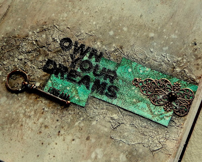
You won't believe what this started with - a covering of Aged Mahogany and Tarnished Brass Distress Paints smooshed around with a baby wipe! After that came a coat of white gesso to tone it all down and give a look of worn plaster. Before adding any paste I stamped 'Becca' to make sure her position on the page was clear, then out came the Crackle Paste and Crackle layering stencil. Once completely dry I added a thick layer of plain paste over 'Becca', let it partially dry, then pressed the stamp back into the paste. Now it was time to add a little colour...


I love how the Lindy's Stamp Gang Magicals and Starbursts develop a wonderful shimmer to them and are fixed when dry. The colours used over the gesso and paste come from the Industrial Chic set and enhance that aged plaster look that you get in old frescos. You can spritz them, paint with them and splatter them (all of which were done here). Time to own up now - I restamped into Becca using Black Archival Ink but it didn't come out as cleanly as I'd hoped (the more paste you use the less easy it is to restamp your image). So I stamped her onto a single ply of tissue with Archival Ink and adhered this over the stamped paste area to fix it. Job done - it worked!


With most of the design in place I needed to add some contrast colour. Using a mix of the green shades from the Industrials sets to colour a strip of paper, I then stamped on it using one of the images from the Tim Holtz Classics #3. The image worked so well I stamped it over the crackled paste areas on the rest of the spread. Having stuck these strips into place they were emphasised with a Distress Marker. You'll also spot copper filigree metal embellishments (with alcohol ink altered pearls) a wonderful Dream key, the stamped sentiment from Tim Holtz Life Quotes set and a couple of Idea-Ology rub ons. A final splattering of Picket Fence Distress Paint brought everything together.


It feels good to get this design out of my head and down on paper (making room for other stuff!) and I'm really pleased with how the crackle element worked. It's been really exciting to take a peak at what my Funkie team mates have come up with for this theme too, and I urge you to head on over to the Frilly and Funkie challenge blog to see for yourselves.

Thank you so much for dropping by today. I hope you feel inspired to join in with the 'Snap, Crackle, Crackle!' fun and even give journalling a go if you've been tempted but not yet tried it.
Whatever you're up to today, take care of yourselves, Jenny xxx


8 May 2015

Paris in 'Abandoned Coral'?

Hi everyone and welcome. Thank you for the amazingly positive reaction to my first attempt at journalling HERE. Spurred on by the lovely comments and bitten by the bug I've been getting stuck in again, though sometimes it's a bit trial and error. Here's another spread - not quite Paris in Springtime (but then my DH and I visited this amazing city in the Summertime anyway, a good 20+ years ago!!!) It was a wonderful trip and I'm crossing fingers we can repeat the experience some time soon. In the meantime...


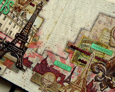
I was inspired by several things including: a photo of the place we stayed; the fact that the colour of the awning in the photo looks just like Abandoned Coral (so I made this a primary project colour); the need to get some ink onto one of the new Tim Holtz Cityscapes stamps; and one of Brenda Brown's journal pages HERE. There is also a new challenge theme over at Stamps and Stencils where they are looking for 'Three of a Kind'.


This took quite some time to complete (in fact I completely scrapped two earlier versions) as it just kept going wrong once the paper had been added and initial inking applied. What went wrong? Muddled ink splattering in the main really, which lead to a confused and over-complicated background - moral of the story is "keep it simple"! There were some techniques I wanted to 'log' for future use, like the mixing of embossing powders and ink for those rusted metallic parts, and paint blistering on the letters. And the Cityscapes stamps are brilliant for creating a border or horizon line, ideal if you are a scrapper or journaller. In amongst a busy composition I kept some 'visual triangles' going, including the repetition of the Eiffel Tower - so you should spot three of them - and the words picked out in Cracked Pistachio.


Well that's a second spread in the bag (and there's another to share soon) and I have to say I am enjoying the freedom this form of crafting gives you. This one will be entered into the following challenges;
Simon Says Stamp Monday Challenge - Don't abandon the Coral
Stamps and Stencils Challenge - Three of a Kind
Country View Challenges - Simply Scenic

Time to disappear again to get ready for an exciting day of demonstrating for IndigoBlu at Domino Crafts in Wolverhampton tomorrow. I'm looking forward to seeing everyone there! If you can't make it don't forget, there are a number of IndigoBlu shows currently being broadcast over at British Craft Network online tv (so you only need an internet connection to see them).
Whatever you're up to this coming weekend have a great one and take care of yourselves, Jenny xxx

2 May 2015

Saturday Step by Step at Frilly and Funkie


Hi everyone and welcome! Well, I've resisted taking the plunge for far too long, but my good friend Brenda Brown's 'Visual Journey' has finally got to me. Having 'rediscovered' an old academic diary I'd decorated for a 'Top Talent Spotlight' some time ago it seemed the perfect opportunity to get started. Not only did my first journal spread get completed, there's a full step by step over at Frilly and Funkie today!!!
Hope you can join me over there to get the blow by blow account.

This journal spread will be entered into these challenges relating to flowers, scenes and journalling;
Country View Challenges - 'Simply Scenic'
Our Creative Corner - 'April Showers Bring May Flowers'
The Mixed Media Monthly Challenge - 'May Flowers'
The Artistic Stamper Creative Team Blog - 'Journalling your heART out'

Have a great weekend everyone and take care of yourselves, Jenny xxx

Related Posts Plugin for WordPress, Blogger...